YouTube

Game Boy Meets Icon Grid: Introducing Pixel! (with Jory + Noah) | Podcast Awesome

Watch Game Boy Meets Icon Grid: Introducing Pixel! (with Jory + Noah) | Podcast Awesome on YouTube

What happens when you take icons built to scale cleanly at any size and deliberately make them look like they were drawn on a Game Boy? You get Pixel, Font Awesome’s retro video game–inspired Pro+ icon pack.

On this episode of Podcast Awesome, Matt sits down with Font Awesome designers Noah Jacobus and Jory Raphael to dig into how Pixel came together. They cover the Game Boy, Panic’s little yellow Playdate, a tip of the hat to original Mac icon designer Susan Kare, and the surprisingly sneaky math behind faking pixels with vectors. Bonus: Jory admits to lying about file sizes in real time.

This one gets visual, with grids, key shapes, and pixel cheats on screen, so it’s worth watching on YouTube instead of just listening.

🗒️ What We Cover
🕹️ Why the original Game Boy shaped Pixel’s look, right down to that shadowy old display
🍌 The Playdate, Panic’s tiny banana-colored handheld, as a daily dose of pixel art inspiration
🖥️ Easter eggs on the Pixel page: a Playdate settings screen and a classic Mac System 7 control panel
📱 How Font Awesome took off by scaling cleanly on high-density screens, and how Pixel runs the opposite direction
💀 “Pixel cheating”: why the skull’s eyes sit on a different grid than its outline
🔲 Landing on a 24-pixel grid after three or four rounds of test sets
✏️ Why removing a single pixel from a corner is a huge design decision
📐 Why vector “pixels” actually make bigger files than smooth curves
🎸 Creative constraints, Jack White, and four-track recorders
👾 A Space Invaders prototype built from Pixel icons, and a possible Space Awesome cameo

⏱️ Timestamps
00:00 – A quick heads-up: watch this one
00:30 – Welcome to Podcast Awesome
01:00 – The Game Boy as Pixel’s muse
02:30 – The Playdate and creative constraints
03:15 – Susan Kare and the classic Mac nods
04:15 – Icon fonts vs. raster: how Font Awesome got its start
05:45 – Pixel cheating and the skull’s eyes
07:15 – The Space Awesome rocket and the 200-icon baseline
08:30 – The Font Awesome flag goes pixel
09:15 – Jory’s Space Invaders prototype
10:15 – Finding the 24-pixel grid
11:30 – Drawing pixels with vectors: paper sketches and key shapes
12:30 – Why one pixel matters so much
14:00 – Jory’s file size confession
15:45 – Jack White, four-tracks, and working with limits
18:00 – Easier and harder at the same time
19:45 – Spotting Pixel in the wild
21:00 – Making things just because they’re fun
22:15 – Wrap-up and credits

🔗 Links & Resources
Hosted, produced and edited by Matt Johnson
Featuring Jory & Noah
Theme song by Ronnie Martin
Music interstitials by Zach Malm
Video editing by Isaac Chase

Browse the Pixel icon pack (Pro+): [https://fontawesome.com/icons/packs/pixel]
Explore the full icon library: [https://fontawesome.com/icons]
Play Space Awesome: [https://spaceawesome.io/]
More episodes of Podcast Awesome: [https://www.podcastawesome.com/]

Using Pixel or another Pro+ pack in a project? Send it our way. We’d love to see what you’re making.

#FontAwesome #PixelArt #IconDesign #GameBoy #Playdate #RetroGaming #PodcastAwesome
Notdog: The Icon Pack That Is Not a Hot Dog | Podcast Awesome

Watch Notdog: The Icon Pack That Is Not a Hot Dog | Podcast Awesome on YouTube

What do a scene from Silicon Valley, a typeface shaped like sausages, and a bottle of mustard have in common? They're all part of the origin story of Notdog, one of Font Awesome's small-batch Pro+ icon packs. It's glossy, it's gooey, and it is very much not a hot dog.

On this episode of Podcast Awesome, Matt sits down with Font Awesome designers Noah Jacobus and Jory Raphael to talk about how a challenge from Dave Gandy ("can we make an icon pack that looks like this?") turned into one of the first proofs that Pro+ packs could work at all. Noah explains why one simple rule about shine shaped every icon in the set, why his early emoji faces looked like dino nuggets, and how a pack inspired by tubes ended up looking like condiments. Plus: the actor who plays Milton in the Font Awesome marketing videos eats a lot of hot dogs on set, and we settle nothing about which regional hot dog is best.

🗒️ What We Cover
😂 How a Silicon Valley gag and the Frankfurter typeface combined into Notdog
✨ Why every icon needed room for a highlight, and how that set the smallest possible shape
🌭 The shift from tube-shaped strokes to blobby, condiment-style forms
🧪 How Noah builds a test set of about 10 icons before committing to all 200
🎭 Why Pro+ packs trade some legibility for personality, like a headline typeface
😵 The faces that fought back, and why the Duotone style is the one to use
🎬 Notdog's starring role in the Font Awesome 7 video
🌭 Chicago dogs, Seattle dogs, and the legendary $1.50 Costco hot dog

⏱️ Timestamps
00:00 — Not a hot dog
00:45 — Welcome to Podcast Awesome
01:00 — Jory lists his favorite hot dogs
02:00 — Why is it called Notdog?
03:45 — The Glyph book and the "could we even do this?" challenge
05:15 — Mood boards and sausage balloon animals
06:45 — From tubes to condiments
08:15 — The shine rule
09:00 — Building a brief: from 200 icons down to 10
11:15 — Core Font Awesome vs. Pro+ personality
13:45 — Where you'd actually use Notdog
16:15 — The easy icons and the dino nugget faces
19:00 — Why Duo is the Notdog to use
20:15 — Diner art, Milton, and hot dog consumption on set
24:15 — Notdog, Jelly, and Slab: the first Pro+ packs
27:15 — The best regional hot dog?
29:30 — The $1.50 Costco hot dog legend
32:00 — Wrap-up and credits

🔗 Links & Resources
Hosted by Matt Johnson
Featuring Jory & Noah
Produced and edited by Matt Johnson
Theme song by Ronnie Martin
Music interstitials by Zach Malm
Video editing by Isaac Chase

Explore the Notdog icon pack: [https://fontawesome.com/icons/packs/notdog]
More episodes of Podcast Awesome: [https://www.podcastawesome.com/]

#FontAwesome #PodcastAwesome #IconDesign #GraphicDesign #DesignProcess #Typography
The CDN Experiment That Taught Us to Fail Well | Podcast Awesome

Watch The CDN Experiment That Taught Us to Fail Well | Podcast Awesome on YouTube

Would you take a shot at something you cared about if your odds of success were 1.4%? Font Awesome founders Dave Gandy and Travis Chase did exactly that when they applied to Y Combinator back in 2014. And in the years since, Font Awesome has racked up plenty of failures right alongside the wins. 'Cos that's just what happens when you're building something awesome.

In this episode, we go digging through Font Awesome's own flops (a product name that confused customers, a CDN experiment that converted exactly ONE person in three months) and line them up next to the real-life Museum of Failure. Which is hilariously an actual museum, started in Sweden in 2017, dedicated entirely to products that didn't make it. Expect Colgate's short-lived frozen dinners, a cologne no biker asked for, and the Nintendo Power Glove.

We also go back to a 2023 conversation with Dave Gandy about flunking out of MIT (twice), what it means to have the freedom to fail, and how a completely unprepped first Y Combinator interview turned into a second shot years later. And the second shot at YC was built on meticulous prep, a childhood friend's help at the Mountain View Public Library, and an unexpected connection with a YC partner.

The through-line: none of this looks like a success story on its own. But it's basically the only way Font Awesome got built.

🗒️ What We Cover
💥 Font Awesome's own quarterly product failures: Fort Awesome and the Font Awesome CDN
📧 How a "failed" CDN experiment quietly built the email list that powered a record-breaking Kickstarter
🎓 Dave Gandy on flunking out of MIT, twice
🏛️ A tour through the real-life Museum of Failure: Colgate Kitchen (and the lasagna that probably never existed), Harley-Davidson Cologne, and the Nintendo Power Glove
📊 Dave's first Y Combinator interview (zero prep) versus his second (a lot of prep, a library, and some serious spreadsheet work)
🤝 Why humility, not confidence, is the trait Font Awesome hires for

⏱️ Timestamps
00:00 — Would you take a 1.4% shot? Font Awesome's Y Combinator odds
03:00 — Clip: Dave Gandy on startups, believing the lie, and finding your real limits
04:00 — The Fort Awesome experiment — and the name confusion that helped sink it
05:00 — The quiet payoff: how that "failed" CDN built the email list behind the Kickstarter
06:00 — Dave on flunking out of MIT — twice
07:00 — Inside the Museum of Failure: Colgate Kitchen (and the lasagna that almost certainly never existed)
09:00 — Harley-Davidson Cologne: bikers said no thanks
10:00 — The Nintendo Power Glove — so bad it inspired a movie line, and still helped shape the Wii Remote
13:00 — Dave's first Y Combinator interview: no plan, no prep
13:30 — Round two: Ryan, the Mountain View Public Library, and the Adobe Typekit comps
15:00 — The Kevin Hale interview and finally clicking
17:00 — The real lesson: humility over hype
19:00 — Go make something awesome

🔗 Links & Resources
Hosted by Matt Johnson
Featuring Mike, Ed, and Jory
Produced and edited by Matt Johnson
Theme song by Ronnie Martin
Music interstitials by Zach Malm
Video editing by Isaac Chase

Font Awesome: [https://fontawesome.com]
When Failure Isn't Failure: Hard Lessons in Business and Life with Dave Gandy — Podcast Awesome EP (2023) [https://www.podcastawesome.com/2092855/episodes/12816619-when-failure-isn-t-failure-hard-lessons-in-business-and-life-with-dave-gandy]

Museum of Failure [https://museumoffailure.com/]

The "Colgate Lasagna" Myth [https://www.ripleys.com/stories/colgate-beef-lasagna] & [https://www.foodrepublic.com/2159233/1960s-colgate-frozen-lasagna/]

Y Combinator [https://www.ycombinator.com/]

Adobe Typekit / Adobe Fonts [https://en.wikipedia.org/wiki/Adobe_Fonts] & [https://blog.typekit.com/]

Power Glove [https://en.wikipedia.org/wiki/Power_Glove] & [https://www.si.edu/visit]

Bring Icons, Kits, and More Into Figma | Using Font Awesome with Figma

Watch Bring Icons, Kits, and More Into Figma | Using Font Awesome with Figma on YouTube

Ready to bring some Font Awesome goodness into your Figma designs?

In this screencast, we’ll show you how to use the official Font Awesome Figma Plugin to search for icons, add them directly to your designs, and customize them to fit your workflow.

Whether you’re using Free icons, Pro icons, or custom icons from your Kits, we’ll walk through getting the plugin set up and putting it to work.

🗒️ What We Cover
🔌 How to install the official Font Awesome Figma Plugin
🔑 Connect the plugin with your Font Awesome account using an API token
🔎 Search Font Awesome icons by Family and Style
✨ Add icons directly to your Figma designs as SVGs
📏 Choose an icon size before adding it to your design
🖼️ Adjust the padding and frame around your icons
🎨 Customize your icons just like other vector elements in Figma
🧰 How Pro users can search and add custom icons from their Font Awesome Kits

⏱️ Timestamps
00:00 – Intro
00:14 – Adding the Official Font Awesome Plugin to Figma
00:42 – Create a new Font Awesome API token
01:23 – Specifications when choosing your icon
01:42 – Uploading custom icons into Figma with the official plugin
02:02 – Using a Kit subset with the official plugin
02:20 – Outro: Go make something awesome

🔗 Links & Resources
📘 Check out the docs: [https://docs.fontawesome.com/desktop/add-icons/figma-plugin]
🎨 Get the official Font Awesome Figma Plugin: [https://www.figma.com/community/plugin/1207989878497331498/font-awesome-icons-official]

Now go make something awesome.

The Sandwich That Broke UX Rules and Won | Podcast Awesome

Watch The Sandwich That Broke UX Rules and Won | Podcast Awesome on YouTube

Pretty much every website has one, you know, those three little lines, usually tucked in a corner, hiding a whole menu behind them. It's become what's known as the hamburger icon. And if you've ever visited fontawesome.com, you may have noticed ours isn't three lines. It's an actual burger, sesame seed bun and all.

On this episode of Podcast Awesome, we trace the icon back to a 1981 Xerox Star screen-space problem, through a 20-year disappearance, a comeback on the first iPhone, and a decade of top UX researchers telling designers to knock it off. And you could probably have guessed it, but the sandwich won anyway. Then we get to why Font Awesome designer Brian Talbot looked at the safe, conventional three-line icon, asked, "Where's the beef?!" and used the FA-burger icon in the most delicious way possible.

🗒️ What We Cover
🖥️ How a 1981 screen-space problem at Xerox PARC turned into three stacked lines
🍔 Norm Cox, the designer behind the original icon, and how he didn't even know it was called "hamburger" until a reporter called him decades later
📱 The icon's 20-year disappearance and its comeback on the first iPhone
🔎 The Nielsen Norman Group research showing how hidden menus cut discoverability almost in half
✅ Why the same research group came back a decade later and declared the icon a win anyway
🎨 Why Font Awesome's own menu icon isn't three lines but an illustrated burger, courtesy of Brian Talbot

⏱️ Timestamps
00:00 – A burger on our own website
00:01 – Welcome to Podcast Awesome
00:02 – Norm Cox and the Xerox Star
00:03 – "Road sign simple": Cox's design philosophy
00:04 – The hamburger menu resurfaces on the first iPhone
00:05 – Apple, Google, and a name nobody planned
00:06 – The UX community picks a fight
00:07 – Nielsen Norman Group's discoverability research
00:08 – "Like a cheap fast food chain..."
00:09 – A decade later: the hamburger icon wins anyway
00:10 – Norm Cox on symbols that improve with time
00:11 – Font Awesome's actual burger icon, courtesy of Brian Talbot
00:13 – Wrap-up and credits

🔗 Links & Resources
Hosted, produced, and edited by Matt Johnson
Theme song by Ronnie Martin
Music interstitials by Zach Malm
Video editing by Isaac Chase

Get the burger icon: [https://fontawesome.com/icons/classic/solid/burger]
Act 1 — The Origin [https://medium.com/readme-mic/a-conversation-with-norm-cox-creator-of-the-hamburger-menu-c913daea5f9e]
Act 3 — The Controversy [https://www.nngroup.com/articles/hamburger-menus/] & [https://www.uxpin.com/studio/blog/hamburger-menu-and-ux-design/]
Act 4 — The Verdict [https://www.nngroup.com/articles/hamburger-menu-icon-recognizability/]
Background / Research Reading [https://eternitymarketing.com/blog/the-history-of-the-hamburger-icon]

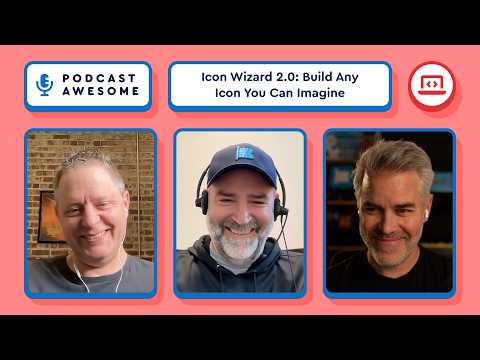
Icon Wizard 2.0: Build Any Icon You Can Imagine | Podcast Awesome

Watch Icon Wizard 2.0: Build Any Icon You Can Imagine | Podcast Awesome on YouTube

Font Awesome's Icon Wizard just got a serious upgrade, and it's now powerful enough to make genuinely great icons (or, per Mike's own admission, genuinely terrible ones, if that's more your speed).

In this episode of Podcast Awesome, host Matt Johnson sits down with Mike, Ed, and Jory (a rare full-team appearance) to talk about the launch of Icon Wizard 2.0. But it's not just a new coat of paint. You can now mix and match icons across styles, layer up to 20 elements at once with full control over size and position, build custom "user" characters by blending heads and bodies, and for the first time run Power Transforms in web fonts, not just SVG.

The crew traces the whole story: how the original Wizard grew out of an internal project once nicknamed F.A.R.Ts (Font Awesome Reusable Tidbits and Shapes, obviously), why this version was almost called the "Icon Genie," and how a customer's offhand feature request turned into a real, shippable icon built live in the tool.

There's also a real-time demo (a thumbs-up icon that grows a seedling), a debate over the correct number of poop-icon swirls, and a very serious 1-to-10 disappointment scale about the road not taken with "Icon F.A.R.Ts." The team is also running an Icon Wizard Contest through September 7, so if you want your creation featured in the gallery, this is your excuse to go play.

🗒️ What We Cover
🧙 What's actually new in Icon Wizard 2.0: mixing icon styles, layering up to 20 elements, add/subtract/stroke operations, and letters and numbers you can punch out of badges
✂️ How Power Transforms — previously an SVG-only capability — now work in web fonts too, and the auto-generated cutouts that made it possible
🧪 The origin story: F.A.R.Ts, the original modifier-only Wizard, and "Snuggles," the team's space for proof-of-concept projects
🎨 Why the team loosened creative control in version 2, and what that trade-off means for good icons (and bad ones)
🖼️ Real community creations from the gallery, including a Starry Night icon, a centaur, a potted cactus, and a live green-thumb demo
🧞 The near-miss name "Icon Genie" and how the team landed back on "Wizard"
🏆 How to enter the Icon Wizard Contest (running through September 7) and where to send feedback during the beta

⏱️ Timestamps
0:00 Cold open: bad icons, good icons, and Jory's grim optimism
1:00 Welcome to the show and episode overview
2:00 The Icon Wizard Contest, explained
4:00 Community favorites: Starry Night, the user blender, and more
5:00 Where this all started: FARTs and the original pitch
7:00 Snuggles and Snactivities, the team's space for proof-of-concept projects
8:00 The real origin story: bringing Power Transforms to web fonts
10:00 What "gooder" actually means in Icon Wizard 2.0
12:00 Ed breaks down what's new: mixing styles, 20 layers, and more
14:00 The real pain point Icon Wizard solves
17:00 Why the Starry Night icon is a different kind of creation
18:00 It's basically a full design tool now
19:00 A customer feature request, solved live with the Wizard
21:00 How v2 actually started: automating the cutouts
23:00 Live demo: building a green thumb icon in real time
26:00 Wizard walkthrough: the four tabs (icons, modifiers, elements, user)
28:00 Add, subtract, stroke: how the Boolean operations work
31:00 Where to send feedback, and how the gallery and sharing work
33:00 Speed round: favorite modifiers
34:00 The secret difference between the poop icon and the poop modifier
35:00 The Icon FARTs disappointment scale
38:00 Almost-names: Icon Genie, Icon Deity, and (sadly, no) Icon Gandalf
40:00 Icon Wizard earns its spot in the main nav
41:00 Wrap-up thoughts on community involvement
43:00 Mike's sign-off

🔗 Links & Resources
Hosted by Matt Johnson
Featuring Mike, Ed, and Jory
Produced and edited by Matt Johnson
Theme song by Ronnie Martin
Music interstitials by Zach Malm
Video editing by Isaac Chase

Icon Wizard: [https://fontawesome.com/icons/wizard]
Gallery + Contest: [https://fontawesome.com/icons/gallery]
Feedback: [feedback@fontawesome.com]
Font Awesome: [https://fontawesome.com]

Using the Icon Wizard | Doing More with Font Awesome [Part 8]

Watch Using the Icon Wizard | Doing More with Font Awesome [Part 8] on YouTube

Ready to make your own icons? In this screencast, we’ll show you how to use the Icon Wizard to stack, blend, and combine Font Awesome icons into custom creations.

From adding icons and modifiers to fine-tuning layers and saving your finished creation to a Kit, we’ll walk through everything you need to start conjuring up some custom icon magic.

🧠 What You’ll Learn in This Screencast
🧩 Add icons, modifiers, elements, and User Blender pieces as layers
🎨 Position, scale, rotate, and blend layers to build your icon
✨ Combine layers with Add, Subtract, and Stroke blend methods
🔀 Reorder, duplicate, and remove layers as you build
💾 Save your custom icon directly to a Font Awesome Kit
🚀 Use your saved icon in your projects just like any other Font Awesome icon
📥 Download your creation as an SVG or PNG
🔗 Share your custom icon with a public landing page
⌨️ Use keyboard shortcuts to nudge, resize, flip, center, and manage your layers

⏱ Timestamps
00:00 – What is the Icon Wizard?
00:15 – Get started
00:30 – Building an icon
01:43 – Saving & sharing your icon
02:27 – Outro

The Icon Wizard is currently a beta feature, so come play around, get creative, and let us know what you think.

🔗 Links & Resources
📚 Learn more about the Icon Wizard: [https://docs.fontawesome.com/web/add-icons/icon-wizard/v2]
✨ Conjure the Icon Wizard: [https://fontawesome.com/icons/wizard]

Beach Ball of Death: The Ghost of a $10,000 Failed Computer | Podcast Awesome

Watch Beach Ball of Death: The Ghost of a $10,000 Failed Computer | Podcast Awesome on YouTube

You've seen it a thousand times: you're two minutes late for a video conference call, you throw on a shirt with buttons (It's okay that you're still wearing jammie pants. Don't worry, nobody can see), and right when you need your computer most, that colorful spinning ball shows up to ruin your day. It's called a lot of things, but most of us just call it a curse word.

Today we trace the beach ball of death back to its actual origin story, which involves a $10,000 computer that flopped commercially, Steve Jobs in exile, a forgotten storage format, and Susan Kare's sketchbook. Turns out the most hated icon in computing has a surprisingly great pedigree.

We also get into why the beach ball exists at all (psst: it's your OS parenting a misbehaving app), how it could've been a spinning slice of pizza, and why Apple Silicon might be quietly killing it off for good.

🗒️ What We Cover
⏳ How much of life is spent waiting on machines, and why the frustration doesn't stop when you sit down at your computer
🖱️ The Xerox PARC origins of the "wait" cursor and Susan Kare's contributions at Apple
🍌 Windows 95 and the golden age of customizable cursors (RIP, dancing banana)
🔄 The lineage from hourglass to wristwatch to spinning disk to beach ball to flat ring
💻 How NeXT, the company Steve Jobs founded after leaving Apple, gave us the beach ball's true ancestor
🍎 Why Apple's 1996 acquisition of NeXT brought the spinning cursor along with it
🌈 How Aqua and Mac OS X turned a monochrome disk icon into a glossy rainbow ball
☠️ The many names for the beach ball, including the delightfully specific "bun of death"
🏖️ Why the beach ball is becoming rarer on modern Macs, and what that means for a whole generation of users

⏱️ Timestamps
00:00 - Cold open: the dreaded beach ball
01:00 - Welcome to Podcast Awesome
01:15 - How much of our lives we spend waiting on machines
02:00 - Xerox PARC and the first "please wait" cursor
02:30 - Susan Kare's contributions to the original Mac
03:30 - Windows 95 and the era of customizable cursors
05:00 - The full lineage: hourglass to beach ball to flat ring
05:30 - Enter NeXT, Steve Jobs's post-Apple company
06:00 - The $10,000 computer nobody could afford
07:00 - Apple acquires NeXT, and the spinning disk comes along
08:00 - The beach ball as an OS parenting a misbehaving app
09:30 - Aqua, Mac OS X, and the rainbow makeover
11:30 - Every alias for the beach ball, including the "bun of death"
13:00 - How Apple Silicon is making the beach ball appearance rarer
13:45 - Closing thoughts and credits

🔗 Credits
Hosted, produced, and edited by Matt Johnson
Theme song by Ronnie Martin
Music interstitials by Zach Malm
Video editing by Isaac Chase

Sources Referenced
Erin J. Rimmer's "The Utterly Obscure History of the Computer Cursor" on Obsolete Technology
Dan Vincent's "What's Inside a NeXT Computer Accessory Kit?" on Userlandia
#PodcastAwesome #BeachBallOfDeath #AppleHistory #MacOSX #DesignHistory #TechHistory #NeXT #SteveJobs
The 404 Error Code Has a Secret Origin Story | Podcast Awesome

Watch The 404 Error Code Has a Secret Origin Story | Podcast Awesome on YouTube

Picture this serious, sterile scene: scientists in lab coats, pocket protectors, carrying clipboards, and nobody’s making eye contact. Nobody would guess that this backdrop would produce some of the best internet lore.

In this episode, we dig into the myth that the 404 error page came from "Room 404" at CERN, track down what a co-creator of the web actually had to say about it, and land on the real, much more boring origin. Along the way we detour into the HTTP status code that was invented as an April Fools' joke, then defended by the developer community hard enough that it got its own RFC. We close it out with a tour of the internet's best 404 pages, including a deep dive into Font Awesome's own, with Jory Raphael.

🗒️ What We Cover
🚪 The Room 404 myth: how it started, why it spread, and why Robert Cailliau, one of the actual creators of the web, wants nothing to do with it
📄 The real, much less exciting origin of the 404 status code
📚 Why HTTP works like a librarian with no short-term memory
🫖 Larry Masinter's HTCPCP proposal and the accidental birth of the 418 "I'm a teapot" code
⚔️ How the dev community fought to save 418 when the IETF tried to reclaim it
🎨 A tour of the internet's best 404 pages: GitHub, Pixar, Lego, and Figma
🎬 Behind the scenes of Font Awesome's own 404 pages with Jory Raphael, including the Ghostbusters, Planes, Trains and Automobiles, Star Wars, and Mario references hiding in them
🥚 The Easter egg hiding on the Font Awesome icons page (and another one on Blog Awesome)

⏱️ Timestamps
00:00 – Cold open: if particle physics research is this serious, how did it produce such a goofy myth?
01:00 – Intro to the episode and the CERN backstory begins, where human "servers" fetched documents by hand
03:00 – How the Room 404 legend took hold, per Wired's reporting
04:00 – Robert Cailliau's one-word review of the myth: "Sigh"
05:00 – The actual, much more mundane origin of the 404 code, plus the DMV and librarian analogies
07:00 – Larry Masinter, RFC 2324, and the Hypertext Coffee Pot Control Protocol
08:00 – The community backlash when the IETF tried to reclaim status code 418
09:00 – Shane Brunswick's save418.com stand, then back to great 404 pages: GitHub's Octocat
10:00 – Pixar's Inside Out 2 tie-in 404
11:00 – Lego's "oh, bricks" 404 and Figma's interactive one
12:00 – Font Awesome's own 404 pages, including the Susan Kare bomb-icon origin story
13:00 – The Ghostbusters Easter egg
14:00 – The Planes, Trains and Automobiles reference and Brian's hidden hand-wave Easter egg
15:00 – Star Wars references and the FA-ndolorian
16:00 – The Mario reference, the icons page Easter egg, and the old Blog Awesome 404s, including "Where's my sandwich?"
17:00 – A shoutout to Brian, the mind behind Font Awesome's 404 copy, and the outro begins
18:00 – Closing credits and sign-off

🔗 Credits
Hosted by Matt Johnson
Featuring Jory Raphael
Produced and edited by Matt Johnson
Theme song by Ronnie Martin
Music interstitials by Zach Malm
Video editing by Isaac Chase

#PodcastAwesome #404Error #WebHistory #InternetLore #TechTrivia #HTTPStatusCodes #FontAwesome #DesignPodcast
Josh Williams on Icon Design, AI, and Knowing When to Stop [Pt. 2]

Watch Josh Williams on Icon Design, AI, and Knowing When to Stop [Pt. 2] on YouTube

What if software had a final season? Josh Williams is back for round two, and this conversation goes places the first one didn't. We get into designing as a generalist instead of a specialist, why some of the best products (RIP Gowalla, RIP Path) might have worked better as limited series instead of forever-apps, and what it actually feels like to use AI tools day to day — not the hot-take version, the real one, where the hardest part isn't the tech, it's knowing when to stop adding features.

Josh also breaks down how the Mosaic icon pack came together, Jory reflects on why his dad's Vermont highway signs are a kind of legacy he thinks about often, and Josh shares his advice for those getting into icon design today. Spoiler: it involves not knowing the rules yet, and that's a good thing.

What We Cover

Why physical, tangible work sticks with you in a way digital work — which can vanish with a hard drive — never quite does.
Jory's dad's landscape architecture and signage firm, and how that legacy is scattered across Vermont
The Mosaic icon pack, and how Scott Riley's Mindful Design site used FA's Slab icon set in a way the team never expected
Generalist vs. specialist: why Josh keeps circling back to brand work but can't stay in one lane
The venture-capital pressure that pushes good products toward becoming "everything apps"
Gowalla, Path, and the idea of software with a beginning, middle, and end — like a TV show's final season
The early App Store era of one-off apps that just were what they were (RIP the beer-drinking app)
Font Awesome's own internal AI experiment weekend, and what came out of it
Taste and discernment as the new bottleneck now that building is fast and cheap
Why "don't be obsequious" should now be a standing instruction in AI prompts
Josh's advice for anyone starting out in icon design today
What's next for the Uni calendar, and a wishlist for a fully custom, build-your-own version

Timestamps

00:00 – Reaching the edge of current tools and processes

00:00 – Intro: what this episode covers 01:00 – The joy of physical, tangible design work

02:00 – Jory's father's legacy in Vermont signage

04:00 – How the Mosaic icon pack might get used and remixed

05:00 – Generalist vs. specialist: where Josh lands

07:00 – Bringing different people and disciplines together

08:00 – VC pressure and the "scale infinitely" mindset 09:00 – Software with a beginning, middle, and end

11:00 – Gowalla, Path, and products as a moment in time

13:00 – Building an intentional, sustainable studio model

14:00 – The early App Store's one-off apps

17:00 – Font Awesome's internal AI experiment weekend

19:00 – Taste and discernment as the new bottleneck

20:00 – Prompting AI to not be obsequious

21:00 – Advice for getting into icon design today

23:00 – Breaking the rules you don't know exist yet – The Mosaic pack vs. the Uni calendar rules 24:00 – A wishlist: fully custom, build-your-own calendars

25:00 – Where to find Josh, and what's next for him

Credits

Featuring Josh Williams and Jory Raphael
Hosted, Produced, and edited by Matt Johnson
Theme song by Ronnie Martin
Music interstitials by Zach Malm
Video editing by Isaac Chase

Links

Font Awesome Mosaic icon pack
Josh Williams: @JW on Instagram and Threads

#PodcastAwesome #IconDesign #FontAwesome #DesignPodcast #AIandDesign #ProductDesign #BrandDesign #TechPodcast #CreativeIndustry #DesignCareers
Icon Design and the Return of Visual Personality w/ Josh Williams [Part 1] | Podcast Awesome

Watch Icon Design and the Return of Visual Personality w/ Josh Williams [Part 1] | Podcast Awesome on YouTube

Josh Williams has been designing icons since before it was a “real” job.

These days, Josh is one of the most respected icon and identity designers working in the field. He helped shape the Font Awesome and Web Awesome logos, and he just designed Mosaic — a brand-new icon pack for Font Awesome Pro with roots in his long-running Uni Calendar letterpress project and a style that's unlike anything we've shipped before.

In Part 1, we talk about where Mosaic came from, what it looks like when a designer actually gets creative freedom, why the web went homogenous, and whether it's finally starting to break back out. Also: Kaleidoscope themes, MySpace CSS exploits, and a cease-and-desist that made at least one person internet famous.

🗒️ What We Cover
🗑️ How Josh nearly bricked a Mac trying to edit the trash can icon
🌈 Kaleidoscope themes, Winamp skins, and the era of tinkering
✨ The MySpace CSS underground (yes, it was a thing)
🖨️ The Uni Calendar letterpress project and how it became Mosaic
🕊️ What "creative freedom" actually feels like when someone hands it to you
🌐 Why everything on the web started looking the same and why it might not stay that way
🤖 AI, low-cost experimentation, and the return of design personality
📸 What Josh is doing next (hint: it involves Keegan Jones and Instagram)

⏱️ Timestamps
00:00 – Cold open: demystification
01:00 – Intro
02:00 – Meeting Josh / fanboy moment
03:00 – Logo collaboration: Web Awesome and Font Awesome marks
04:00 – Announcing Mosaic
06:00 – Uni Calendar roots and the style thread
09:00 – The ResEdit / trash can story
13:00 – Kaleidoscope themes era
14:00 – MySpace CSS and early community
17:00 – Tinkerer culture and design demystification
18:00 – How homogenous web cycles work
21:00 – AI and low-cost experimentation
23:00 – What Josh is doing next

✨ Check out the Mosaic icon pack: https://fontawesome.com/icons

🔗 Credits
Hosted, produced, and edited by Matt Johnson
Co-host Jory Raphael
Featuring Josh Williams
Theme song by Ronnie Martin
Music interstitials by Zach Malm
Video editing by Isaac Chase

Laura Bohill: A Dream Project, a Design Crisis, and the Chisel Icon Pack| Podcast Awesome

Watch Laura Bohill: A Dream Project, a Design Crisis, and the Chisel Icon Pack| Podcast Awesome on YouTube

⏱️What happens when you give a world-class icon designer a dream brief with almost no boundaries? A brief existential crisis, and eventually a beautiful type-inspired icon packs for Font Awesome 7. 😅

In this episode, Matt and Jory chat with icon designer Laura Bohill about the making of Chisel — the wonderfully chunky icon pack she designed for Font Awesome 7. They get into the weird magic of creative constraints, why icon design is really just tiny-illustration puzzle solving, and how type, branding, and metaphor all shape great icon systems.

They also talk about freelance life, protecting your creative brain, why not every design problem should follow you into your evenings, and how sometimes the best ideas show up only after you’ve stepped away from the screen. It’s thoughtful, funny, nerdy, and full of delightful icon design rabbit trails.

🗒️ What We Cover in This Episode
✨ How Laura went from “dream project” to “I am spiritually untethered”
✏️ How a book cover typeface sparked the visual idea behind the Chisel icon pack
🧩 Why icon design is basically a never-ending series of tiny, beautiful puzzles
🧠 Why creative boundaries and time away from work matter more than hustle culture admits
🖼️ How Laura balances clarity vs. creativity in icon design systems
🏰 Why designing icons for Historic England meant trading “upload” icons for castles and country houses
🛠️ Laura’s journey from Illustrator to Figma, with a little help from Noah
🌍 Why icon designers might secretly be some of the most-seen artists on the internet

⏱️ Timestamps
00:00:00 — Intro: Dream project meets existential crisis
00:01:46 — Meet Laura Bohill
00:04:19 — How an open-ended brief led to Chisel’s distinctive style
00:09:37 — Why Laura doesn’t usually do self-directed design projects
00:11:42 — How she found icon design through illustration and freelance work
00:16:30 — Freelance life, boundaries, and protecting creative energy
00:20:21 — How type design influences icon systems
00:29:56 — Why icon design is really a puzzle-solving practice
00:35:31 — Balancing clarity and creativity in icon systems
00:41:00 — Dropbox + Historic England, castles, and designing beyond typical UI icons
00:50:40 — Laura’s Figma origin story and Noah’s helpful onboarding
00:53:22 — Why icon designers are quietly famous
00:55:24 — Find Laura online and final thoughts

🔗 Links & Resources
Hosted by Matt Johnson
Featuring: Laura Bohill, and Jory Raphael
Produced and edited by Matt Johnson
Theme song: Ronnie Martin
Music interstitials: Zach Malm
Additional video editing: Isaac Chase

Check out Laura Bohill work: https://laurarbee.com/
Chisel Icon Pack: https://fontawesome.com/icons/packs/chisel
Font Awesome: https://fontawesome.com/

How to Use Kits in Your Project | Getting Started with Font Awesome [Part 2]

Watch How to Use Kits in Your Project | Getting Started with Font Awesome [Part 2] on YouTube

Ready to add awesome icons to your project in mere seconds? Look no further, because in this quick tutorial, we'll show you how to install and use a Font Awesome Kit — the easiest way to get icons into your project with just a single line of code. Whether you're building a personal site, client project, or your next side hustle, we’ll walk you through every step.

In just a few minutes, you'll learn how to:
✅ Embed a FA Kit into your HTML
🔎 Search & find the perfect icon
📋 Copy and paste icon code like a pro
🎉 Make your UI way more fun & functional, instantly!

No fuss. No config headaches. Just super-duper icon magic.

💡 Perfect for devs, designers, and digital tinkerers looking to speed up their workflow and make their projects stand out.

🔗 BONUS: We’re using [CodePen] (https://codepen.io) for the demo so you can play along in real time!

🧰 What You’ll Learn:

How Font Awesome Kits simplify icon installation
The fastest way to get icons into your project (no downloads required!)
The difference between icon styles (solid, regular, etc.)
Pro tips to keep your HTML clean and maintainable

⏱️ Timestamps
00:00 – Copy your kit into your project
00:40 – Search page & icon detail modal
01:10 – Using icons in your web projects
01:18 – Wrap-up & next steps

#FontAwesome #WebDesign #CodeTutorial #WebDevelopment #HTMLIcons #DevTips #FrontendDev #IconLibrary #WebAwesome

Subsetting Your Icons Using Kits | Getting Started with Font Awesome [Part 5]

Watch Subsetting Your Icons Using Kits | Getting Started with Font Awesome [Part 5] on YouTube

Want to keep your projects loading up fast while still using the icons you love? In this screencast, we’ll show you how to subset your Font Awesome Kit, so you’re only loading the icons you actually need.

We’ll walk through the different ways to subset your icons—from automatic options to fully custom selections—so you can cut down file size, improve performance, and keep your setup streamlined.

🧰 What You’ll Learn:
⚡ What subsetting is and why it improves performance
🤖 The different subsetting options available in Kits
🔎 How to create a custom subset by selecting specific icons
💾 See how to enable 'Custom Subsetting' in your Kit settings
🚀 How to use your subsetted Kit in your project

⏱️ Timestamps
00:00:00 – Intro: Subsetting your icons using Kits
00:00:16 – FAQ: What is a subset?
00:00:41 – FAQ: What are my options when it comes to subsetting?
00:00:57 – Adding icons to your Kit: Subsetting 'By Icon'
00:01:35 – Managing your subset in Kit settings
00:01:42 – Using a subset in your project
00:02:05 – Outro: Go make something awesome!

Now that your icons are leaner and faster, go make something awesome!

🔗 Links & Resources
🎨 Font Awesome: https://fontawesome.com/
📘 Font Awesome Docs: https://docs.fontawesome.com/web/dig-...
💡 More Doing More with Font Awesome screencasts: • [v7-7.20] Managing Domains and Pageviews i...

Upload Custom Icons and Make Font Awesome Yours | Doing More with Font Awesome [Part 7]

Watch Upload Custom Icons and Make Font Awesome Yours | Doing More with Font Awesome [Part 7] on YouTube

🎨 In this tutorial, we’ll walk you through uploading custom icons to your Font Awesome Kit. We’ll cover everything — from navigating the Custom Icons tab to troubleshooting any bumps along the way — so you can mix your unique custom icons with the official Font Awesome collection. And of course, we’ll show you how to easily add these icons to your projects using a quick code snippet. By the end, you'll have a personalized icon library that adds extra flair to your projects.✨

⏰ Timestamps:
🎉 00:00 Introduction to Custom Icons in Font Awesome
📤 00:20 Uploading Your Custom Icons
🛠️ 01:01 Handling Icon Issues and Publishing
📂 02:03 Using Custom Icons in Your Project
📥 03:17 Downloading Kits with Custom Icons
📝 04:00 Recap and Final Thoughts

#FontAwesome #CustomIcons #WebDesign #Tutorial #Icons #WebDevelopment

Cozy Keyboard Build and Build Awesome AMA

Watch Cozy Keyboard Build and Build Awesome AMA on YouTube

Back the Kickstarter: https://www.kickstarter.com/projects/fontawesome/build-awesome-pro?ref=9n0yiq

In this special episode of the Build Awesome Stream we’ll have special guest Noah Jacobus (Font Awesome’s Icon Sommelier and Keyboard Enthusiast https://www.noahjacob.us/) helping Zach Leatherman (Build Awesome/11ty Creator, Keyboard Amateur) stumble through assembly of the Font Awesome keyboard.

We’ll also field any questions you might have about Font Awesome, Build Awesome, 11ty, and the Build Awesome Pro Kickstarter!

A few demos of Editing and Collaboration in Build Awesome Pro (as always, AMA!)

Watch A few demos of Editing and Collaboration in Build Awesome Pro (as always, AMA!) on YouTube

In this episode, we’ll walk through a few very early demos of the collaboration and editing features in Build Awesome Pro!

Come hang out — ask me anything! Let’s talk about Build Awesome (11ty), the Build Awesome Pro Kickstarter, funding open source through Kickstarter.

🔗 Back Build Awesome Pro: https://www.kickstarter.com/projects/fontawesome/build-awesome-pro?ref=63jze0

An Awesome Theming Demo with Dave Gandy (and more Build Awesome AMA)

Watch An Awesome Theming Demo with Dave Gandy (and more Build Awesome AMA) on YouTube

Today we’ll have a special demo from Dave Gandy, who has been building a color theming tool!

As always, hang out — ask us anything! Let’s talk about Build Awesome (11ty), the Build Awesome Pro Kickstarter, funding open source through Kickstarter. Show me your web site! Tell me what you like and/or don’t like about your current deployment system/CMS/host!

🔗 And of course: back Build Awesome Pro: https://www.kickstarter.com/projects/fontawesome/build-awesome-pro?ref=3y9mok

Start Your Escape from WordPress Using 11ty (in 3 minutes!)

Watch Start Your Escape from WordPress Using 11ty (in 3 minutes!) on YouTube

It’s time to think about getting off of WordPress for more stable blogging pastures. In this video we’ll talk about using 11ty to do just that!

Read the docs: https://www.11ty.dev/docs/migrate/wordpress/

Eleventy Import: https://github.com/11ty/eleventy-import
Eleventy Base Blog: https://github.com/11ty/eleventy-base-blog

Poster image by Berni Wittmann: https://unsplash.com/photos/black-wooden-bench-on-green-grass-field-near-mountains-during-daytime-xEjWEkSagLg

Managing content management (with no vendor lock-in) — David Large, Liam Bigelow (11ty Conf 2024)

Watch Managing content management (with no vendor lock-in) — David Large, Liam Bigelow (11ty Conf 2024) on YouTube

CloudCannon is the Recommended CMS Partner of 11ty:

https://cloudcannon.com/11tyconf/
https://cloudcannon.com/blog/how-to-manage-hundreds-of-connected-websites-with-a-git-based-headless-cms/

This was a talk given at the 11ty International Symposium on Making Web Sites Real Good (2024): https://conf.11ty.dev/2024/managing-content-management/

If Jamstack has taught us anything, it’s that websites work best when they’re generated from folders full of flat files. Even massively interconnected websites!

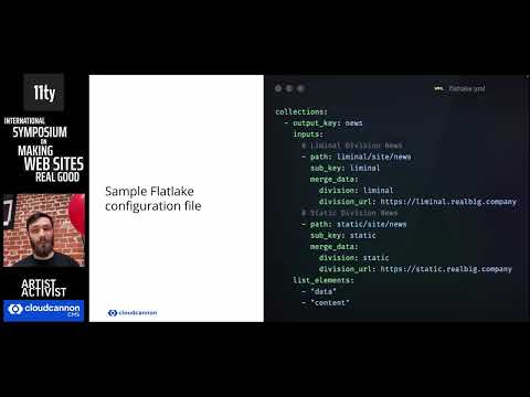
We talk through a classically Jamstacky approach to content management for large organizations: mounting shared layout and component repositories, creating a central content lake to aggregate content like news articles, and automating site builds and deployments when your content or dependencies change.

11ty and Large-Project Tooling — Paul Everitt (11ty Conf 2024)

Watch 11ty and Large-Project Tooling — Paul Everitt (11ty Conf 2024) on YouTube

This was a talk given at the 11ty International Symposium on Making Web Sites Real Good (2024): https://conf.11ty.dev/2024/11ty-and-large-project-tooling/

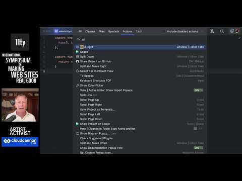
JetBrains has a knowledge base with lots of content, customizing, authors, developers… so we built it in Gatsby. Then switched to 11ty. But we wanted to keep some of the large-project tooling, so we added it. In this talk, we'll cover component driven development through TypeScript and TSX, unit testing with Vitest, in-editor validation of Markdown frontmatter for authors, content queries, and more.

Digital Frontiers, IndieWeb Cowboys, and A Place Online To Call… — Henry Desroches (11ty Conf 2024)

Watch Digital Frontiers, IndieWeb Cowboys, and A Place Online To Call… — Henry Desroches (11ty Conf 2024) on YouTube

This was a talk given at the 11ty International Symposium on Making Web Sites Real Good (2024): https://conf.11ty.dev/2024/digital-frontiers-indieweb-cowboys-and-a-place-online-to-call-your-own/

The IndieWeb is a community of developers and designers and web-surfing wraiths connected by a belief in personal websites/domains as identity, digital self-publishing, and perhaps most chiefly owning one's content. In this talk, Henry will explore the key principles of the IndieWeb, and specifically focus on the concept of POSSE (or "Publish (on your) Own Site, Syndicate Elsewhere"), its benefits, and how it empowers folks to reclaim ownership of their online content or data. They will also discuss concrete and actionable strategies for implementing POSSE in one's own online presence (PERHAPS USING ELEVENTY?!?!?) and the potential impact it can have on the wider web

You're Probably Doing Web Performance Wrong —  Sia Karamalegos (11ty Conf 2024)

Watch You're Probably Doing Web Performance Wrong —  Sia Karamalegos (11ty Conf 2024) on YouTube

This was a talk given at the 11ty International Symposium on Making Web Sites Real Good (2024): https://conf.11ty.dev/2024/you-re-probably-doing-web-performance-wrong/

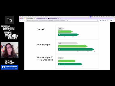
Lighthouse 100 is a common goal for developers seeking to make their sites fast, but does this really center user experience? In this talk, Sia will cover how to get a broader perspective on how real users are experiencing your website performance and better strategies for improving it.

Building a Town That Doesn't Exist — Dan Sinker (11ty Conf 2024)

Watch Building a Town That Doesn't Exist — Dan Sinker (11ty Conf 2024) on YouTube

This was a talk given at the 11ty International Symposium on Making Web Sites Real Good (2024): https://conf.11ty.dev/2024/building-a-town-that-doesnt-exist/

The town of Question Mark, Ohio has a city hall, a newspaper, a library, a chicken joint, an ice cream store, a dump, a haunted factory, two cults, a sordid past, and a mysterious glowing void in the woods.

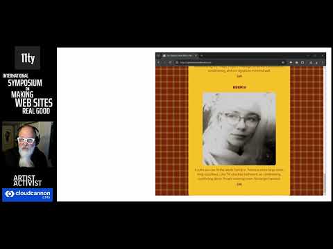
None of it is real, of course, but all of it exists on the web, thanks to Eleventy, Tailwind CSS, and Alpine.js, the crucial building blocks for creating a year-long immersive novel told not in a book but across the entire internet. This talk looks under the hood at how one person built 40 websites to tell the story of Question Mark, Ohio, a town that disappears into time.

Don't Fear the Cascade — Mayank (11ty Conf 2024)

Watch Don't Fear the Cascade — Mayank (11ty Conf 2024) on YouTube

This was a talk given at the 11ty International Symposium on Making Web Sites Real Good (2024): https://conf.11ty.dev/2024/dont-fear-the-cascade/

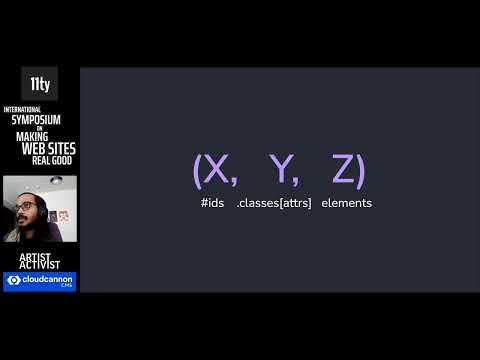
In this talk, Mayank will teach the audience how to make sense of the cascade, clear up some common misconceptions (e.g. shadow DOM vs host context styles), and ultimately offer practical advice on how to make best use of the cascade.

They will show off some newer game-changing CSS features (like :where, cascade layers, and @scope) that enable us to write styles with confidence and intention. They may also sprinkle in some tips on how these new features interact with current workflows, including frameworks, build tools, browser devtools, and IDEs.

11ty for “Non-Developers” — Adrianna Tan (11ty Conf 2024)

Watch 11ty for “Non-Developers” — Adrianna Tan (11ty Conf 2024) on YouTube

This was a talk given at the 11ty International Symposium on Making Web Sites Real Good (2024): https://conf.11ty.dev/2024/11ty-sites-for-people-who-dont-think-they-are-web-developers/

For a long time, we've thought of web development in two separate streams. WYSWYG builders for non-techical people, code for the rest. What if 'non-technical' isn't real, ‘web dev’ doesn't have to be just something you do for money, and building sites on the open web can be a fun hobby, especially with 11ty?

In this talk, Adrianna will share how 11ty helped them finally break down the ’I’m not a web developer’ thoughts so they could build cool sites. Just like everyone can draw without being an artist, everyone can cook without being a chef.

Adrianna will also share a framework they've developed for talking about and teaching 11ty to people who think they are not web developers, but who really have things to share on the web.

Come to the light side: HTML Web Components — Chris Ferdinandi (11ty Conf 2024)

Watch Come to the light side: HTML Web Components — Chris Ferdinandi (11ty Conf 2024) on YouTube

This was a talk given at the 11ty International Symposium on Making Web Sites Real Good (2024): https://conf.11ty.dev/2024/come-to-the-light-side-html-web-components/

While Web Components have been around for years, they're seeing a bit of a renaissance thanks to an emerging approach for authoring them: ditch the shadow DOM and progressively enhance existing HTML.

In this talk, we'll look at what Web Components, how the "HTML Web Component" approach works, why it's awesome, and some tips, tricks, and gotchas when working with them.

Chinese Type Systems — ivan zhao (11ty Conf 2024)

Watch Chinese Type Systems — ivan zhao (11ty Conf 2024) on YouTube

This was a talk given at the 11ty International Symposium on Making Web Sites Real Good (2024): https://conf.11ty.dev/2024/chinese-type-systems/

In this talk, ivan will educate listeners about understanding Chinese type systems, pairing Chinese fonts, and why its so hard to put your Chinese font in the @font-face in CSS. Typesetting on the web with Chinese fonts is extremely difficult and ivan will give examples of pages that do this beautifully, and recommendations on how to find these.

They will also talk about the history of the Chinese language, the differences in character based vs glyph based, and the difficulties of pairing the two types together. They’ll dive into the various classifications of systems that they use and talk about how to notice and pair Chinese fonts together, as well as actionably implementing them in CSS and the bundle size of the file.