Game Boy Meets Icon Grid: Introducing Pixel!

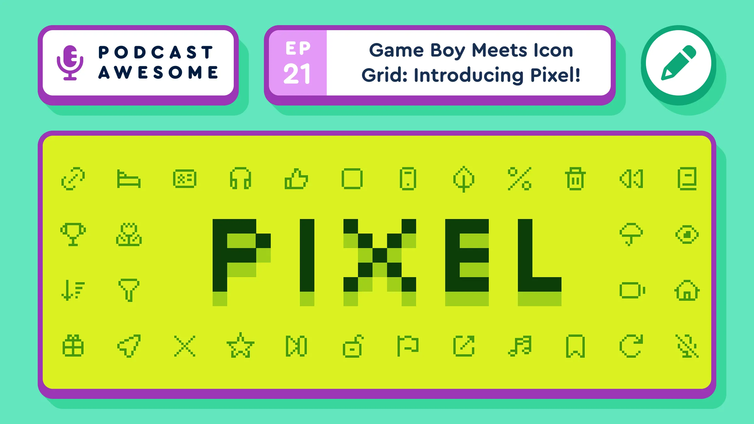
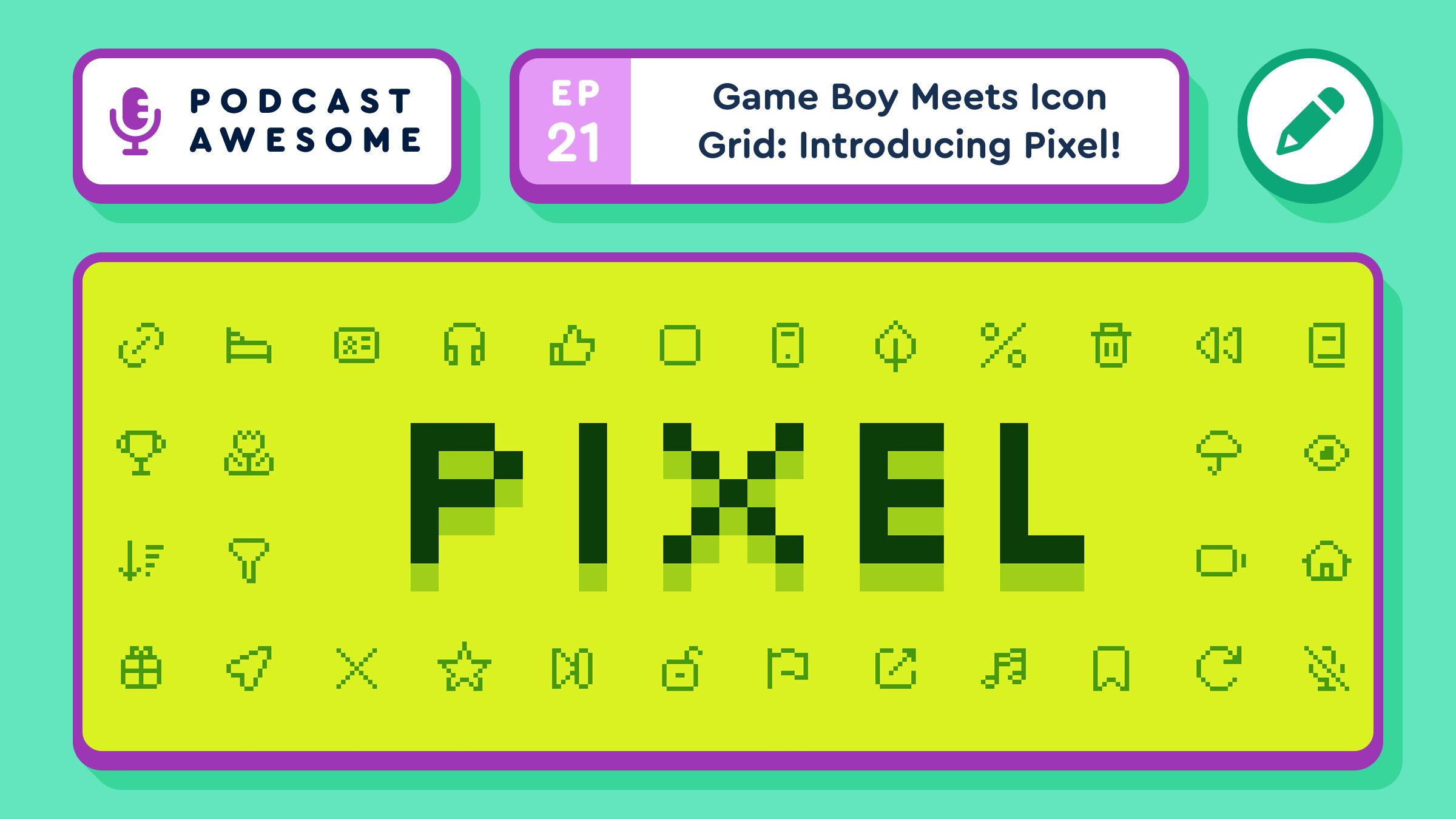
What happens when you take icons built to scale cleanly at any size and deliberately make them look like they were drawn on a Game Boy? You get Pixel, Font Awesome’s retro video game–inspired Pro+ icon pack.

On this episode of Podcast Awesome, Matt sits down with Font Awesome designers Noah Jacobus and Jory Raphael to dig into how Pixel came together. They cover the Game Boy, Panic’s little yellow Playdate, a tip of the hat to original Mac icon designer Susan Kare, and the surprisingly sneaky math behind faking pixels with vectors. Bonus: Jory admits to lying about file sizes in real time.

This one gets visual, with grids, key shapes, and pixel cheats on screen, so it’s worth watching on YouTube instead of just listening.

What We Cover

  • Why the original Game Boy shaped Pixel’s look, right down to that shadowy old display
  • The Playdate, Panic’s tiny banana-colored handheld, as a daily dose of pixel art inspiration
  • Easter eggs on the Pixel page: a Playdate settings screen and a classic Mac System 7 control panel
  • How Font Awesome took off by scaling cleanly on high-density screens, and how Pixel runs the opposite direction
  • “Pixel cheating”: why the skull’s eyes sit on a different grid than its outline
  • Landing on a 24-pixel grid after three or four rounds of test sets
  • Why removing a single pixel from a corner is a huge design decision
  • Why vector “pixels” actually make bigger files than smooth curves
  • Creative constraints, Jack White, and four-track recorders
  • A Space Invaders prototype built from Pixel icons, and a possible Space Awesome cameo

Timestamps
00:00 – A quick heads-up: watch this one
00:30 – Welcome to Podcast Awesome
01:00 – The Game Boy as Pixel’s muse
02:30 – The Playdate and creative constraints
03:15 – Susan Kare and the classic Mac nods
04:15 – Icon fonts vs. raster: how Font Awesome got its start
05:45 – Pixel cheating and the skull’s eyes
07:15 – The Space Awesome rocket and the 200-icon baseline
08:30 – The Font Awesome flag goes pixel
09:15 – Jory’s Space Invaders prototype
10:15 – Finding the 24-pixel grid
11:30 – Drawing pixels with vectors: paper sketches and key shapes
12:30 – Why one pixel matters so much
14:00 – Jory’s file size confession
15:45 – Jack White, four-tracks, and working with limits
18:00 – Easier and harder at the same time
19:45 – Spotting Pixel in the wild
21:00 – Making things just because they’re fun
22:15 – Wrap-up and credits

Links

Using Pixel or another Pro+ pack in a project? Send it our way. We’d love to see what you’re making.

Credits
Produced, edited, and hosted by Matt Johnson
Theme song by Ronnie Martin
Music interstitials by Zach Malm
Video editing by Isaac Chase

#FontAwesome #PixelArt #IconDesign #GameBoy #Playdate #RetroGaming #PodcastAwesome

Stay up to date on all the Font Awesomeness!
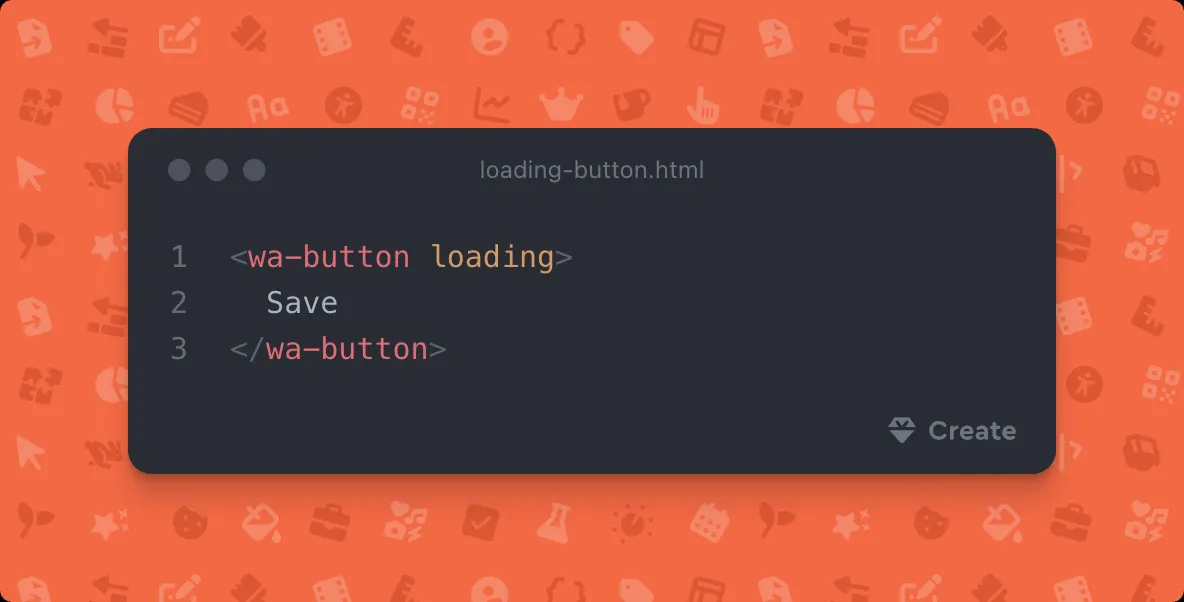
Most layouts are a stack, a cluster, or a split, so those get classes. Your button padding doesn't.

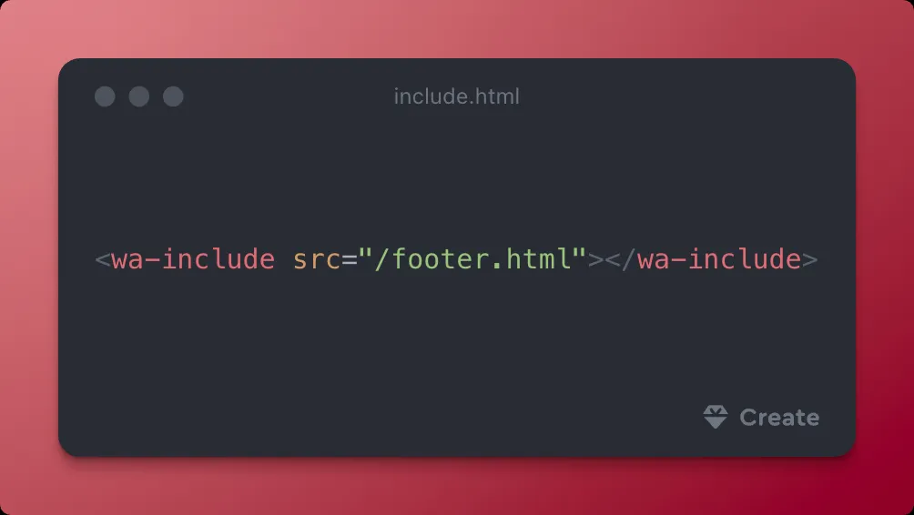
<div class="wa-stack">
<div class="wa-cluster">…</div>
</div>

Here's a way to visualize layout utilities.

Stack. Cluster. Split. | Create
Three cards built with a handful of layout classes and a few lines of readable CSS, no class soup. Flip “Show the layout” to outline every wa-stack, wa-cluster, wa-split, wa-flank, wa-grid and wa-fram...

The scariest thing in your codebase this Halloween is a feature your coding agent made up.

🙅‍♀️ <wa-fancy-card glow>

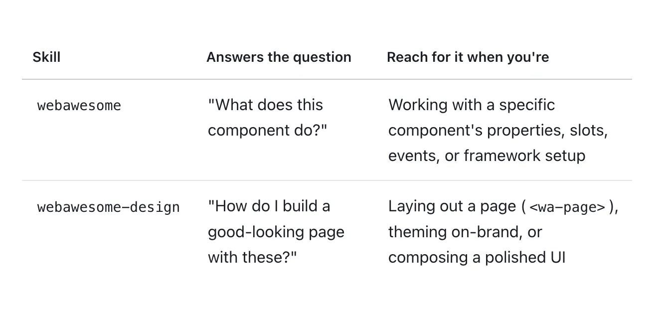
Our agent skills are checked against the library on every build, so you can create faster and more consistently with AI.

Notdog: The Icon Pack That Is Not a Hot Dog

What do a scene from Silicon Valley, a typeface shaped like sausages, and a bottle of mustard have in common? They're all part of the origin story of Notdog, one of Font Awesome's small-batch Pro+ icon packs. It's glossy, it's gooey, and it is very much not a hot dog.

On this episode of Podcast Awesome, Matt sits down with Font Awesome designers Noah Jacobus and Jory Raphael to talk about how a challenge from Dave Gandy ("can we make an icon pack that looks like this?") turned into one of the first proofs that Pro+ packs could work at all. Noah explains why one simple rule about shine shaped every icon in the set, why his early emoji faces looked like dino nuggets, and how a pack inspired by tubes ended up looking like condiments. Plus: the actor who plays Milton in the Font Awesome marketing videos eats a lot of hot dogs on set, and we settle nothing about which regional hot dog is best.

What We Cover

  • How a Silicon Valley gag and the Frankfurter typeface combined into Notdog
  • Why every icon needed room for a highlight, and how that set the smallest possible shape
  • The shift from tube-shaped strokes to blobby, condiment-style forms
  • How Noah builds a test set of about 10 icons before committing to all 200
  • Why Pro+ packs trade some legibility for personality, like a headline typeface
  • The faces that fought back, and why the Duotone style is the one to use
  • Notdog's starring role in the Font Awesome 7 video
  • Chicago dogs, Seattle dogs, and the legendary $1.50 Costco hot dog

Timestamps
00:00 Not a hot dog
00:45 Welcome to Podcast Awesome
01:00 Jory lists his favorite hot dogs
02:00 Why is it called Notdog?
03:45 The Glyph book and the "could we even do this?" challenge
05:15 Mood boards and sausage balloon animals
06:45 From tubes to condiments
08:15 The shine rule
09:00 Building a brief: from 200 icons down to 10
11:15 Core Font Awesome vs. Pro+ personality
13:45 Where you'd actually use Notdog
16:15 The easy icons and the dino nugget faces
19:00 Why Duo is the Notdog to use
20:15 Diner art, Milton, and hot dog consumption on set
24:15 Notdog, Jelly, and Slab: the first Pro+ packs
27:15 The best regional hot dog? 
29:30 The $1.50 Costco hot dog legend
32:00 Wrap-up and credits

Links

Credits
Hosted produced and edited by Matt Johnson
Guests: Noah Jacobus and Jory Raphael
Theme song by Ronnie Martin
Music interstitials by Zach Malm
Video editing by Isaac Chase

#FontAwesome #PodcastAwesome #IconDesign #GraphicDesign #DesignProcess #Typography

Stay up to date on all the Font Awesomeness!
Changelog Feed

Follow the changelog in any feed reader, and AI agents can now read our key pages as markdown.

You no longer have to remember to check back here. The changelog now comes to you, and it's easier for your tools to read too.

  • Subscribe in any feed reader. Every new release and website update now has an RSS feed you can follow. Add it to your feed reader, and new entries show up with their full notes and working links. Look for the Subscribe link under the months on this page.
  • Readable by AI agents. This page and our license, plans, privacy, and refunds pages are also published as markdown, so an assistant asked about Font Awesome gets the real answer instead of a blank page.

For the spreadsheet people, here's the math: pageview and bandwidth add-ons run about 25% cheaper than overages for the same usage. Overages are for spikes you didn't see coming. Add-ons are for the ones you did.

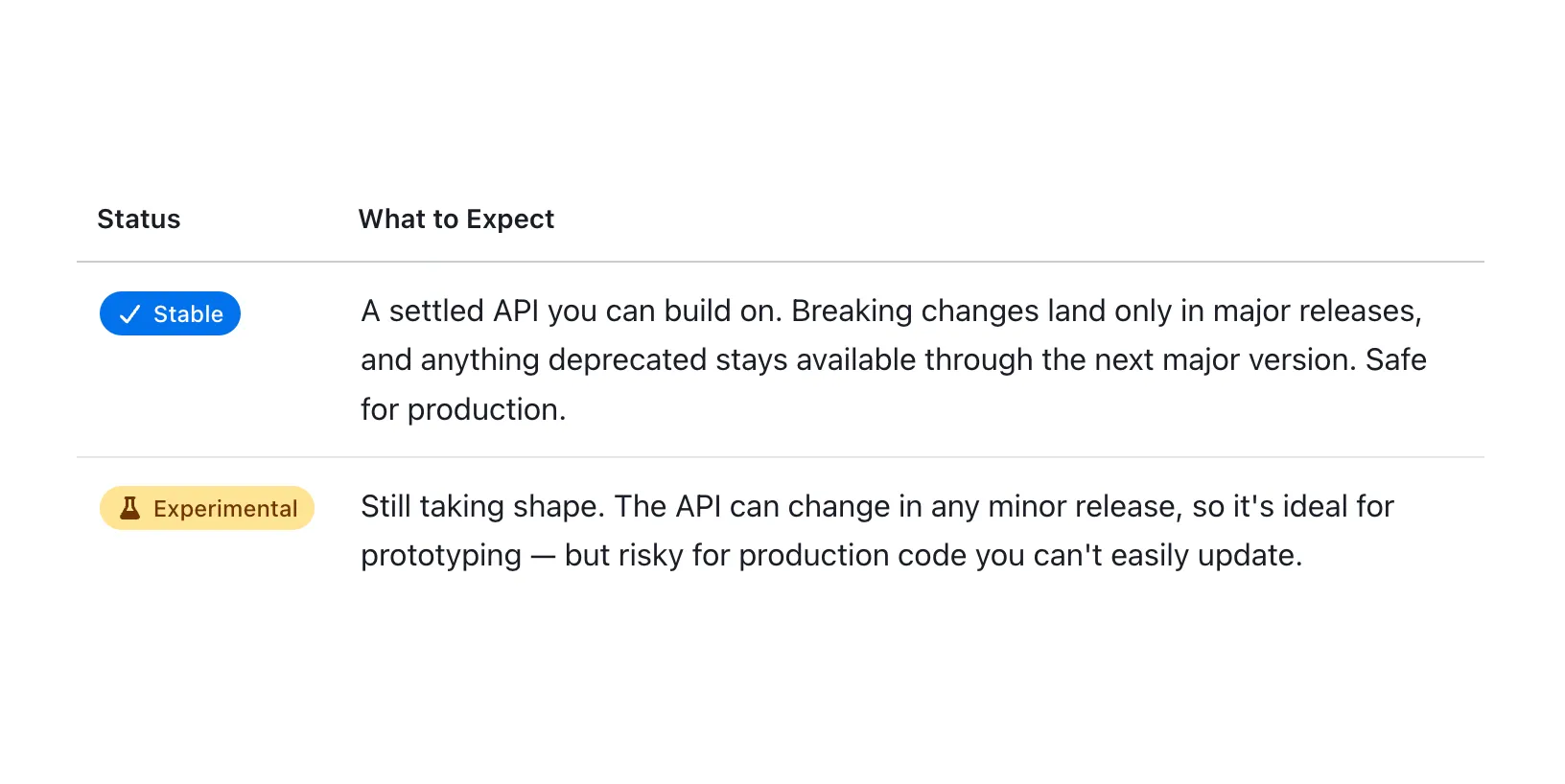
The experimental badge isn't marketing fog, it means we need testers and feedback and things _could_ change between now and the final version. (Rarely happens unless we find a critical issue)

Stable = battle-tested, ready to build.

We label both so you don't have to guess.

Screenshot of the stable/experimental table in the changelog