Finds all local JavaScript and TypeScript dependencies (ES module imports and CommonJS require()) from a filename.
"Snacktivities" are bite-size projects small enough to finish during a Snuggle week and built on the stuff you can only really do in person. The Icon Wizard is one of those projects.
Things that have come out of a week where a remote team is finally occupying the same physical space: the Icon Wizard, a bunch of "snacktivities," at least one new hire, and a Hoobastank chorus that'll get stuck in your head just as you lay down to go to sleep. (Blame Ed.)
New: Font Awesome Plan Add-ons. Need more Kits but your pageviews are fine? Add Kits. That's it. No tier jump, no paying for stuff you won't use. Uncle Owen has been overruled. blog.fontawesome.com/add-with...
Font Awesome paid plans can now add extra Kits, Custom Icons, pageviews, or bandwidth individually. No more upgrading a whole tier because one number ran out. https://blog.fontawesome.com/add-without-upgrading/
Add Kits, Pageviews, and More Without Upgrading Your Plan
New Podcast Awesome: Font Awesome is fully remote, and twice a year we all meet up for a week we call the Snuggle. This episode traces the name back to the "Cape Cuddles" and covers what actually happens when a remote team gets together. 🧸 https://www.podcastawesome.com/2092855/episodes/19924901-cape-cuddles-icon-farts-and-hoobastank-the-story-of-the-snuggle
New Podcast Awesome: our company's biannual meetup is called the Snuggle. We're a software company. We're adults. This episode is the story of how that happened and why we're never changing it. 🧸 www.podcastawesome.com/209285...
@awesome.me/buildawesome@0.0.3
A simpler way to build awesome web sites.
@awesome.me/buildawesome@0.0.2
A simpler way to build awesome web sites.
Cape Cuddles, Icon Farts, and Hoobastank: The Story of the Snuggle
Every company has a name for the week everybody flies in. The offsite. The summit. The all-hands. At Font Awesome, it's called the Snuggle. For real.
Recorded from a hotel room at the October 2026 Snuggle, this episode digs into the Podcast Awesome vault to tell the story behind the most ridiculous name in company meetups. Matt stitches together clips from Dave Gandy, Travis Chase, Rob Madole, Jory Raphael, Cory LaViska, Ed Emanuel, and Frances Botsford. Along the way you'll hear how four guys and a beach house on Cape Cod turned into a fully remote company that still flies everyone in, and what keeps coming out of that week together.
What We Cover
- How the "Cape Cuddles" became the Snuggle, and why the name stuck
- Rob Madole on the real tradeoff of remote work: focus is great, but coworkers can start to feel like a resource
- The Icon Wizard, a feature that got its start at a Snuggle
- Cory LaViska's whirlwind trip from a Twitter follow to a porch phone call to Arkansas, plus the "Snuggle Is Real" shirt
- How the Icon Wizard grew into something bigger, with Ed and Frances
- Snacktivities: bite-size projects you can only really build in person (and a feature name that, thankfully, got changed)
- What it felt like when COVID canceled the Snuggles
- Rob's change of heart, and why he stopped being annoyed
- Dave Gandy at the 2024 Snuggle, somewhere between karaoke and game night, on how loyalty gets built
- Why the ridiculous name has one great side effect
Timestamps
- 00:00 – Welcome to the Snuggle (yes, really)
- 01:10 – Cape Cuddles and the origin of the name
- 02:30 – Rob Madole on what remote work gives and what it costs
- 04:10 – The Icon Wizard's Snuggle roots
- 05:00 – Cory LaViska joins the crew
- 06:15 – "The Snuggle Is Real"
- 07:30 – Ed and Frances on pushing the Icon Wizard further
- 08:15 – Snacktivities explained
- 09:50 – When the Snuggles stopped
- 11:40 – Rob comes around
- 13:40 – The 2024 Snuggle with Dave Gandy
- 15:00 – How loyalty is built
- 15:20 – Back to the name
- 16:10 – Telling the story from the 2026 Snuggle
- 16:50 – Credits
Episodes Featured
- Remote Work: How We Snuggle Our Way to a Healthy Company Culture
- Font Awesome's 2022 Year in Review with Matt and Jory
- The Snuggle Is Real: How Font Awesome and Shoelace Are on a Mission to Make Dev Work Easier
- New Font Awesome Features: PNG Downloads, Color Picker, and User Blender
- Character First: The Font Awesome Key to Hiring Success
Links
Credits
- Hosted, produced, and edited by Matt Johnson
- Theme song by Ronnie Martin
Stay up to date on all the Font Awesomeness!
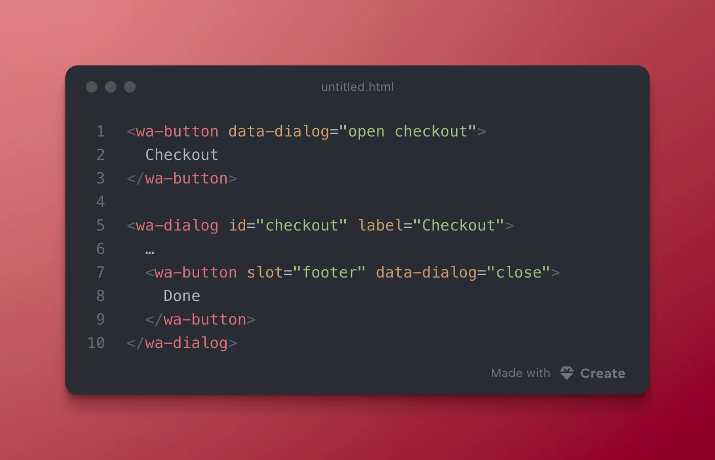
You can open and close <wa-dialog> from anywhere on the page without writing JavaScript. (The same concept works for <wa-drawer>)
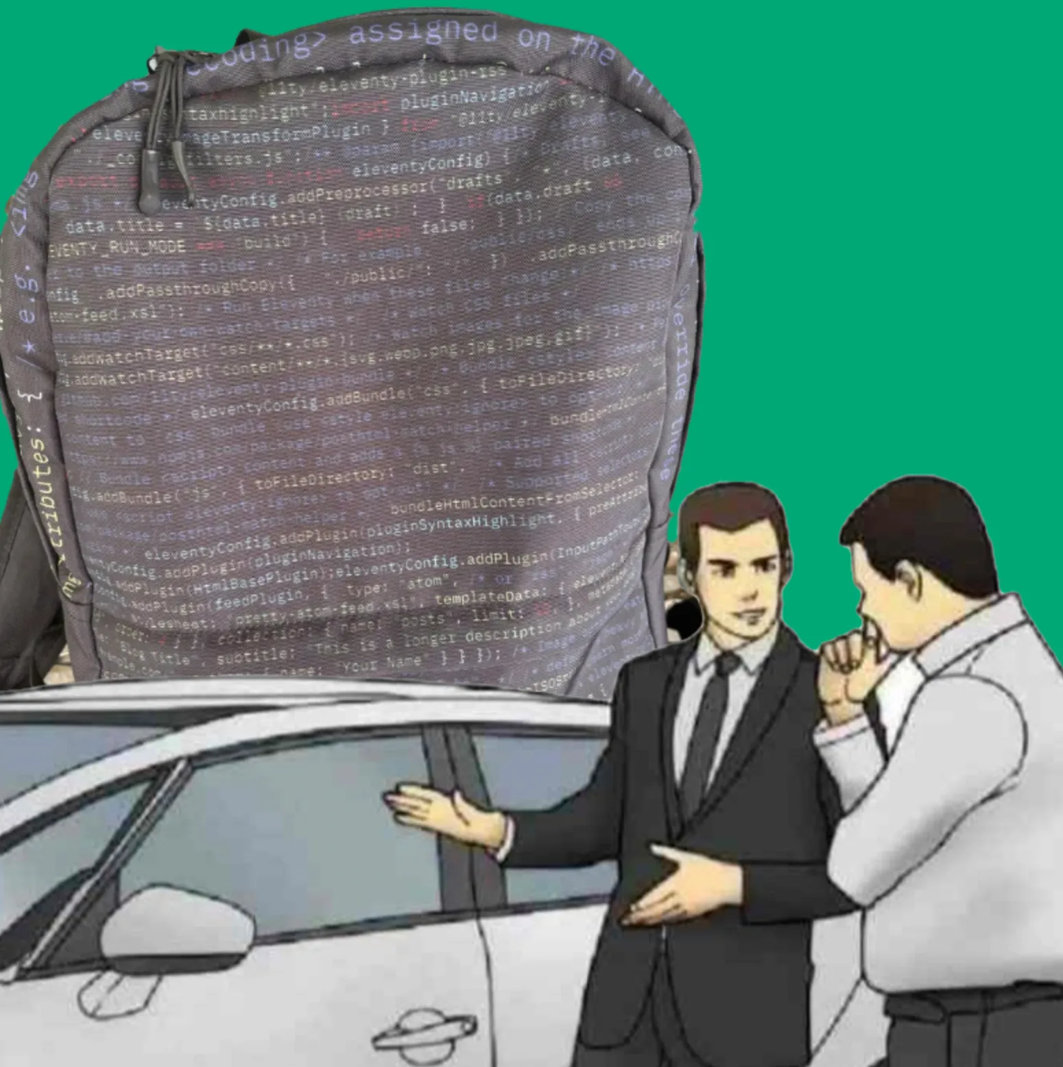
*slaps roof of backpack*
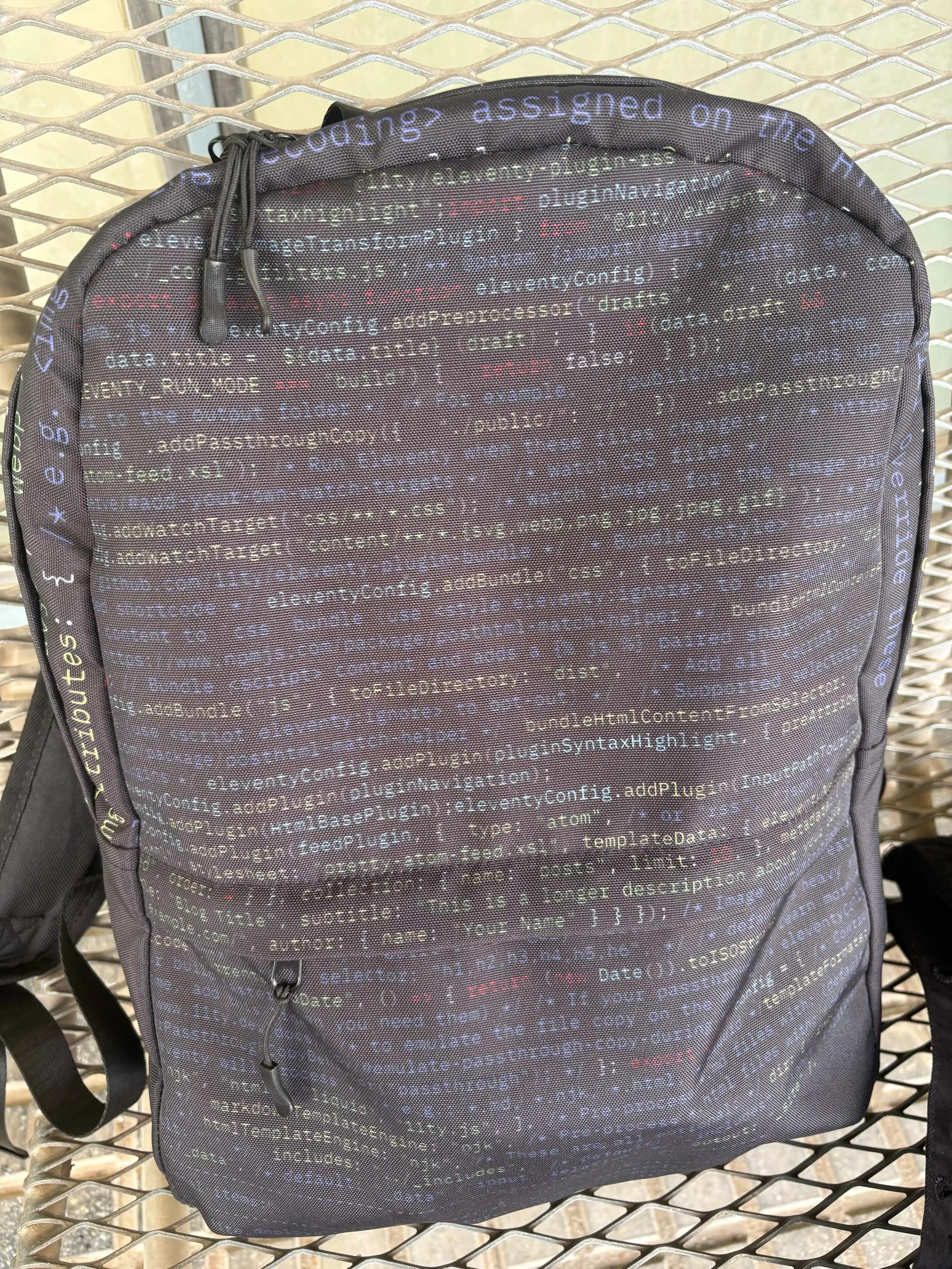
On a scale from zero to “I design my own backpack with its code in it”, how much do you like @11ty.dev?
Web Awesome Blazor Bindings: a community-maintained wrapper for C# devs.
Great work! 👏
@11ty/eleventy-plugin-rss@3.1.0
Generate an Atom, RSS, or JSON feed.
@11ty/posthtml-urls@2.0.0
PostHTML plugin for transforming URLs. A fork of posthtml/posthtml-urls.
More in the docs: https://webawesome.com/docs/components/otp-input
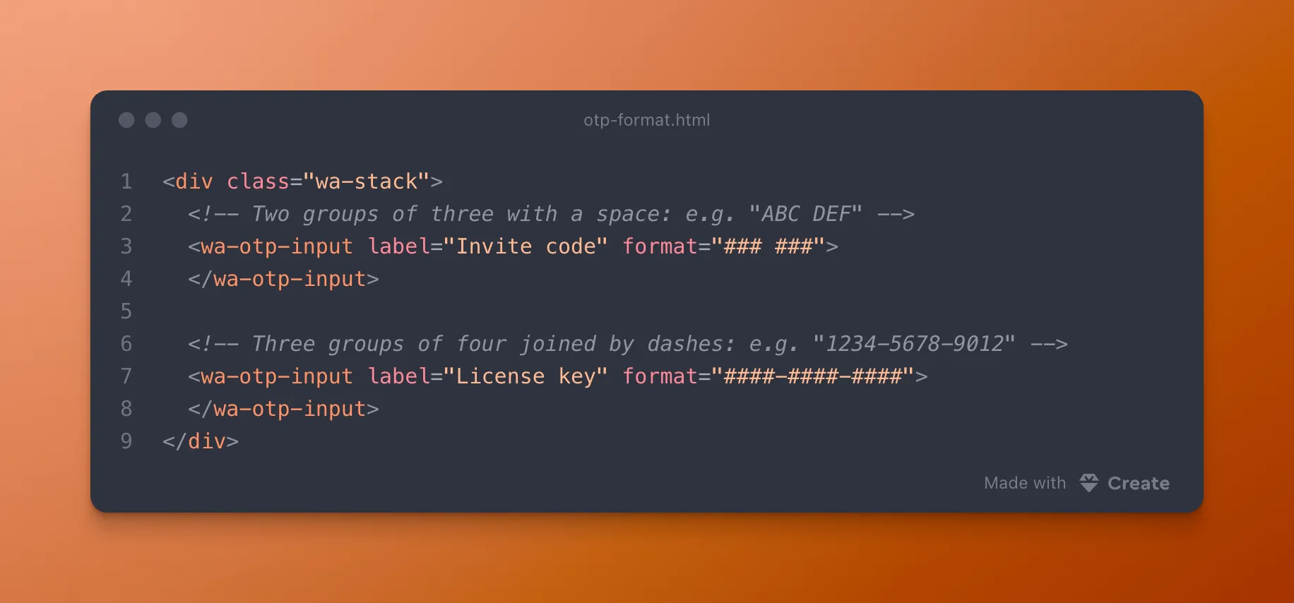
<wa-otp-input> can group passcode segments for you using the format attribute. Just add `#` to represent a character. Everything else is decoration.
@11ty/eleventy-dev-server@3.0.0-alpha.12
A minimal, modern, generic, hot-reloading local web server to help web developers.
More about random content over at blog.fontawesome.com/web-awesome-...
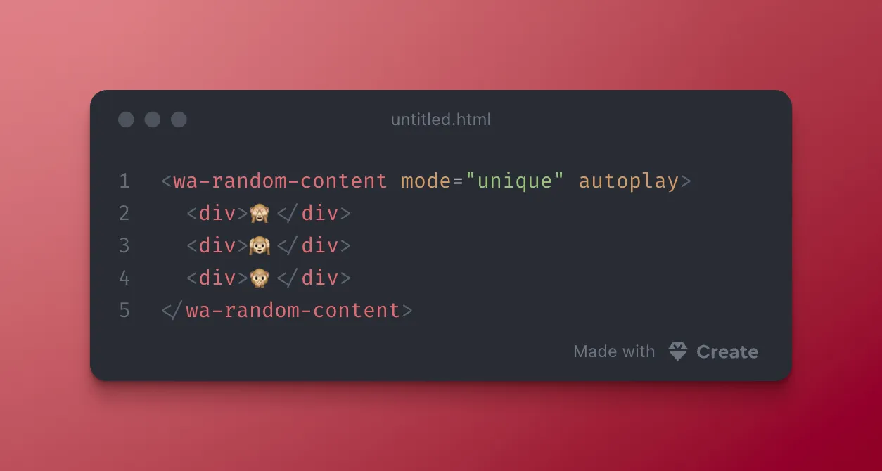
<wa-random-content> is stable as of 3.13!
Slot tips, call randomize(), or turn on autoplay. Set mode="unique" so you don’t get the same tip twice in a row. Works on static pages, too!
View the docs webawesome.com/docs/compone...
<wa-random-content> is stable as of 3.13!
Slot tips, call randomize(), or turn on autoplay. Set mode="unique" so you don’t get the same tip twice in a row. Works on static pages, too!
More info in the docs: webawesome.com/docs/compone...
<wa-combobox> can pull options from your server now!
Set a dataSource callback, get debounced fetch + loading/error/empty slots, and improve performance by not shipping thousands of options in your DOM.
More info in the docs: https://webawesome.com/docs/components/combobox
Here comes the hot stepper! 🪜 WA 3.14 is out.
The experimental <wa-stepper> breaks checkout and signup into stages. We also taught <wa-combobox> (Pro) to load from your server, rewrote our AI design skill, and fixed a stack of a11y bugs.
Web Awesome 3.14 is out! 🪜
🪜 <wa-stepper> (experimental) for breaking checkout, signup, and setup into clear stages
🔍 <wa-combobox> can load options from your server as the user types (Pro)
🤖 A rewritten webawesome-design skill with a DESIGN.md template
➖ <wa-divider> takes a label, like the "OR" between sign-in options
Aaand .... the Nintendo Power Glove was rushed to market in about five months, launched with a single compatible game, and only sold close to a million units thanks to the movie, "The Wizard" saying it was "so bad". BUT, the Power Glove is often cited as part of the path to the Wii Remote.
Dave Gandy's first Y Combinator interview, years before Font Awesome: no prep, and it went nowhere. His second, with Travis Chase: a session at the Mountain View Public Library with a childhood friend, working through Adobe Typekit comps. That one ended with a surprise second interview.
The Nintendo Power Glove had about 5 months to go from lab prototype to trending Xmas gifts for 1989. But the Power Glove got cheaper finger sensors to hit the deadline, and launched only one game built for it. Years later it's cited as part of the road to the Wii Remote. The long game is weird.
The word "Drupal" is derived from the English pronunciation of the Dutch word "druppel' which means "drop", and someone just _dropped_ Web Awesome into it with this helper. Nice work! 🫡
@awesome.me/webawesome@3.14.0
A forward-thinking library of web components.
More info in the docs: https://webawesome.com/docs/ai/agent-skills
Don't let your agent make guesses about your component library. Agent skills help them get it right the first time.
Web Awesome ships two:
- webawesome for using components
- webawesome-design for designing with WA
New Podcast Awesome: the Font Awesome CDN experiment that took four people three months and converted one person, and what it taught us about failing well. Plus a few exhibits from the real Museum of Failure.
🎧 Listen: https://www.podcastawesome.com/2092855/episodes/19845860-the-cdn-experiment-that-converted-one-person-and-what-it-taught-us-about-failing-well
📺 Watch: https://www.youtube.com/watch?v=DMGJAk2XXEg
Myth-bust from this episode: the famous "Colgate Beef Lasagna" image isn't real. Colgate did test frozen chicken and crabmeat entrees in 1964, though. Ew. So the truth is a toothpaste company selling frozen crab dinners, which isn't any better.
Get it here: https://webawesome.com/docs/components/otp-input/
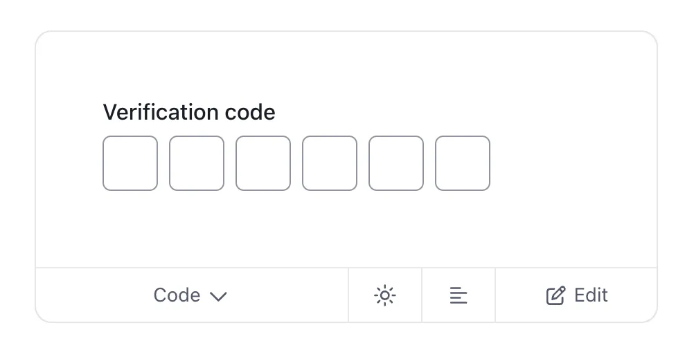
Six separate inputs for a verification code? Nah.
<wa-otp-input> acts as one form control and supports paste and constraint validation.
Web Awesome and done.
New Podcast Awesome episode is out: the Font Awesome CDN experiment that took four people three months and converted one person, and what it taught us about failing well. Plus a few exhibits from the real Museum of Failure.
Listen → https://www.podcastawesome.com/2092855/episodes/19845860-the-cdn-experiment-that-converted-one-person-and-what-it-taught-us-about-failing-well
Watch → https://www.youtube.com/watch?v=DMGJAk2XXEg
#Startups #Entrepreneurship #FontAwesome
Font Awesome CDN experiment that took four people three months & converted exactly one person. Plus "Fort Awesome," a product name that confused customers, and a tour of the real Museum of Failure.🏛️
Watch → www.youtube.com/watch?v=DMGJA...
Listen → www.podcastawesome.com/209285...
https://loveandpickpockets.com/ is #BuiltAwesome by Gary Beason 🏆
The CDN Experiment That Converted One Person (and What It Taught Us About Failing Well)
Would you take a shot at something you cared about if your odds of success were 1.4%? Font Awesome founders Dave Gandy and Travis Chase did exactly that when they applied to Y Combinator back in 2014. And in the years since, Font Awesome has racked up plenty of failures right alongside the wins. 'Cos that's just what happens when you're building something awesome.
In this episode, we go digging through Font Awesome's own flops (a product name that confused customers, a CDN experiment that converted exactly ONE person in three months) and line them up next to the real-life Museum of Failure. Which is hilariously an actual museum, started in Sweden in 2017, dedicated entirely to products that didn't make it. Expect Colgate's short-lived frozen dinners, a cologne no biker asked for, and the Nintendo Power Glove.
We also go back to a 2023 conversation with Dave Gandy about flunking out of MIT (twice), what it means to have the freedom to fail, and how a completely unprepped first Y Combinator interview turned into a second shot years later. And the second shot at YC was built on meticulous prep, a childhood friend's help at the Mountain View Public Library, and an unexpected connection with a YC partner.
The through-line: none of this looks like a success story on its own. But it's basically the only way Font Awesome got built.
What We Cover
- Font Awesome's own quarterly product failures: Fort Awesome and the Font Awesome CDN
- How a "failed" CDN experiment quietly built the email list that powered a record-breaking Kickstarter
- Dave Gandy on flunking out of MIT, twice
- A tour through the real-life Museum of Failure: Colgate Kitchen (and the lasagna that probably never existed), Harley-Davidson Cologne, and the Nintendo Power Glove
- Dave's first Y Combinator interview (zero prep) versus his second (a lot of prep, a library, and some serious spreadsheet work)
- Why humility, not confidence, is the trait Font Awesome hires for
Timestamps
- 00:00 — Would you take a 1.4% shot? Font Awesome's Y Combinator odds
- 00:03 — A quick tease: meet "Fort Awesome"
- 00:03 — Clip: Dave Gandy on startups, believing the lie, and finding your real limits
- 00:04 — The Fort Awesome experiment — and the name confusion that helped sink it
- 00:04 — Font Awesome CDN: a full quarter of work for one signup
- 00:05 — The quiet payoff: how that "failed" CDN built the email list behind the Kickstarter
- 00:06 — Dave on flunking out of MIT — twice
- 00:07 — Inside the Museum of Failure: Colgate Kitchen (and the lasagna that almost certainly never existed)
- 00:09 — Harley-Davidson Cologne: bikers said no thanks
- 00:10 — The Nintendo Power Glove — so bad it inspired a movie line, and still helped shape the Wii Remote
- 00:13 — Dave's first Y Combinator interview: no plan, no prep
- 00:13 — Round two: Ryan, the Mountain View Public Library, and the Adobe Typekit comps
- 00:15 — The Kevin Hale interview and finally clicking
- 00:17 — The real lesson: humility over hype
- 00:19 — Go make something awesome
Credits
- Produced, hosted, and edited by Matt Johnson
- Featuring Dave Gandy and Travis Chase
- Theme song by Ronnie Martin
- Music interstitials by Zach Malm
- Video editing by Isaac Chase
Links
- Font Awesome: https://fontawesome.com
- Podcast Awesome: https://www.podcastawesome.com
- When Failure Isn't Failure: Hard Lessons in Business and Life with Dave Gandy — Podcast Awesome (June 2023)
Museum of Failure
- Museum of Failure — official site
- Colgate Kitchen Entrees — exhibit page
- Harley-Davidson Perfume — exhibit page
- Nintendo Power Glove — exhibit page
- Museum of Failure — Wikipedia (background, Samuel West, tour history)
The "Colgate Lasagna" myth
- Ripley's Believe It or Not: The Truth Behind the "Failure" of Colgate Beef Lasagna
- Food Republic: Did Colgate Really Sell Frozen Lasagna in the '60s?
Y Combinator
Adobe Typekit / Adobe Fonts
Power Glove background
#FontAwesome #PodcastAwesome #FailureIsData #StartupLessons #YCombinator #DesignAndDev #WebDesign #BuildInPublic
Stay up to date on all the Font Awesomeness!
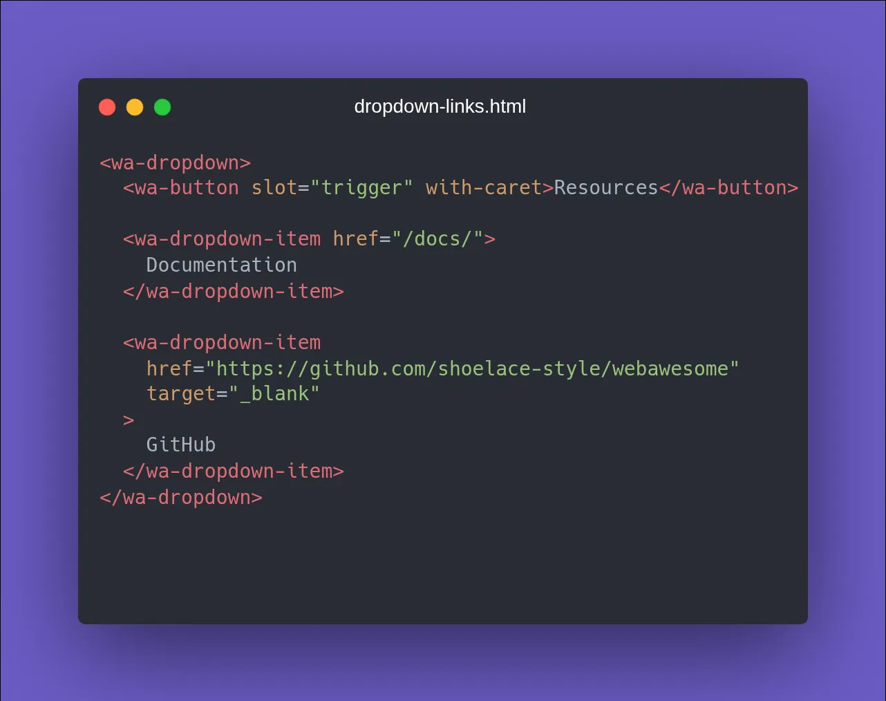
<wa-dropdown-item href="..."> works as of v3.12
Click it and it navigates like a link. A lot of folks asked for this one. Happy to deliver 🫡
Random Content, On Purpose
Use Web Awesome's Random Content component to add some random content (in the right places) to your UI. Here are 10 places to start! https://blog.fontawesome.com/web-awesome-random-content/
🚀 Web Awesome 3.13.0 shipped last week!
🏷️ New <wa-tag-input> for keywords, emails, labels, etc.
🎓 Also graduation day: accordion, OTP, pagination, known date, time input, and friends are now STABLE.
Bring Icons, Kits, and More Into Figma | Using Font Awesome with Figma
Ready to bring some Font Awesome goodness into your Figma designs?
In this screencast, we’ll show you how to use the official Font Awesome Figma Plugin to search for icons, add them directly to your designs, and customize them to fit your workflow.
Whether you’re using Free icons, Pro icons, or custom icons from your Kits, we’ll walk through getting the plugin set up and putting it to work.
🗒️ What We Cover
🔌 How to install the official Font Awesome Figma Plugin
🔑 Connect the plugin with your Font Awesome account using an API token
🔎 Search Font Awesome icons by Family and Style
✨ Add icons directly to your Figma designs as SVGs
📏 Choose an icon size before adding it to your design
🖼️ Adjust the padding and frame around your icons
🎨 Customize your icons just like other vector elements in Figma
🧰 How Pro users can search and add custom icons from their Font Awesome Kits
⏱️ Timestamps
00:00 – Intro
00:14 – Adding the Official Font Awesome Plugin to Figma
00:42 – Create a new Font Awesome API token
01:23 – Specifications when choosing your icon
01:42 – Uploading custom icons into Figma with the official plugin
02:02 – Using a Kit subset with the official plugin
02:20 – Outro: Go make something awesome
🔗 Links & Resources
📘 Check out the docs: [https://docs.fontawesome.com/desktop/add-icons/figma-plugin]
🎨 Get the official Font Awesome Figma Plugin: [https://www.figma.com/community/plugin/1207989878497331498/font-awesome-icons-official]
Now go make something awesome.
@11ty/eleventy-plugin-bundle@4.0.3
Little bundles of code, little bundles of joy.
Most devs have had to build a star rating component from scratch at least once.
Web Awesome ships it as one tag:
<wa-rating>
Half-stars, custom icons, accessible out of the box. Try it here:
https://codepen.io/editor/team/webawesome/pen/01a08cc3-720b-7cce-b267-a78562b64929
@11ty/font-awesome@2.0.0
Optimized per-page tree-shaken SVG spritesheets for Eleventy.
Web Awesome 3.13 is out! 🏷️
What's new:
🏷️ <wa-tag-input> (experimental) for collecting keywords, email addresses, or labels as removable tags
📊 A handful of <wa-data-grid> fixes for formatter clicks, flex columns, date filters, and icons
🎓 11 components promoted to stable, including accordion, pagination, date picker, and video
♿ Tab now reaches every <wa-accordion> header
Full changelog: https://webawesome.com/docs/resources/changelog
Tag, you're it! 🏷️ Web Awesome 3.13 is out.
The new experimental <wa-tag-input> turns keywords, emails, and labels into tidy, removable tags. We also fixed up the data grid and promoted 11 components to stable.
@awesome.me/webawesome@3.13.0
A forward-thinking library of web components.
@fortawesome/ember-fontawesome@3.1.1
Official Ember component for Font Awesome
Plan Add-ons
Add Kits, custom icons, pageviews, bandwidth, or seats to your plan without changing plans.
Need a little more room without moving to a bigger plan? Head to the Add-ons page. Every change lands in one order summary with one checkout, and you can scale an add-on back at renewal. You'll also see the option right when you hit a limit.
✨ Duotone just joined the Icon Wizard.
Now you can mix, match, stack, and blend Duotone icons with other icons, modifiers, and shapes to conjure up custom creations.
The Wizard has leveled up. 🪄
Good News: Your AI Assistant Already Knows Your Icon Kit
https://www.youtube.com/watch?v=53kc2QjGxnY is a great video from @vkc@linuxmom.net about creating a Podcasting Platform using static websites and the magical powers of 🪄 RSS!
Did you know that Norm Cox designed the original 3-line icon at Xerox PARC in 1981? He didn't find out it was nicknamed "hamburger" until a reporter called him in 2013 more than 30 years later. Ahmazing.
The guy who invented it, Norm Cox, didn't even know it was called a "hamburger icon" until someone called to interview him about it in 2013. He'd been sitting on one of the most-used UI symbols in the world without even knowing its nickname. 🤣
Your AI assistant knows your code. Now it can know your icons, too. 🤖
Meet Font Awesome Agent Tools: authenticated, Kit-aware tools that help your coding agent find and use the icons you actually have access to.
Read all about it on the blog → https://blog.fontawesome.com/font-awesome-ai-agent-tools/
The hamburger menu icon started in 1981 as a Xerox screen-space hack. It disappeared for 20 years, came back on the first iPhone, got torn to shreds by UX researchers, and won anyway. The new Podcast Awesome episode is on how and why our own menu icon is an actual burger. 🍔
Watch → https://youtu.be/rkZ6ZfxWVIU?si=IccGgiy9KaIdC79a
Listen → https://www.podcastawesome.com/2092855/episodes/19714222
The hamburger menu started as a 1981 Xerox screen-space hack. Users didn't get it. Years later, researchers said it was bad UX. It won anyway. So with true FA-flair, we made ours an actual burger. 🍔
Watch → youtu.be/rkZ6ZfxWVIU?si=IccGg...
Listen → www.podcastawesome.com/209285...
The Sandwich That Broke UX Rules and Won
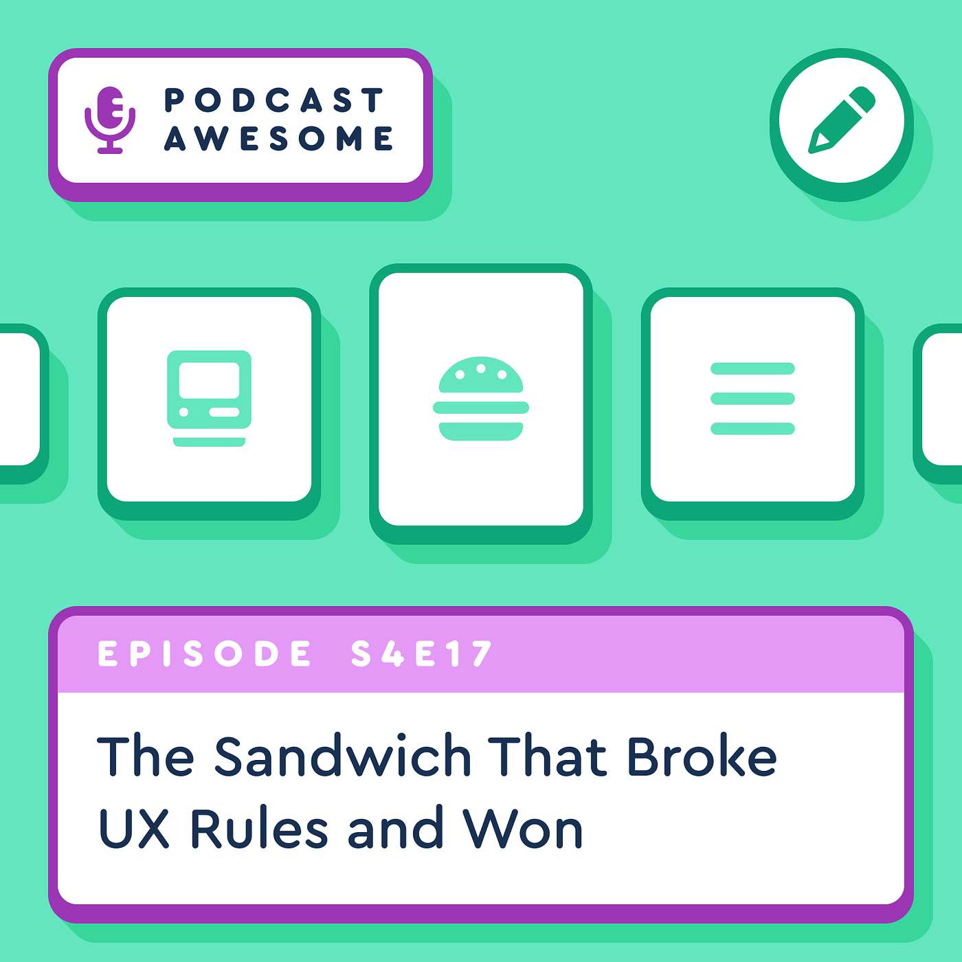
Pretty much every website has one, you know, those three little lines, usually tucked in a corner, hiding a whole menu behind them. It's become what's known as the hamburger icon. And if you've ever visited fontawesome.com, you may have noticed ours isn't three lines. It's an actual burger, sesame seed bun and all.
On this episode of Podcast Awesome, we trace the icon back to a 1981 Xerox Star screen-space problem, through a 20-year disappearance, a comeback on the first iPhone, and a decade of top UX researchers telling designers to knock it off. And you could probably have guessed it, but the sandwich won anyway. Then we get to why Font Awesome designer Brian Talbot looked at the safe, conventional three-line icon, asked "where's the beef?!" and used the FA-burger icon in the most delicious way possible.
What We Cover
- How a 1981 screen-space problem at Xerox PARC turned into three stacked lines
- Norm Cox, the designer behind the original icon, and how he didn't even know it was called "hamburger" until a reporter called him decades later
- The icon's 20-year disappearance and its comeback on the first iPhone
- The Nielsen Norman Group research showing how hidden menus cut discoverability almost in half
- Why the same research group came back a decade later and declared the icon a win anyway
- Why Font Awesome's own menu icon isn't three lines but an illustrated burger, courtesy of Brian Talbot
Timestamps 00:00 – A burger on our own website
00:01 – Welcome to Podcast Awesome 00:02 – Norm Cox and the Xerox Star 00:03 – "Road sign simple": Cox's design philosophy
00:04 – The hamburger menu resurfaces on the first iPhone
00:05 – Apple, Google, and a name nobody planned
00:06 – The UX community picks a fight
00:07 – Nielsen Norman Group's discoverability research
00:08 – "Like a cheap fast food chain..."
00:09 – A decade later: the hamburger icon wins anyway
00:10 – Norm Cox on symbols that improve with time
00:11 – Font Awesome's actual burger icon, courtesy of Brian Talbot
00:13 – Wrap-up and credits
Links
- Get the burger icon:
- Act 1 — The Origin
- A Conversation with Norm Cox, Creator of the Hamburger Menu — Tri Vo, Mic Product Blog
- Act 3 — The Controversy
- Hamburger Menus and Hidden Navigation Hurt UX Metrics — Nielsen Norman Group
- Hamburger Menu and UX Design — UXPin
- Act 4 — The Verdict
- Hamburger Menu Icon Recognizability — Nielsen Norman Group, 2026
- Background / Research Reading
- The History of the Hamburger Icon — Eternity Marketing
Credits
- Hosted, produced, and edited by Matt Johnson
- Theme song by Ronnie Martin
- Music interstitials by Zach Malm
- Video editing by Isaac Chase
Stay up to date on all the Font Awesomeness!
Web Awesome styles your words, not just your components. Wrap your blog post, docs, or changelog in one class & every heading, list, blockquote, & code block lands on your theme's scale. A 3xs–5xl type scale handles the rest, + CSS @Scope stops leaks. https://blog.fontawesome.com/web-awesome-docs-prose/
Icon Wizard Duotone
The Icon Wizard now makes duotone icons, with multi-layer select and undo history.
The Icon Wizard just learned a second color, and picked up a few other tricks along the way.
- Duotone icons. Split your creation into two tones and watch it render like every other Duotone icon in the library.
- Multi-layer select. Grab several layers at once and move or duplicate them together, instead of one at a time.
- Better controls. Type an exact value and send any control back to its default with a single click.
- Nudge UI. New arrows around the canvas shift the selected layer without reaching for the keyboard.
- Undo history. Wandered down the wrong path? Step back through your changes until it looks right again.
Biggest performance gain on the Built Awesome Leaderboards this week goes to Bryon Tjanaka: improved 23 Lighthouse points with a ~3s improvement in LCP!
https://www.gildaconarne.de/ is #BuiltAwesome (using @webawesome.com and @fontawesome.com too!) by Stefan Frede
Your Design System Should Style Your Words, Too
Icon Search Redesign
Icon search is rebuilt with a pack rail, a tighter grid with hover actions, and search that understands plain-language descriptions.
Icon search has been rebuilt around the thing you actually came for: finding the right icon, fast.
- A rail down the side gives every pack its own place, so you can jump straight to Classic, Sharp, Duotone, or any of the Pro+ packs and see that pack on its own. Styles sit right above the results, one click away.
- The grid is tighter and quicker to scan, with bigger icons, less space between them, and the actions you want on a cell (copy the markup, grab the SVG, drop it in a Kit) right there when you hover.
- Filtered yourself into a corner? If your icon lives in a different pack, a different plan, or another category, you'll see it in its own section under the results, with a one-click way to go there.
- When nothing matches at all, you get four ways forward instead of a dead end.
- Search now reads for meaning, not just wording, so describing what you need in plain language can turn up icons that never use your exact words.
websites deserve weekends
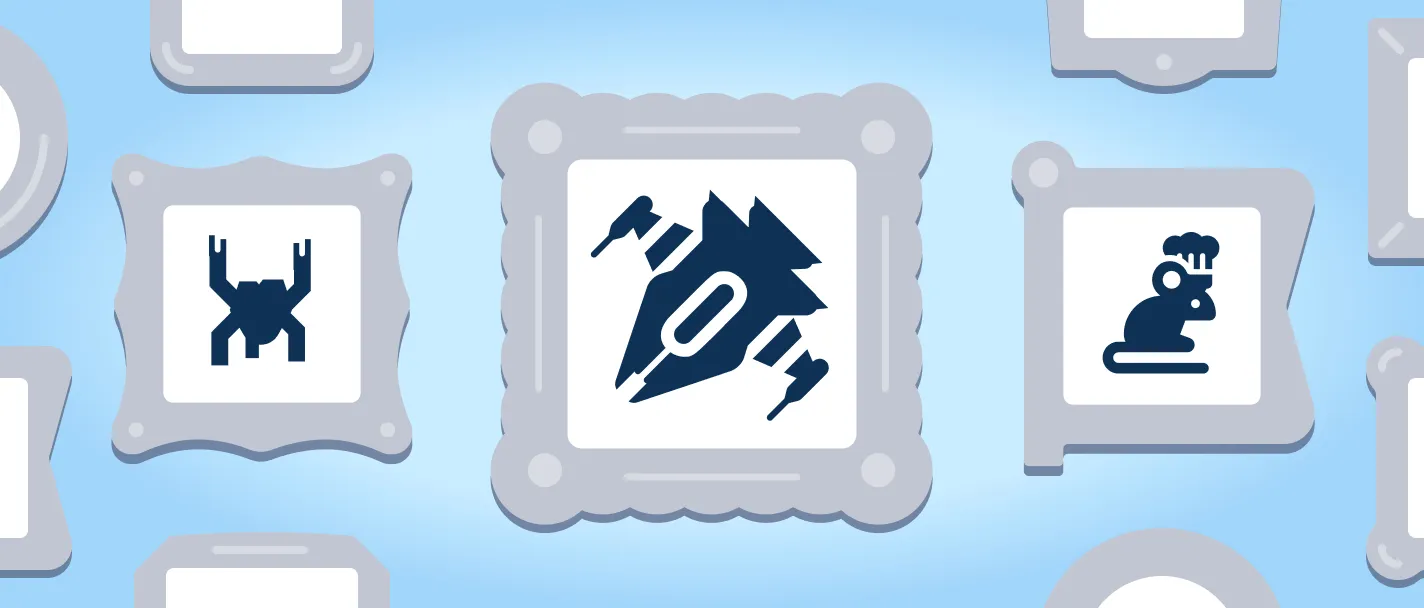
The Icon Wizard Contest runs through September 7. Build something weird, clever, or fun, and submit it to the gallery, and it might get featured. There's already a Starry Night icon and a centaur in there!
Get to building → https://fontawesome.com/icons/wizard
In this post @snook.ca describes a method to create exclusive RSS-only content: https://snook.ca/everything/secret-rss-posts/
@mattdsteele.carhenge.club.ap.brid.gy is trying out @davatron5000.bsky.social’s new MicroLighter Syntax Highlighting plugin (using CSS Custom Highlights) and shows how you can do the same on your Build Awesome/Eleventy project:
@11ty/find-generator@2.0.0
Find the <meta name='generator'> value from a web site URL.
Icon Wizard is in beta and the team wants feedback: feedback@fontawesome.com. There's also a contest running through September 7 if you want to build something and get it into the public gallery.
The Icon Wizard Contest runs through September 7. Build something weird, clever, or fun, and submit it to the gallery, and it might get featured. There's already a Starry Night icon and a centaur in there!
Icons look like the small stuff in a design system. They're not. They communicate faster than words and become some of the most recognizable parts of your brand. (We might be a little biased.) Part IV, live now: blog.fontawesome.com/art-of-i...
Kit Package Rebuilds
Rebuild a Kit's package yourself from its Package view, instead of asking Support.
If your Kit's package looks stale or broken, rebuild it yourself from the Kit's Package view. It's the digital equivalent of turning it off and on again, and you no longer need to ask us to do it for you. Find it in your Kits.
Testing out some new OpenGraph images: https://build.awesome.me/
Icon Wizard is in beta and the team wants feedback: feedback@fontawesome.com. There's also a contest running through September 7 if you want to build something and get it into the public gallery.
Reminder: the Icon Wizard Contest closes September 7. Build something with the Wizard, submit it to the gallery, and it might end up featured. Gallery entries need a paid plan, but anyone can go play with the tool.
fontawesome.com/icons/gallery
All the ways to follow along to Build Awesome news and updates: https://build.awesome.me/how-to-follow/
The Art of Iconography and How to Future-Proof Your Design System [Part IV]
The whole project traces back to an internal idea called F.A.R.Ts (Font Awesome Reusable Tidbits and Shapes) all within the context of "Snuggles": dedicated, in-person time for proof-of-concept work. Both versions of the Icon Wizard started there.
Watch → https://youtu.be/xbjXi0eXXFA?si=PAr-5PQI0Bv1kiS1
Listen → https://www.buzzsprout.com/2092855/episodes/19660934
Fun bit: the OG Icon Wizard almost got named F.A.R.Ts (Font Awesome Reusable Tidbits and Shapes). Version 2 almost became the "Icon Genie." They landed on Wizard. Mike says he's only 2/10 disappointed about it
Watch → youtu.be/xbjXi0eXXFA?si=PAr-5...
Listen → www.buzzsprout.com/2092855/ep...
Icon Wizard 2.0 is out and it's a real upgrade: mix icon styles, layer up to 20 elements, build your own custom characters, and (new) run Power Transforms in web fonts, not just SVG. New Podcast Awesome episode has the whole story.
Watch → https://youtu.be/xbjXi0eXXFA?si=-V4VKN7xqvPA-qj8
Listen → https://www.buzzsprout.com/2092855/episodes/19660934
Icon Wizard 2.0: Build Any Icon You Can Imagine
Font Awesome's Icon Wizard just got a serious upgrade, and it's now powerful enough to make genuinely great icons (or, per Mike's own admission, genuinely terrible ones, if that's more your speed).
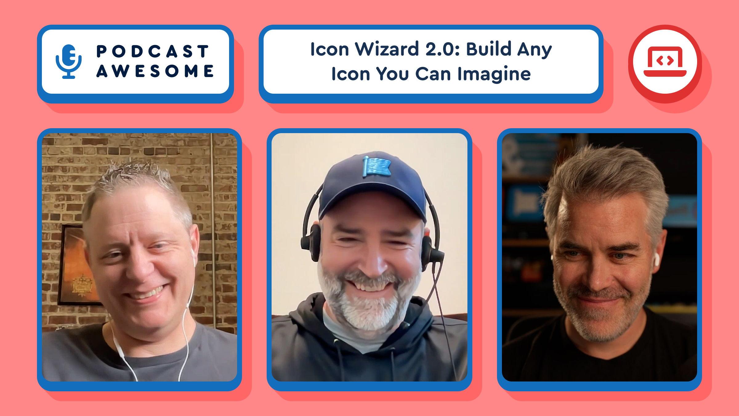
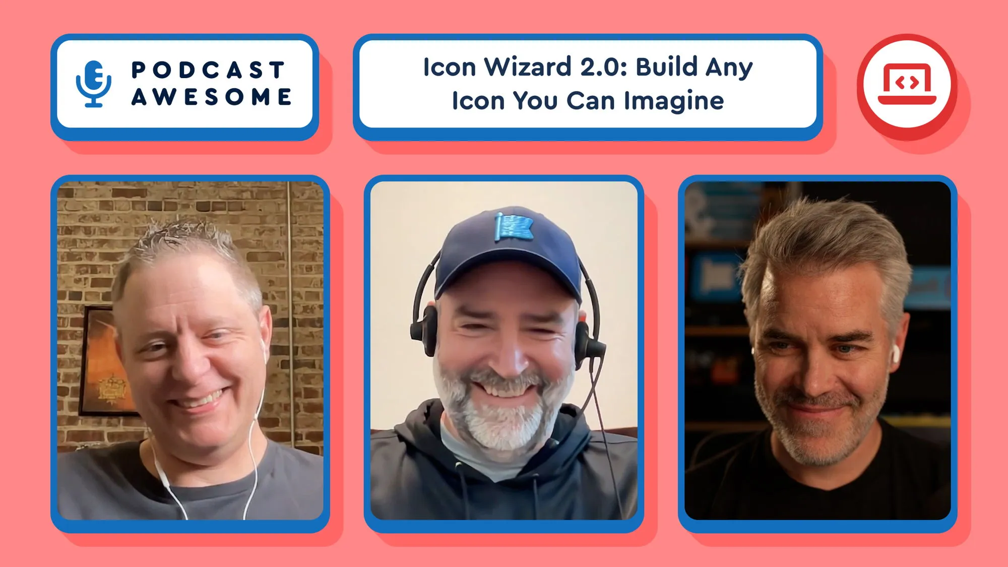
In this episode of Podcast Awesome, host Matt Johnson sits down with Mike, Ed, and Jory (a rare full-team appearance) to talk about the launch of Icon Wizard 2.0. But it's not just a new coat of paint. You can now mix and match icons across styles, layer up to 20 elements at once with full control over size and position, build custom "user" characters by blending heads and bodies, and for the first time run Power Transforms in web fonts, not just SVG.
The crew traces the whole story: how the original Wizard grew out of an internal project once nicknamed F.A.R.Ts (Font Awesome Reusable Tidbits and Shapes, obviously), why this version was almost called the "Icon Genie," and how a customer's offhand feature request turned into a real, shippable icon built live in the tool.
There's also a real-time demo (a thumbs-up icon that grows a seedling), a debate over the correct number of poop-icon swirls, and a very serious 1-to-10 disappointment scale about the road not taken with "Icon F.A.R.Ts." The team is also running an Icon Wizard Contest through September 7, so if you want your creation featured in the gallery, this is your excuse to go play.
**
What We Cover**
- What's actually new in Icon Wizard 2.0: mixing icon styles, layering up to 20 elements, add/subtract/stroke operations, and letters and numbers you can punch out of badges
- How Power Transforms — previously an SVG-only capability — now work in web fonts too, and the auto-generated cutouts that made it possible
- The origin story: F.A.R.Ts, the original modifier-only Wizard, and "Snuggles," the team's space for proof-of-concept projects
- Why the team loosened creative control in version 2, and what that trade-off means for good icons (and bad ones)
- Real community creations from the gallery, including a Starry Night icon, a centaur, a potted cactus, and a live green-thumb demo
- The near-miss name "Icon Genie" and how the team landed back on "Wizard"
- How to enter the Icon Wizard Contest (running through September 7) and where to send feedback during the beta
**
Timestamps**
00:00 — Cold open: bad icons, good icons, and Jory's grim optimism
00:01 — Welcome to the show and episode overview
00:02 — The Icon Wizard Contest, explained
00:04 — Community favorites: Starry Night, the user blender, and more
00:05 — Where this all started: FARTs and the original pitch
00:07 — "Snuggles," the team's space for proof-of-concept projects
00:08 — The real origin story: bringing Power Transforms to web fonts
00:10 — What "gooder" actually means in Icon Wizard 2.0
00:12 — Ed breaks down what's new: mixing styles, 20 layers, and more 00:14 — The real pain point Icon Wizard solves
00:17 — Why the Starry Night icon is a different kind of creation
00:18 — It's basically a full design tool now
00:20 — A customer feature request, solved live with the Wizard 00:21 — How v2 actually started: automating the cutouts
00:23 — Live demo: building a green thumb icon in real time
00:26 — Wizard walkthrough: the four tabs (icons, modifiers, elements, user) 00:28 — Add, subtract, stroke: how the Boolean operations work
00:31 — Where to send feedback, and how the gallery and sharing work
00:33 — Speed round: favorite modifiers
00:34 — The secret difference between the poop icon and the poop modifier 00:35 — The "Icon FARTs" disappointment scale
00:37 — Almost-names: Icon Genie, Icon Deity, and (sadly, no) Icon Gandalf
00:40 — Icon Wizard earns its spot in the main nav
00:41 — Wrap-up and Mike's sign-off
**
Credits**
- Hosted by Matt Johnson
- Featuring Mike, Ed, and Jory
- Produced and edited by Matt Johnson
- Theme song by Ronnie Martin
- Music interstitials by Zach Malm
- Video editing by Isaac Chase
**
Links**
- Icon Wizard:
- Icon Wizard gallery and contest
- Feedback: feedback@fontawesome.com
- Font Awesome: https://fontawesome.com
Stay up to date on all the Font Awesomeness!
New around here: we're spotlighting a few things that Web Awesome does that you might've missed. First up, QR codes in one tag: <wa-qr-code value="..."></wa-qr-code>. Try it live 👇 https://codepen.io/editor/team/webawesome/pen/019ffca1-bd82-7c52-a88a-d090696114d5
WA 3.12: Figma Design Kit 3.0, Dropdown Links, Plus Tooltip Fixes
WA 3.12 is a small but mighty release:
🎨 New components, variables, and slots added to the Figma Kit.
🔗 <wa-dropdown-item> navigation
🧰 Fixes and improvements
See it all: https://webawesome.com/docs/resources/changelog#wa_3120
Another week, another batch of ridiculously clever Icon Wizard creations.
From useful to hilarious to "how did they even think of that?"—the gallery keeps getting better. Submit yours for a chance to win a free year of Font Awesome Pro!
Check out the gallery → fontawesome.com/icons/gallery
@awesome.me/webawesome@3.12.0
A forward-thinking library of web components.
https://sensorsandsensibility.com/ is #BuiltAwesome by Francis Berriman and @infrequently.org 🏆
Proposal: should we add a new `parseDateString` universal filter?
https://github.com/11ty/buildawesome/issues/4346
Feedback welcome!