In reply to Bluesky post
🌟 Add user feedback to your app with ease!
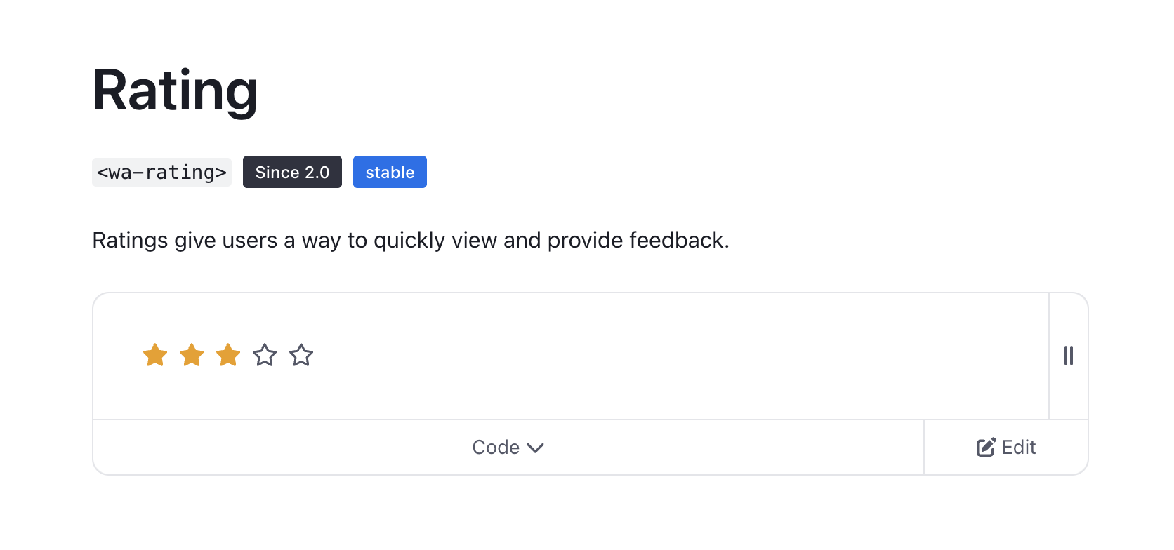
The <wa-rating> component lets you customize ratings with labels, precision, sizing, custom icons, and more.
Check out the docs and make your UI shine! 📊✨
Link: https://webawesome.com/docs/components/rating/
Friendly reminder that Web Awesome is — and always will be — free and open source 👑
Hello, Fediverse! 👋
Clippy Cult: The Paperclip That Wouldn’t Quit
Inside the UX lessons, internet lore, and surprising comeback of Clippy
Love him or loathe him, you remember him. Clippy — the googly-eyed paperclip that lived inside Microsoft Word — has become a permanent fixture in internet culture. But how did a productivity tool become the patron saint of annoying-yet-adorable UI? In this episode of Podcast Awesome, we’re digging into the cult of Clippy with behind-the-scenes insights from Clippy's original creator Kevan Atteberry and Microsoft designer Sam Cundall. From meme fame to Microsoft Teams emoji, Clippy's legacy is more layered than you think.
📝 What We Cover in This Episode:
- 📎 Why Clippy was loved and hated
- 🧠 The psychology of nostalgic design
- 🔁 When Microsoft secretly brought Clippy back
- 🤖 What Clippy might teach us about the future of AI assistants
- ✍️ thoughts on reviving legacy designs the right way
⏱️ Timestamps:
00:00 – Welcome to the Cult of Clippy
02:00 – The origin story: from helpful to hated
04:30 – Nostalgia and annoyance: why we love to hate him
06:00 – Microsoft’s secret Clippy emoji comeback
08:00 – What makes emoji design "work"?
10:00 – Fun at work: why weirdness builds culture
14:00 – The creator's take: Kevan Atteberry on designing Clippy
20:00 – From embarrassment to pride: Clippy's redemption arc
24:00 – Clippy vs. Siri: The rise of personality-driven UI
26:00 – Final thoughts: where personality fits in UX
🔗 Links & Resources:
- Sam Kundal on LinkedIn
- Kevan Atteberry's books
- How to add a paperclip emoji to your UI
- Vote a favorite icon up the leaderboard
- 🎥 Podcast Awesome on YouTube
🎶 The Font Awesome Theme Song – Composed by Ronnie Martin
🎸 Music Interstitials by Zach Malm
🎬 Produced and edited by Matt Johnson with some extra help from Isaac Chase
Stay up to date on all the Font Awesomeness!
Missed it last week?
Burton Smith joined Podcast Awesome to share how he’s building a smoother dev experience for Web Components.
📦 Tooling
📚 Docs
💡 Ideas
🎧 Replay it → www.buzzsprout.com/2092855/epis...
#WebComponents #PodcastAwesome #DXMatters
“The better the DX, the more people stick around.”
— Burton Smith
If you’ve ever wrestled with Web Components and wished they worked like framework components…
This one’s for you.
🎥 Watch here → youtu.be/o6ygtiP31ws?...
🎧 Listen here → www.buzzsprout.com/2092855/epis...
#WebComponents
Did you know? An Eleventy icon is now available (for free!) in Font Awesome v7: https://fontawesome.com/icons/eleventy
Use it today with the newly released stable v1.0.0 of the Font Awesome Eleventy plugin: https://github.com/11ty/eleventy-plugin-font-awesome/releases/tag/v1.0.0
@11ty/font-awesome@1.0.0
Optimized per-page tree-shaken SVG spritesheets for Eleventy.
🔥 Developer take:
Declarative Shadow DOM isn’t the final solution.
Burton Smith shares why Declarative Custom Elements might be the future.
🎧 Full convo → youtu.be/o6ygtiP31ws?feature=...
#PodcastAwesome #WebComponents #DeclarativeDesign
🎙️ Rage Coding, Headless Web Components, and the Future of DX with Burton Smith
Have you ever rage-coded your way into building a developer tool that actually fixes things? Burton Smith has. And we’re here for it.
In this episode of Podcast Awesome, Matt and Web Awesome's boss, Cory Laviska chat with Burton Smith. Burton is an open source wizard and creator of the Web Components Toolkit, and he tells us about the gap between the promise of Web Components and the messy reality devs often face.
💻 Burton’s toolkit bridges that gap like Gandalf on a DX bender.
In this episode we dive into:
⚙️ Developer experience pain points
🧩 Custom Elements Manifests (CEMs) and real-world tooling
🎯 Form-associated custom elements, declarative shadow DOM, and why they still have rough edges
🚀 Why frameworks finally (mostly) play nice with Web Components
📦 How open source tools can fix the stuff we all silently suffer through
🧠 And why making components “just work” should be table stakes
This one’s for devs who are tired of wiring up wrappers, fighting with VS Code autocomplete, or wondering why their component still doesn’t show up right in Storybook.
✨ Bonus: We get a little spicy about SSR, headless UI, and whether a global design system is even a thing we want.
⏱️ Timestamps
00:00 – Welcome to Podcast Awesome
02:00 – Meet Burton Smith: The Stuff Breaker
04:00 – Why Web Components Tooling is (Still) a Pain
06:00 – Closing the Gap Between DX and Dev Reality
12:00 – CEMs, ASTs, and Metadata Magic
20:00 – Form-associated Custom Elements (and the Weird Gaps)
24:00 – Declarative Shadow DOM: Blessing or Band-Aid?
28:00 – SSR, Frameworks, and the Next Frontier
34:00 – Global Design Systems, Gatekeeping, and Interop
42:00 – Headless UI vs. Useless DX
44:00 – How to Support Burton + Where to Find the Toolkit
🔗 Links & Resources
🌐 Burton’s Toolkit: https://wc-toolkit.com
🧙♂️ Follow Burton on GitHub: https://github.com/Breakstuff
🐦 Burton on Social: @StuffBreaker
📄 Learn more about Custom Elements Manifest: https://github.com/webcomponents/custom-elements-manifest
🛠️ Web Awesome: https://webawesome.dev
🧡 Shoutout to all you open sourcers building magic after hours
🎶 The Font Awesome Theme Song – Composed by Ronnie Martin
🎸 Music Interstitials by Zach Malm
🎬 Produced and edited by Matt Johnson with some extra help from Isaac Chase
Stay up to date on all the Font Awesomeness!
🧙 Web Components need better tools.
Burton Smith built them.
🎧 Full ep → youtu.be/o6ygtiP31ws?...
#ToolingFixes #DXLove #PodcastAwesome
🎧 New Podcast Awesome episode!
What do you get when you mix:
🛠️ An open source wizard
💡 A pile of DX friction
🤯 And a dream of seamless Web Components?
You get Burton Smith’s Web Components Toolkit.
▶️ youtu.be/o6ygtiP31ws?...
#WebComponents #DXMatters #PodcastAwesome
Make sure you subscribe to https://socket.dev/blog/category/security-news to see the latest in JS supply chain security (we’ll update you if any reports affect Eleventy!)
Some good practices to help mitigate in your projects:
1. Use `npm install --ignore-scripts` (or use pnpm)
2. Use `npm ci` and a package-lock.json on your build server
Update: bsky.app/profile/weba...
Web Awesome 3.0.0-beta.6 has just been published to npm.
This version is safe to use, as it pins the affected dependency to the last safe version. You can update to 3.0.0-beta.6 by running the following command:
npm i @awesome.me/webawesome@3.0.0-beta.6
Web Awesome 3.0.0-beta.6 has just been published to npm.
This version is safe to use, as it pins the affected dependency to the last safe version. You can update to 3.0.0-beta.6 by running the following command:
npm i @awesome.me/webawesome@3.0.0-beta.6
⚠️ SECURITY ALERT: An npm dependency used by Web Awesome was compromised a few hours ago.
This ONLY affects npm installs — CDN users are safe.
DO NOT install Web Awesome via npm right now. New unaffected version is publishing now…
🚨 Malicious update to @ctrl/tinycolor on npm is part of an active supply chain attack hitting 40+ packages across multiple maintainers. Audit & remove affected versions.
Our analysis of the malware: socket.dev/blog/tinycol... #NodeJS #JavaScript
Details on the affected dependency can be found here: t.co/pvhIvAA7N1
⚠️ SECURITY ALERT: An npm dependency used by Web Awesome was compromised a few hours ago.
This ONLY affects npm installs — CDN users are safe.
DO NOT install Web Awesome via npm right now. New unaffected version is publishing now…
@awesome.me/webawesome@3.0.0-beta.6
A forward-thinking library of web components.
well that ended up unanimous, thanks for voting y’all
Eleventy v4.0 Proposal: remove the data deep merge opt-out feature originally introduced to ease a breaking change for folks upgrading to Eleventy v1.
Vote with a 👍 or 👎 here: https://github.com/11ty/eleventy/issues/3937
🚀 3.0.0-beta.5
🎨 Added color generation to Theme Builder (pro)
📐 <wa-icon> now works with @fontawesome.com 7
👀 Added <wa-intersection-observer> component
💬 Added the Hindi translation
🐛 Various bug fixes and improvements
Changelog: webawesome.com/docs/resourc...
@awesome.me/webawesome@3.0.0-beta.5
A forward-thinking library of web components.
Eleventy Leaderboards №31
https://11ty.dev/speedlify/
🥇 https://www.a11yproject.com/
🥈 https://andy.bond/ from @andybond
🥉 https://sia.codes from @sia
Using Lighthouse v12.8
@fortawesome/vue-fontawesome@3.1.2
Official Vue component for Font Awesome 7
Some more information about the payload here: https://www.aikido.dev/blog/npm-debug-and-chalk-packages-compromised
To check to see if your project was affected, check your package-lock.json file to see what version of `debug` you have installed.
Notice: one of Eleventy’s dependencies was compromised a few hours ago. `debug@4.4.2` was the compromised version affected (it is now unpublished from npm).
More context: https://socket.dev/blog/npm-author-qix-compromised-in-major-supply-chain-attack
👀 “It looks like you’re trying to listen to a podcast…”
This week on Podcast Awesome, we dig into the weird legacy of Microsoft’s most notorious UI assistant: 🧷 Clippy.
🎧 Full ep → youtu.be/sXuFnrPOkuc
#PodcastAwesome #UXHistory #ClippyCult #DesignHumor
7.0.1
Clearer check and exclamation icons, new icons, and fixes for Safari and desktop fonts.
Added
- Introduces CSS custom property
--fa-widthfor standardized width management in stacked icons. - We added some new icons, including:
- a juicy new
lycheeicon, - a fancy new
envelope-ribbonicon, - a neighborly new
mailbox-open-emptyicon, - a freshly delivered
mailbox-open-lettericon, - a chunky new
tank-recoveryicon, - a zappy new
transducericon, - and a nosy new
box-magnifying-glassicon.
- a juicy new
Fixed
- Fixes a Regular Expression that caused errors in older versions of Safari when using SVG JavaScript pseudo-elements.
- Fixes content alternative (when using the
content: var(--fa)CSS attribute) with Safari 14.1 specifically (and maybe others) by adding@supportsto target browsers that support it. - Fixes a Windows font family grouping problem when using OTF Desktop files.
- Fixes style-only (no family specified) icon CSS classes not rendering icons when using
dom.watch(). - Fixed a number of icon-related issues:
- Fixed issue with where our
betaandrectangle-high-dynamic-rangeicons were missing some Duotone fills. - Fixed a missing cutout in the Solid styles of our
screwdriver-wrenchicons. - Our new
stadiumicon in Sharp Solid was showing the wrong style. - Our
pencil,pencil-line, andmotorcycleicons had the wrong fills in some Duotone styles. - The
cheese-swissicon had a few too manyholesglitches. - Fixed our Duotone
mangoicon. - Fixed issues with our
box-arrow-down-magnifying-glassandbox-arrow-down-arrow-upicons. - Removed extra bars in our
signal-weakicon. - Fixed a missing fill in the Regular style of our
dot-circleicon. - Fixed issues with
envelope-open-dollar,filter-circle-dollar, andfilter-circle-xmark.
- Fixed issue with where our
Changed
- Solved the case of the shriking checkmarks and adjusted the sizing and legibility of all of our icons that contain a
check. - Took a similar approach and tweaked the design of our
exclamationicons. - Updated the design of our
stretchericon to look more like a stretcher. - Adjusted the design of our
peruvian-solesicons to remove the outdated dot. - Remapped the design of our
oil-temperatureicon to a newwater-temperatureand redesigned the original.
@fortawesome/free-brands-svg-icons@7.0.1
The iconic font, CSS, and SVG framework
@fortawesome/free-regular-svg-icons@7.0.1
The iconic font, CSS, and SVG framework
@fortawesome/free-solid-svg-icons@7.0.1
The iconic font, CSS, and SVG framework
@fortawesome/fontawesome-common-types@7.0.1
The iconic font, CSS, and SVG framework
@fortawesome/fontawesome-free@7.0.1
The iconic font, CSS, and SVG framework
@fortawesome/fontawesome-svg-core@7.0.1
The iconic font, CSS, and SVG framework
@fortawesome/react-fontawesome@3.0.2
Official React component for Font Awesome
New release: <is-land> v5.0.0
🏎️ Better performance
⛰️ Adds *more* browser support
🎪 Passive event listeners with `on:interaction`
✍️ Rename tag name or on:* attributes
🆕 Framework APIs
@11ty/is-land@5.0.0
A framework independent partial hydration islands architecture implementation.
@11ty/eleventy-plugin-webc@0.12.0-beta.7
WebC support for Eleventy adds for Single File Web Components
@11ty/webc@0.12.0-beta.2
Single File Web Components
@11ty/eleventy-img@7.0.0-alpha.2
Low level utility to perform build-time image transformations.
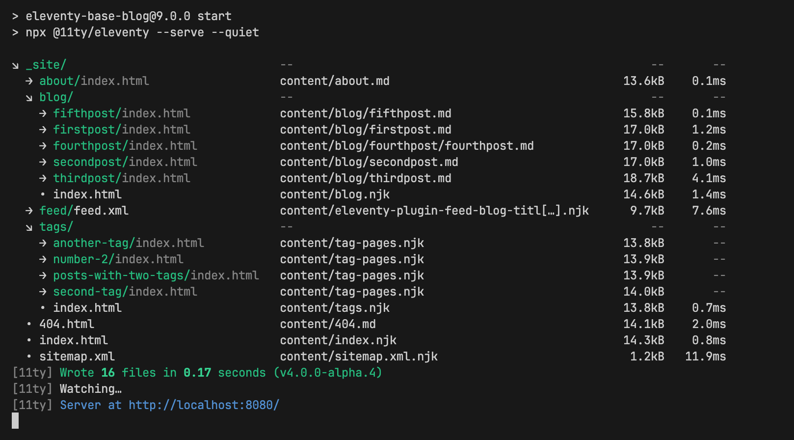
Did you know? 💡 Eleventy has an official plugin that shows your project’s output files organized by directory with file sizes and compile/render times shown? Compatible with Eleventy v1 and newer!
https://www.11ty.dev/docs/plugins/directory-output/
@fortawesome/react-fontawesome@3.0.1
Official React component for Font Awesome
@11ty/eleventy-plugin-directory-output@1.0.2
Group and sort Eleventy’s verbose output by directory (and show file size with benchmarks)
@11ty/image-color@1.0.7
Small utility to efficiently fetch the colors from an image.
Finally, it has happened: WebC has received some updates and a beta release of v0.12 is now available!
npm install @11ty/eleventy-plugin-webc@beta
Make sure you review the release notes for WebC v0.12 as there are some breaking changes with webc:type="js" webc:type="render" and webc:setup: https://github.com/11ty/webc/releases/tag/v0.12.0-beta.1
@11ty/eleventy-plugin-webc@0.12.0-beta.6
WebC support for Eleventy adds for Single File Web Components
@11ty/eleventy-plugin-webc@0.12.0-beta.5
WebC support for Eleventy adds for Single File Web Components
@11ty/eleventy-plugin-webc@0.12.0-beta.4
WebC support for Eleventy adds for Single File Web Components
@11ty/eleventy-plugin-bundle@3.0.7
Little bundles of code, little bundles of joy.
On this episode of Podcast Awesome, we dive deep into Office Space lore and tell the story behind the red stapler icon.
🎥 Watch here → youtu.be/FEKq7yz8sk8?...
🎧 Listen here → www.buzzsprout.com/2092855/epis...
a man sitting at a desk with a stapler that says snapple
ALT: a man sitting at a desk with a stapler that says snapple

@11ty/webc@0.12.0-beta.1
Single File Web Components
@fortawesome/react-fontawesome@3.0.0
Official React component for Font Awesome
@fortawesome/react-fontawesome@0.2.6
Official React component for Font Awesome
New episode of Podcast Awesome — the design nerdery behind the Office Space-themed red stapler is real.
🎥 Watch here → youtu.be/FEKq7yz8sk8?...
🎧 Listen here → www.buzzsprout.com/2092855/epis...
#OfficeSpace #PodcastAwesome #DesignQuotes
@fortawesome/react-fontawesome@0.2.5
Official React component for Font Awesome
This week’s Podcast Awesome dives deep into one of the strangest and most beloved symbols of design culture: Milton’s red stapler.
Office satire meets UI delight.
🎧 www.buzzsprout.com/2092855/ep...
#StaplerIcon #DesignCulture #PodcastAwesome
"Excuse me… I believe you have my stapler?"
One line. Infinite memes. A red-hot icon.
🎙️ This week on Podcast Awesome, we explore the unlikely design legacy of Milton’s most prized possession.
🎧 Watch now → youtu.be/FEKq7yz8sk8?...
#PodcastAwesome #OfficeSpace #StaplerIcon #DesignNerds
🖇️ Podcast Awesome: The Story Behind the Stapler Icon
🔴 “Excuse me … I believe you have my stapler?”
One line. Infinite memes. A red-hot icon.
In this episode of The Story Behind the Icon, we dive deep into the surprisingly rich lore behind the humble office stapler — and how a cult classic film, a soft-spoken cubicle dweller, and a spray-painted prop turned it into a cultural artifact.
🎧 Whether you’ve got 37 pieces of flair or just enough sarcasm to survive corporate life, this one’s for the design nerds, Office Space devotees, and UI jokesters looking for the perfect button metaphor.
🔍 What We Cover in This Episode
🔴 The origin story of Milton’s beloved red stapler
🎞️ Mike Judge’s animated roots and early Office Space shorts
💻 Remote work, legacy office gear, and the evolution of workplace design
🧑💼 Font Awesome’s very own “Milton” and the logic behind the madness
🎨 How to recreate Milton’s soul in HTML with our duotone icon
🎬 The real reason Swingline started making red staplers
⏰ Timestamps
00:00 – Welcome to Podcast Awesome
01:25 – A new take on the old office
02:40 – Meet Milton: The patron saint of passive resistance
04:20 – Mike Judge: From Beavis and Butthead to box office satire
05:55 – The stapler becomes an icon
06:35 – Meet FA’s own Milton (Hi, Steve 👋)
07:20 – Grumpiness as UI insight
08:05 – Milton’s stapler wasn’t red... until it was
09:00 – Design challenge: Where will you use the stapler icon?
09:50 – Commission your own icon or vote one into existence
10:30 – Credits and a final plea: Return. The. Stapler.
🔗 Links & Resources
🖇️ Stapler Icon on Font Awesome
📽️ Office Space (1999)
🎨 Vote for an icon on the leaderboard
📝 FA Blog: The Story Behind the Icon Series
🎥 Podcast Awesome on YouTube – Full uncut convo with extra music nerdiness
🎶 The Font Awesome Theme Song – Composed by Ronnie Martin
🎸 Music Interstitials by Zach Malm
🎬 Produced and edited by Matt Johnson
Stay up to date on all the Font Awesomeness!
@fortawesome/ember-fontawesome@3.1.0
Official Ember component for Font Awesome
As a reminder, the Font Awesome website will now be unavailable for up to three hours.
Access to our website and search interface will be offline during this time. Our Kits service, API, and NPM packages will continue working normally. Thanks!
@fortawesome/svelte-fontawesome@0.2.4
Svelte component for Font Awesome
Hey Folks! On Monday, August 18, starting at 5:00 p.m. EDT, the Font Awesome website will be unavailable for up to three hours.
Access to our website and search interface will be offline during this time. Our Kits service, API, and NPM packages will continue working normally. Thanks!
“Does it spark joy?”
That’s Don Clark’s test for everything he makes — from vinyl toys to murals to kids books.
Rewatch the extended YouTube ep of Podcast Awesome to hear more.
youtu.be/Dkar9QC2Oao?...
#InvisibleCreature #PodcastAwesome #CreativeStorytelling
Thinking of doing a podcast soon. Part of it will have a Q&A. What questions do you have for us? 🤔
@11ty/eleventy-plugin-vite@7.1.0-alpha.2
A plugin to use Vite as a development server and run Vite to postprocess your Eleventy build.
@11ty/eleventy-plugin-vite@7.1.0-alpha.1
A plugin to use Vite as a development server and run Vite to postprocess your Eleventy build.
🎨 Design like a Pro
With Font Awesome 7, you can:
- Use core packs like Classic & Sharp for thousands of options
- Explore Pro Plus packs like Jelly or Notdog for curated flair
- Swap styles on the fly using just CSS
Your design toolbox just got awesomer. 🧰⚡
youtu.be/C1xelmbZPaE?...
In a world of swipes and scrolls, Don Clark makes design that sticks. 🖼️
Stream the extended Podcast Awesome episode on YouTube now.
youtu.be/Dkar9QC2Oao?...
#PodcastAwesome #InvisibleCreature #DesignMatters
🚀 Web Awesome 3.0.0-beta.4
💺 Team seats - invite your collaborators
📋 Fresh patterns
⚛️ JSX typings for React 19 and Preact
🐛 Bug fixes
See the changelog for more info: webawesome.com/docs/resourc...
From album covers to children’s books to espresso machines to multi-story airport murals — Don Clark has built a design legacy rooted in joy, nostalgia, and soul.
Explore the full conversation in our extended YouTube episode.
🎧🎥 youtu.be/Dkar9QC2Oao?...
@awesome.me/webawesome@3.0.0-beta.4
A forward-thinking library of web components.
🚨 Extended cut just dropped! 🎧 🎥 Don Clark of @icreature dives deep into nostalgia, design that lasts, and his punk rock roots.
Hit play and get inspired: youtu.be/Dkar9QC2Oao?...
#PodcastAwesome #DesignNerdery #InvisibleCreature #CreativeProcess
Eleventy Leaderboards №30 Winners
11ty.dev/speedlify/
🥇 11ty.rocks from @5t3ph.bsky.social
🥈 www.victoriacutting.co.uk from Dan Urbanowicz
🥉 sia.codes from @sia.codes
Using Lighthouse v12.8.1 and speedlify.dev
🎨 Design that sticks. Nostalgia that moves.
Invisible Creature’s Don Clark talks toys, Target, and timelessness.
🎧 Weekend listen → www.podcastawesome.com/209285...
#PodcastAwesome #VisualCulture #RetroVibes
@fortawesome/angular-fontawesome@3.0.0
Angular Fontawesome, an Angular library
New leaderboards results have been posted! https://www.11ty.dev/speedlify/
Eleventy Syntax Highlighter (Prism) release v5.0.2 fixes a bug with `diff-` languages: https://github.com/11ty/eleventy-plugin-syntaxhighlight/releases/tag/v5.0.2
@11ty/eleventy-plugin-syntaxhighlight@5.0.2
Prism.js based syntax highlighting for Markdown, Liquid, Nunjucks, WebC, and 11ty.js templates.
@11ty/eleventy@4.0.0-alpha.4
A simpler static site generator.
@11ty/client@4.0.0-alpha.4
Run Eleventy in your browser.
@11ty/eleventy-dev-server@3.0.0-alpha.3
A minimal, modern, generic, hot-reloading local web server to help web developers.
https://www.11ty.dev/ is now running Eleventy v4 alpha
AROUND HERE WE TEST IN PRODUCTION (and also staging, previews, local, unit and integration tests in 12 different environments and JavaScript runtimes, but you get the idea)
@11ty/eleventy@4.0.0-alpha.3
A simpler static site generator.
@11ty/client@4.0.0-alpha.3
Run Eleventy in your browser.
@11ty/eleventy@4.0.0-alpha.2
A simpler static site generator.
@11ty/client@4.0.0-alpha.2
Run Eleventy in your browser.
@11ty/eleventy@4.0.0-alpha.1
A simpler static site generator.
@11ty/client@4.0.0-alpha.1
Run Eleventy in your browser.
@11ty/eleventy-dev-server@3.0.0-alpha.2
A minimal, modern, generic, hot-reloading local web server to help web developers.
You might not know Don Clark. But you know Don Clark’s work.
From @icreature, he’s the hand behind iconic art in music, retail, books, and beyond.
🎧 Meet the designer’s designer → www.podcastawesome.com/209285...
#PodcastAwesome #DesignMatters #InvisibleCreature
Invisible Creature’s Don Clark on Nostalgia, Iconography, and Staying Human
Designing Joy: Don Clark of Invisible Creature on Creativity, Collectibles & Culture
In this episode of Podcast Awesome, Matt hangs out with legendary designer Don Clark of Invisible Creature to dive into the analog soul of digital design. From their punk rock roots and Grammy-nominated album covers to art directing for Seattle’s swankiest restaurant, Don and his brother Ryan have created work you’ve seen —whether you know it or not.
They discuss growing up with a NASA illustrator grandpa, how nostalgia fuels creativity, the value of physical objects in a swipe-and-scroll world, and how a sibling-run design studio rides the waves of industry change. It’s a masterclass in storytelling, aesthetics, and sneaky inspiration.
Plus, Don once designed a 7-story mural for Newark Airport that one construction worker told him no one would ever notice. Art, meet irony.
✨ What We Cover in This Episode
- 🚀 Grandpa drew spaceships for NASA — no big deal
- 🎸 From hardcore zines to Grammy-nominated album art
- 🧸 Why physical objects still matter (even in a scroll-y, swipey world)
- 😊 Nostalgia, and the purposeful creation of joy
- 🏠 Turning a love of toys and typography into brand work for Target, Canlis, and more
- 🏄🏻♂️ Creating a career by riding the wave (not controlling it)
- 👾 How Invisible Creature got its name — and why most people don’t realize they’ve seen their work
- 🍽️ Art direction in fine dining, and designing for iconic spaces
⏱️ Timestamps
[00:01:00] – Don’s creative upbringing & grandpa's NASA work
[00:04:00] – From punk flyers to full-time design
[00:08:00] – Physical design in a digital world
[00:12:00] – Object design, collectibles, and vintage influence
[00:16:00] – Tapping nostalgia the right way
[00:20:00] – Album covers, influence, and desktop publishing
[00:24:00] – The decline of CDs & the rise of gig posters
[00:28:00] – The challenges (and joys) of working with family
[00:32:00] – Canlis restaurant and entering the fine dining space
[00:36:00] – Creating inspiring physical spaces
[00:38:00] – Why “Invisible Creature” is the perfect name
[00:42:00] – Good design as invisible, objective experience
[00:44:00] – Designing stamps, murals, and children’s Bibles
[00:46:00] – Streamlining creativity after 25 years in the biz
[00:48:00] – Wrapping up and why riding the wave matters
🔗 Links & Resources
- Invisible Creature
- Mind Reader Music – Album packaging by Ryan Clark & Kevin Moore
- Canlis – Seattle fine dining where Don is art director
- Art of the Incredibles Book – Don’s favorite Pixar art book
- Podcast Awesome on YouTube – Full uncut convo with extra music nerdiness
- The Font Awesome Theme Song – Composed by Ronnie Martin
- Music Interstitials by Zach Malm
- Audio mastering by Chris Enns at Lemon Productions
- Produced and edited by Matt Johnson
Stay up to date on all the Font Awesomeness!
@11ty/eleventy-dev-server@3.0.0-alpha.1
A minimal, modern, generic, hot-reloading local web server to help web developers.
Icon Packs, Families & Styles, Oh My!
Wanna learn how to navigate all the Font Awesome 7 icon options? We got you.
Switching styles like fa-solid to fa-thin?
Trying out fa-sharp or going full fa-jelly-fill?
You’re in control, inconster.
Start mixing & matching today ➡️ youtu.be/C1xelmbZPaE