The iconic font, CSS, and SVG framework
@fortawesome/fontawesome-common-types@7.3.1
The iconic font, CSS, and SVG framework
@fortawesome/fontawesome-free@7.3.1
The iconic font, CSS, and SVG framework
@fortawesome/fontawesome-svg-core@7.3.1
The iconic font, CSS, and SVG framework
7.3.1
New icons, plus fixes for brand icons missing from Free and a few 7.3.0 icon glitches.
Added
-
New Icons!
It's game on with new sports icons:
padel,padel-ball,cricket-bat,field-hockey-stick, andtable-tennis-paddle.
Fixed
- These new brand icons were introduced in 7.3.0 but were mistakenly excluded from Font Awesome Free:
visual-studio,dolibarr,obs-studio,storybook,a11y-project,copilot. Those responsible have been sacked, and the icons have been freed. - The new
meerkaticon in 7.3.0 somehow got a capitalized name alias of "Suricata", though all names are supposed to be lowercase. - Some new Slab Duo icons looked already-pressed in 7.3.0, like their Slab Press Duo counterparts:
box,bug. They've been un-pressed. - The primary and secondary layers for the
gearicon in Jelly Duo Regular were swapped. - These seal icons were redesigned and rotated:
seal,seal-exclamation,seal-question.
Part 2 with Josh Williams: software's "final season," why Gowalla and Path are worth studying, and what AI actually changes about design taste and discernment. #design #icons #podcast
Watch on YouTube -> https://youtu.be/8VGw_MduwX4
Listen to the Pod -> https://www.podcastawesome.com/episodes/episodes/19487560-josh-williams-on-icon-design-ai-and-knowing-when-to-stop-pt-2
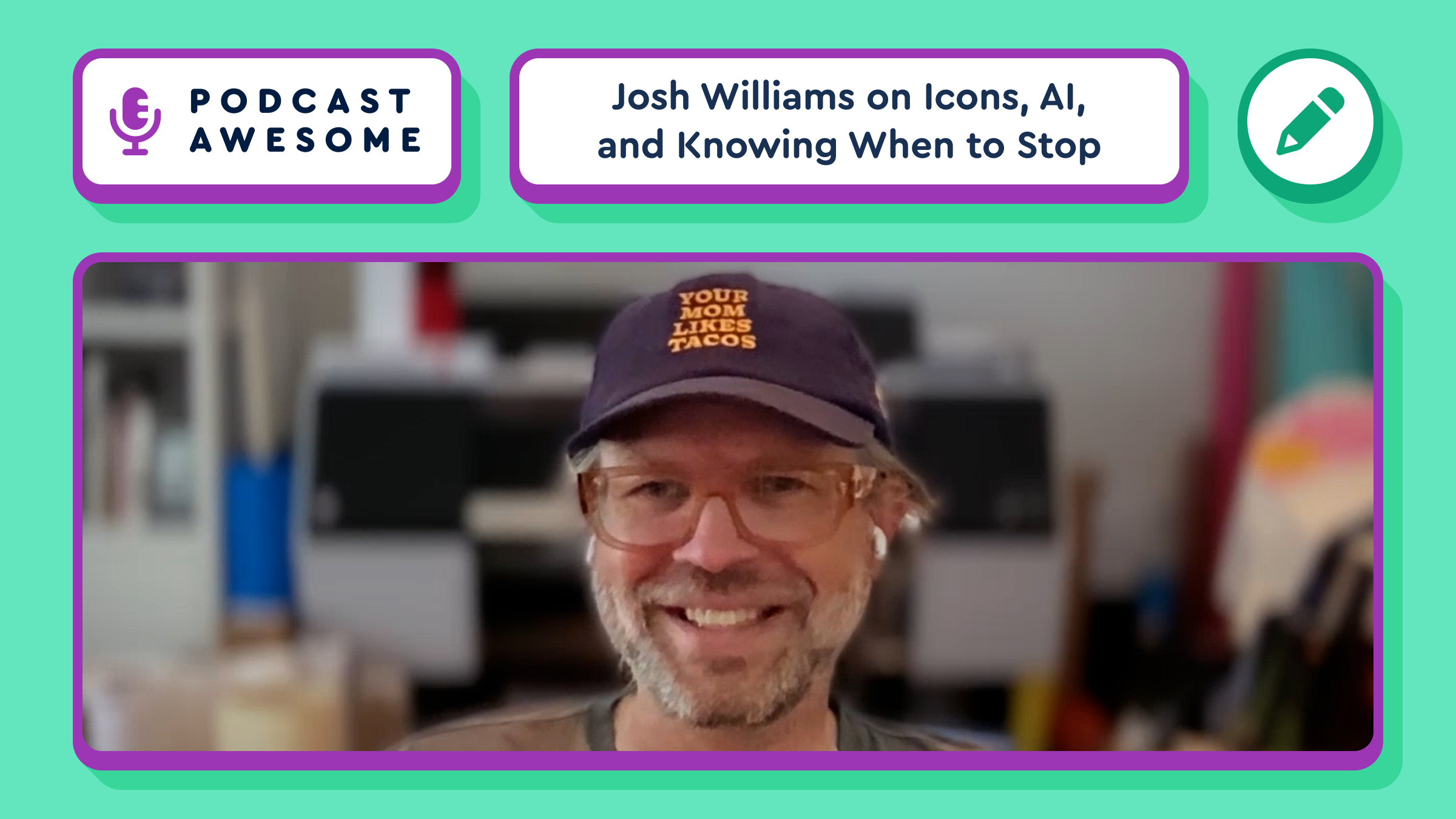
New episode is out!: Josh Williams on why some software might need a final season, Gowalla/Path and "everything apps," and what AI really changes about design (it's not the building, it's about editing and taste).
Watch: youtu.be/8VGw_MduwX4
Listen: www.podcastawesome.com/episod...
New Plans
Three new plans, Starter, Solo, and Team, with nothing changing for current subscribers.
We've simplified our plans to better fit how folks actually use Font Awesome, whether you're one person with a side project or a whole team shipping constantly. The new lineup: Starter, Solo, and Team. Details on our plans page.
Already a subscriber? Nothing changes for you. Your current plan stays exactly as it is. Same price, same limits, same features. Questions? We've got answers.
Changelog Refresh
The changelog gets a month-by-month sidebar, type filters, and website updates alongside Icon Library releases.
We're going full inception on this one and posting a changelog entry about a change to our changelog. Among the changes:
- A month-by-month sidebar
- Filter changelog entries by type: All, Icon Library, or Website
- Website updates now share the feed with the Icon Library
- Tooting our own horn just got easier
Josh Williams on Icon Design, AI, and Knowing When to Stop [Pt. 2]
What if software had a final season? Josh Williams is back for round two, and this conversation goes places the first one didn't. We get into designing as a generalist instead of a specialist, why some of the best products (RIP Gowalla, RIP Path) might have worked better as limited series instead of forever-apps, and what it actually feels like to use AI tools day to day — not the hot-take version, the real one, where the hardest part isn't the tech, it's knowing when to stop adding features.
Josh also breaks down how the Mosaic icon pack came together, Jory reflects on why his dad's Vermont highway signs are a kind of legacy he thinks about often, and Josh shares his advice for those getting into icon design today. Spoiler: it involves not knowing the rules yet, and that's a good thing.
**
What We Cover**
- Why physical, tangible work sticks with you in a way digital work — which can vanish with a hard drive — never quite does.
- Jory's dad's landscape architecture and signage firm, and how that legacy is scattered across Vermont
- The Mosaic icon pack, and how Scott Riley's Mindful Design site used FA's Slab icon set in a way the team never expected
- Generalist vs. specialist: why Josh keeps circling back to brand work but can't stay in one lane
- The venture-capital pressure that pushes good products toward becoming "everything apps"
- Gowalla, Path, and the idea of software with a beginning, middle, and end — like a TV show's final season
- The early App Store era of one-off apps that just were what they were (RIP the beer-drinking app)
- Font Awesome's own internal AI experiment weekend, and what came out of it
- Taste and discernment as the new bottleneck now that building is fast and cheap
- Why "don't be obsequious" should now be a standing instruction in AI prompts
- Josh's advice for anyone starting out in icon design today
- What's next for the Uni calendar, and a wishlist for a fully custom, build-your-own version
**
Timestamps**
00:00 – Reaching the edge of current tools and processes
00:00 – Intro: what this episode covers 01:00 – The joy of physical, tangible design work
02:00 – Jory's father's legacy in Vermont signage
04:00 – How the Mosaic icon pack might get used and remixed
05:00 – Generalist vs. specialist: where Josh lands
07:00 – Bringing different people and disciplines together
08:00 – VC pressure and the "scale infinitely" mindset 09:00 – Software with a beginning, middle, and end
11:00 – Gowalla, Path, and products as a moment in time
13:00 – Building an intentional, sustainable studio model
14:00 – The early App Store's one-off apps
17:00 – Font Awesome's internal AI experiment weekend
19:00 – Taste and discernment as the new bottleneck
20:00 – Prompting AI to not be obsequious
21:00 – Advice for getting into icon design today
23:00 – Breaking the rules you don't know exist yet – The Mosaic pack vs. the Uni calendar rules 24:00 – A wishlist: fully custom, build-your-own calendars
25:00 – Where to find Josh, and what's next for him
**
Credits**
- Featuring Josh Williams and Jory Raphael
- Hosted, Produced, and edited by Matt Johnson
- Theme song by Ronnie Martin
- Music interstitials by Zach Malm
- Video editing by Isaac Chase
**
Links**
- Font Awesome Mosaic icon pack
- Josh Williams: @JW on Instagram and Threads
**
Hashtags**
#PodcastAwesome #IconDesign #FontAwesome #DesignPodcast #AIandDesign #ProductDesign #BrandDesign #TechPodcast #CreativeIndustry #DesignCareers
Stay up to date on all the Font Awesomeness!
@fortawesome/vue-fontawesome@3.3.2
Official Vue component for Font Awesome 7
Bulk Icon Import
Paste a list of icon names to add them all to a Kit at once, with typos flagged before you import.
Bringing an existing icon list to a Kit used to mean adding icons one at a time. Now hit Import Icons on your Kit, paste the list (one name per line, and don't sweat stray fa- prefixes or quotes), preview the matches, fix any typos we flag, and add the whole batch in one go. One paste instead of 750 clicks. Your mouse thanks you.
Part 2 is coming next week... but first:
Catch up with Josh Williams as we talk about Mosaic, his commissioned Font Awesome Pro+ icon pack, how it came together, and why “green fields” create the best design work.
Watch → https://youtu.be/vpgC_N2s49I?si=7MoGEoJRAGEV-aa-
Listen → https://www.buzzsprout.com/2092855/episodes/19424515
@fortawesome/vue-fontawesome@3.3.1
Official Vue component for Font Awesome 7
Homepage Redesign
A redesigned homepage with a faster path to icon search, plans, and the rest of the site.
It's cleaner from top to bottom. Come on in and wipe your feet, the welcome mat's brand new. Take it for a spin on the homepage.
@fortawesome/react-fontawesome@3.4.0
Official React component for Font Awesome
@fortawesome/angular-fontawesome@5.1.0
Angular Fontawesome, an Angular library
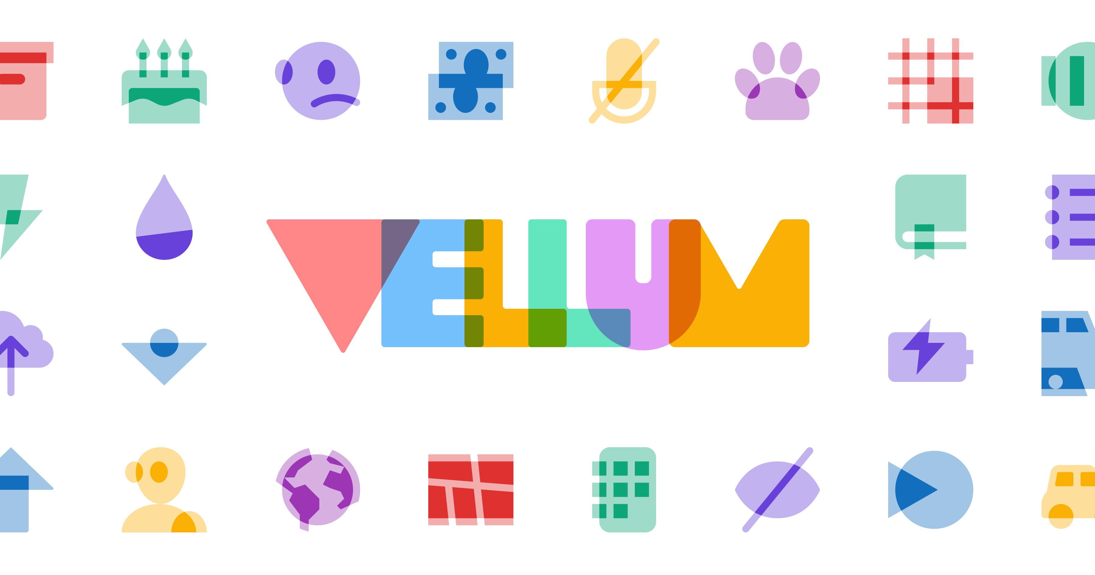
FA Vellum: guest designer Brian Brasher created a small-batch set of icons that are layered, overlapping slabs of visual significance. Like a good joke: it's all about those layers. Available with Font Awesome Pro+ only. fontawesome.com/icons/packs/v...
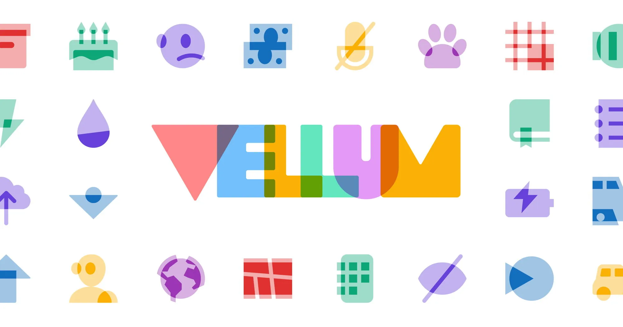
FA Vellum: layered icons from guest designer Brian Brasher that feature depth, dimension, and overlapping forms. Available now in Font Awesome Pro+. https://fontawesome.com/icons/packs/vellum
Josh's framing on AI: "Designers are realizing they're not totally at the mercy of someone more technical than them. The cost of experimentation is a lot lower."
He's not wide-eyed about it, just noticing that maybe tinkerer culture is back. Which feels right.
The Mosaic icon style traces back to Josh's Uni Calendar letterpress project. It’s geometric, mid-century-ish, built on reusable shapes. A made-for-print aesthetic that got adapted for screen. Jory has all of them. Because of course he does.
Some minor housekeeping: our `11ty-website` repo on GitHub has been renamed to `docs`: https://github.com/11ty/docs
A new Build Awesome (Eleventy) alpha is available for testing:
🥷 Using our fully async-friendly Nunjucks fork
🎁 Includes updated Bundle Plugin
https://github.com/11ty/buildawesome/releases/tag/v4.0.0-alpha.9
📊 17 fewer dependencies than 3.1.6 (-14%)
📉 6 MB smaller than 3.1.6 (-39%)
@awesome.me/buildawesome@4.0.0-alpha.10
A simpler way to build awesome web sites.
@11ty/client@4.0.0-alpha.10
Run Build Awesome (Eleventy) in your browser.
@11ty/eleventy@4.0.0-alpha.10
A simpler way to build awesome web sites.
@awesome.me/buildawesome@4.0.0-alpha.9
A simpler way to build awesome web sites.
@11ty/client@4.0.0-alpha.9
Run Build Awesome (Eleventy) in your browser.
@11ty/eleventy@4.0.0-alpha.9
A simpler way to build awesome web sites.
FA Pixel: a retro icon pack for the halcyon days of 128kb computers and arcade games. Available now in Pro+, and ready to byte. 🕹️ https://fontawesome.com/icons/packs/pixel
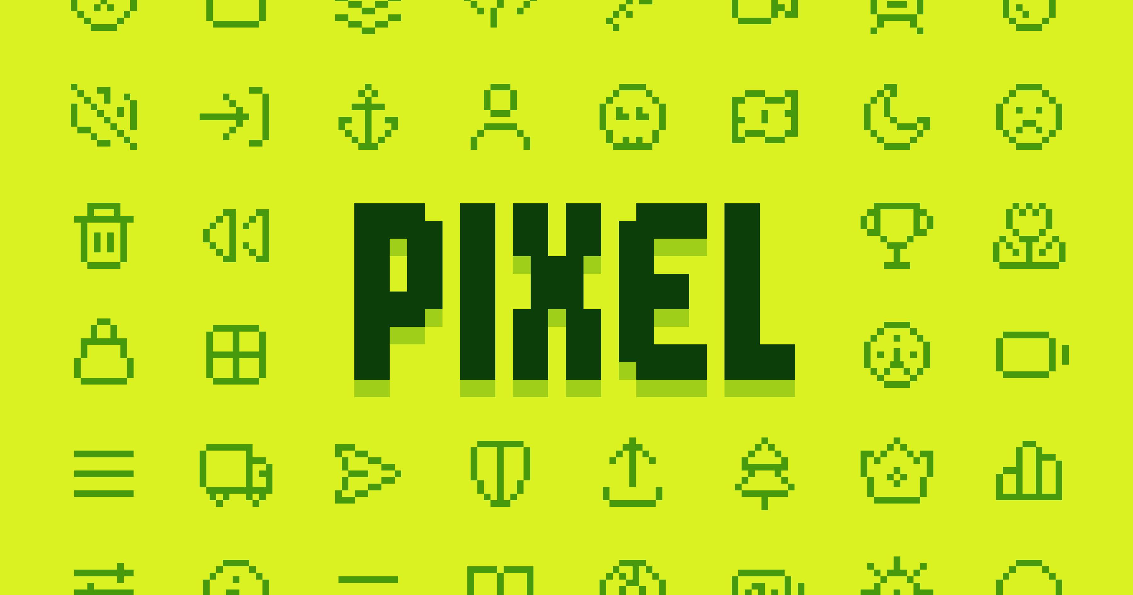
FA Pixel: back when computers boasted 128kb of memory and a stack of quarters held your place in line at the arcade. Retro icon goodness, now available with Font Awesome Pro+, and ready to byte back! fontawesome.com/icons/packs/p...
Josh's framing on AI: "Designers are realizing they're not totally at the mercy of someone more technical than them. The cost of experimentation is a lot lower."
Josh on the design monoculture question: "Things have become homogenous for a while. I feel like we're in a place where maybe it'll break back out a little bit."
He traces this partly to AI lowering the cost of experimentation. Not in a hype way, but more like a tinkerer noticing the tools have changed.
@11ty/eleventy-plugin-bundle@4.0.2
Little bundles of code, little bundles of joy.
GitHub Releases [11ty/fetch]: Fetch v5.1.3
https://github.com/11ty/fetch/releases/tag/v5.1.3
GitHub Releases [11ty/eleventy-plugin-bundle]: Bundle Plugin v4.0.1
https://github.com/11ty/eleventy-plugin-bundle/releases/tag/v4.0.1
@11ty/eleventy-fetch@5.1.3
Fetch and locally cache remote API calls and assets.
@11ty/eleventy-plugin-bundle@4.0.1
Little bundles of code, little bundles of joy.
WA 3.10 brings you:
🍫 <wa-random-content> to randomly display one (or more!) slotted elements
👾 Support for FA 7.3 in <wa-icon>, including new Pixel, Mosaic, and Vellum Pro+ packs
🧰 A healthy set of fixes and improvements
See it all: https://webawesome.com/docs/resources/changelog#wa_3100
GitHub Releases [11ty/nunjucks]: Nunjucks v4.0.0-alpha.3 FULL ASYNC
https://github.com/11ty/nunjucks/releases/tag/v4.0.0-alpha.3
@awesome.me/webawesome@3.10.0
A forward-thinking library of web components.
GitHub Releases [11ty/nunjucks]: Nunjucks v4.0.0-alpha.3 FULL ASYNC
https://github.com/11ty/nunjucks/releases/tag/v4.0.0-alpha.3
GitHub Releases [11ty/eleventy-plugin-bundle]: v4.0.0
https://github.com/11ty/eleventy-plugin-bundle/releases/tag/v4.0.0
GitHub Releases [11ty/nunjucks]: Nunjucks v4.0.0-alpha.3 FULL ASYNC
https://github.com/11ty/nunjucks/releases/tag/v4.0.0-alpha.3
@11ty/eleventy-plugin-bundle@4.0.0
Little bundles of code, little bundles of joy.
New Podcast Awesome episode: Josh Williams on Mosaic icons, why he almost got fired editing Mac OS 7 system resources as a teenager, and whether the design monoculture of the last decade is finally cracking.
Part 1 is out!
Watch → youtu.be/vpgC_N2s49I?...
Listen → www.buzzsprout.com/2092855/epis...
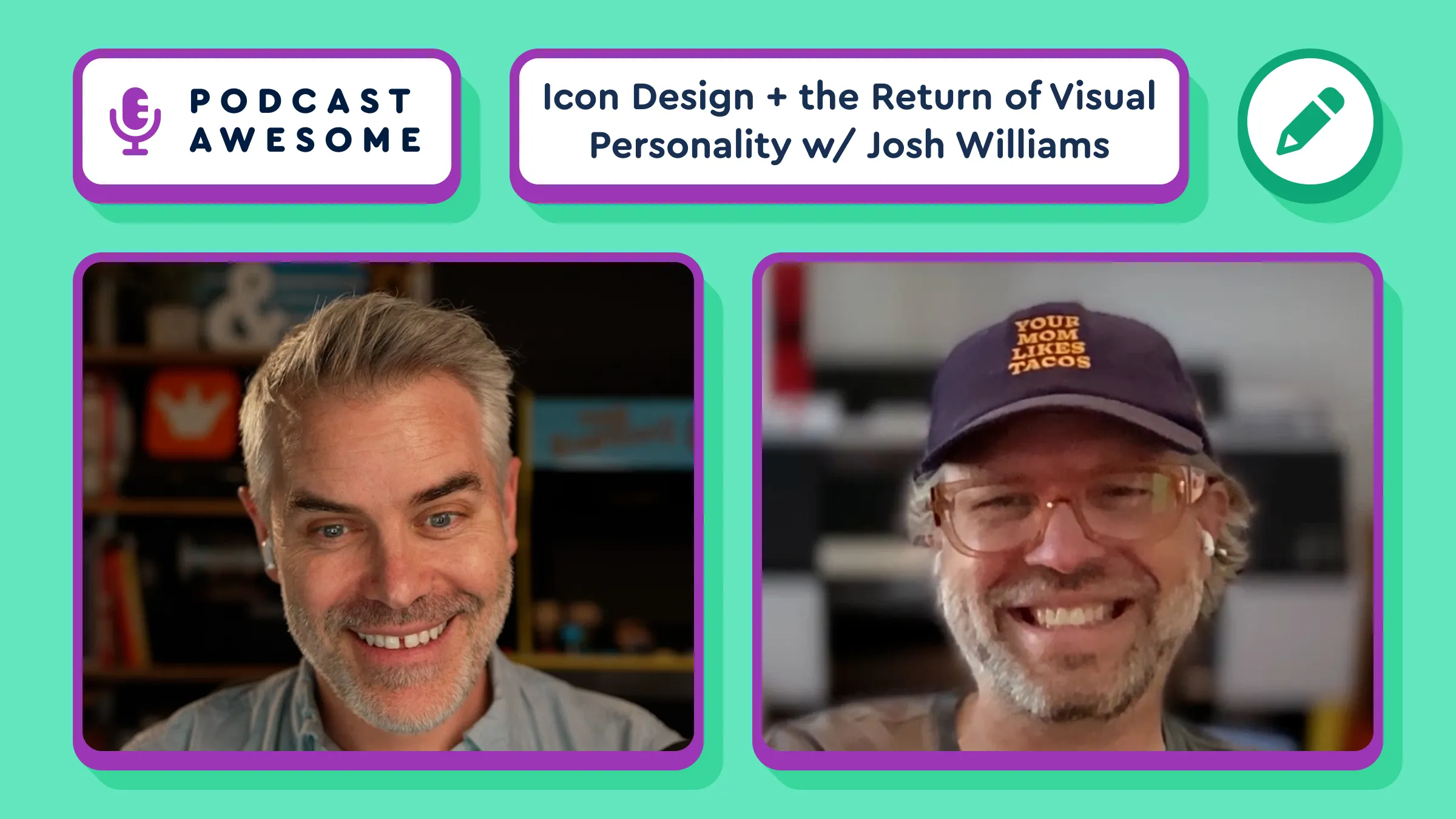
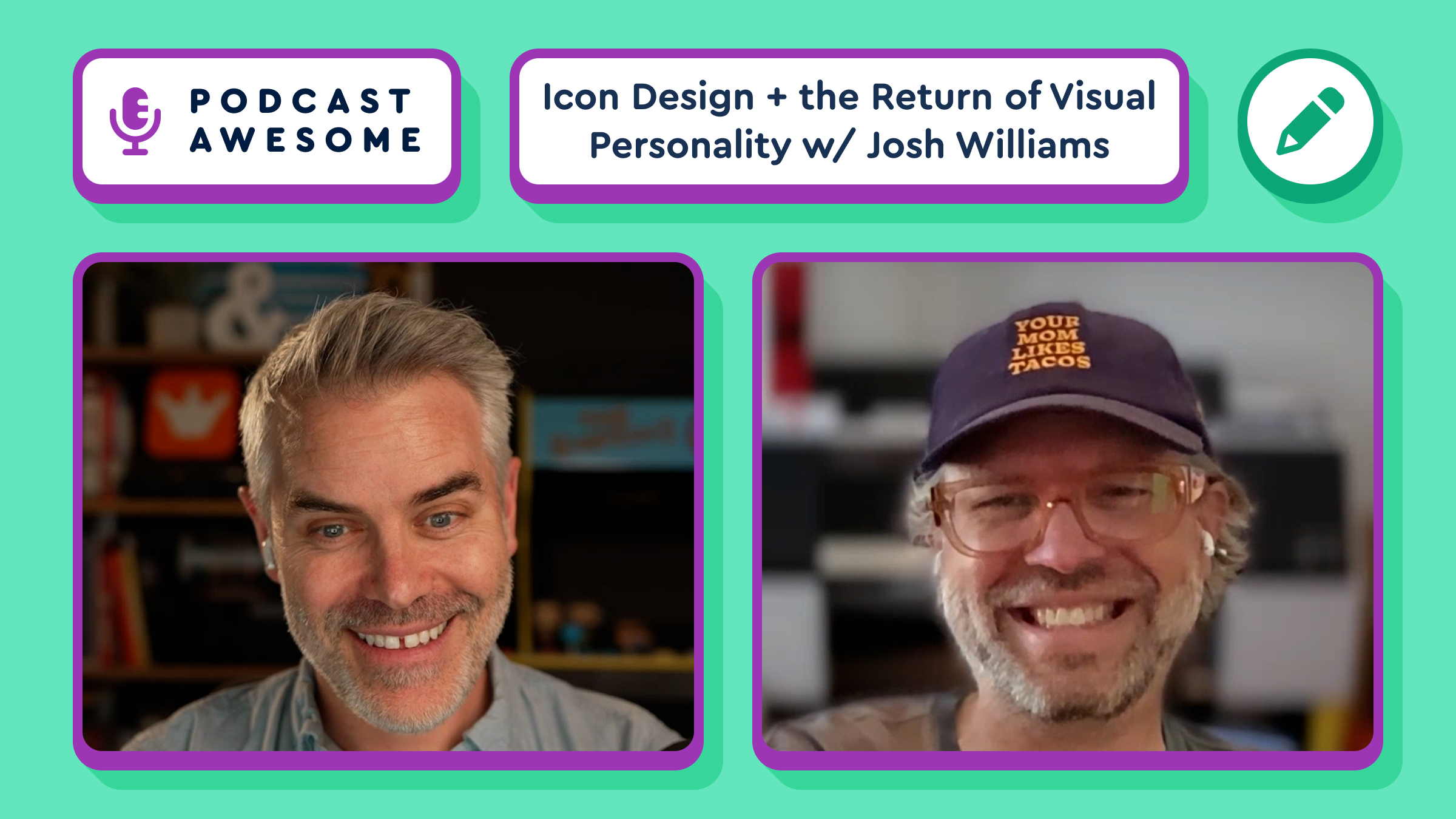
We asked Josh Williams onto the podcast, and the man opened by talking about ResEdit. Naturally.
Josh designed Mosaic, our new icon pack for Font Awesome Pro. He also once nearly got fired as a teenager for going two layers deep into Mac OS 7 system resources to edit the trash can icon. We're not saying those things are connected, but … you know.
Part 1 is out now!
Watch → https://youtu.be/vpgC_N2s49I?si=sdE-BHE3wk9Uc3pQ
Listen → https://www.buzzsprout.com/2092855/episodes/19424515
Just to be clear: we forked Nunjucks.
@11ty/nunjucks@4.0.0-alpha.3
A powerful templating engine with inheritance, asynchronous control, and more (jinja2 inspired)
Icon Design, Creative Freedom, and the Return of Visual Personality — with Josh Williams [Part 1]
Josh Williams has been designing icons since before it was a “real” job.
These days, Josh is one of the most respected icon and identity designers working in the field. He helped shape the Font Awesome and Web Awesome logos, and he just designed Mosaic — a brand-new icon pack for Font Awesome Pro with roots in his long-running Uni Calendar letterpress project and a style that's unlike anything we've shipped before.
In Part 1, we talk about where Mosaic came from, what it looks like when a designer actually gets creative freedom, why the web went homogenous, and whether it's finally starting to break back out. Also: Kaleidoscope themes, MySpace CSS exploits, and a cease-and-desist that made at least one person internet famous.
🗒️ What We Cover
🗑️ How Josh nearly bricked a Mac trying to edit the trash can icon
🌈 Kaleidoscope themes, Winamp skins, and the era of tinkering
✨ The MySpace CSS underground (yes, it was a thing)
🖨️ The Uni Calendar letterpress project and how it became Mosaic
🕊️ What "creative freedom" actually feels like when someone hands it to you
🌐 Why everything on the web started looking the same and why it might not stay that way
🤖 AI, low-cost experimentation, and the return of design personality
📸 What Josh is doing next (hint: it involves Keegan Jones and Instagram)
⏱️ Timestamps
00:00 – Cold open: demystification
01:00 – Intro
02:00 – Meeting Josh / fanboy moment
03:00 – Logo collaboration: Web Awesome and Font Awesome marks
04:00 – Announcing Mosaic
06:00 – Uni Calendar roots and the style thread
09:00 – The ResEdit / trash can story
13:00 – Kaleidoscope themes era
14:00 – MySpace CSS and early community
17:00 – Tinkerer culture and design demystification
18:00 – How homogenous web cycles work
21:00 – AI and low-cost experimentation
23:00 – What Josh is doing next
✨ Check out the Mosaic icon pack: https://fontawesome.com/icons
🔗 Credits
Hosted, produced, and edited by Matt Johnson
Co-host Jory Raphael
Featuring Josh Williams
Theme song by Ronnie Martin
Music interstitials by Zach Malm
Video editing by Isaac Chase
Stay up to date on all the Font Awesomeness!
Font Awesome Pro+ icon pack Mosaic was designed by Josh Williams with craft in mind: solid forms, swoopy curves, and signature "quirks." Available now in Pro+. https://fontawesome.com/icons/packs/mosaic
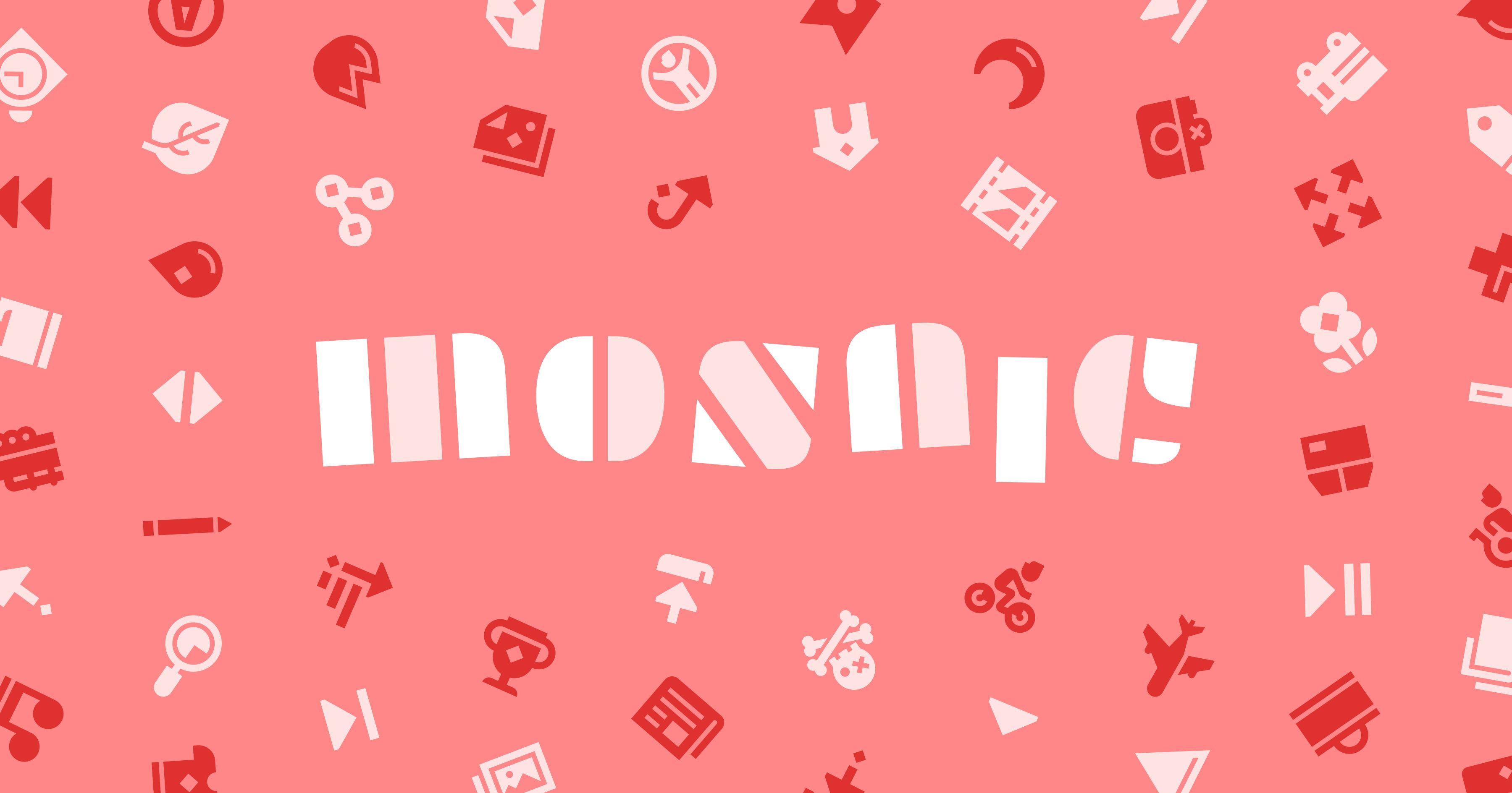
The Font Awesome Pro+ icon pack Mosaic is Josh Williams breaking the mold. Mosaic is built on solid forms, swoopy curves, and lovingly placed "quirks." These icons were built with solid craft behind them. fontawesome.com/icons/packs/m...
Icon Animations and Padding
The icon detail page adds flip, buzz, float, jello, swing, and wag animations, plus square and roomy padding controls.
The icon detail page picked up a batch of new animations, including flip, buzz, float, jello, swing, and wag (tail not included). There are also new padding controls for square and roomy canvases, because even icons appreciate a little personal space. Every option applies live to the preview and drops straight into your code snippet. Try them from any icon in icon search.
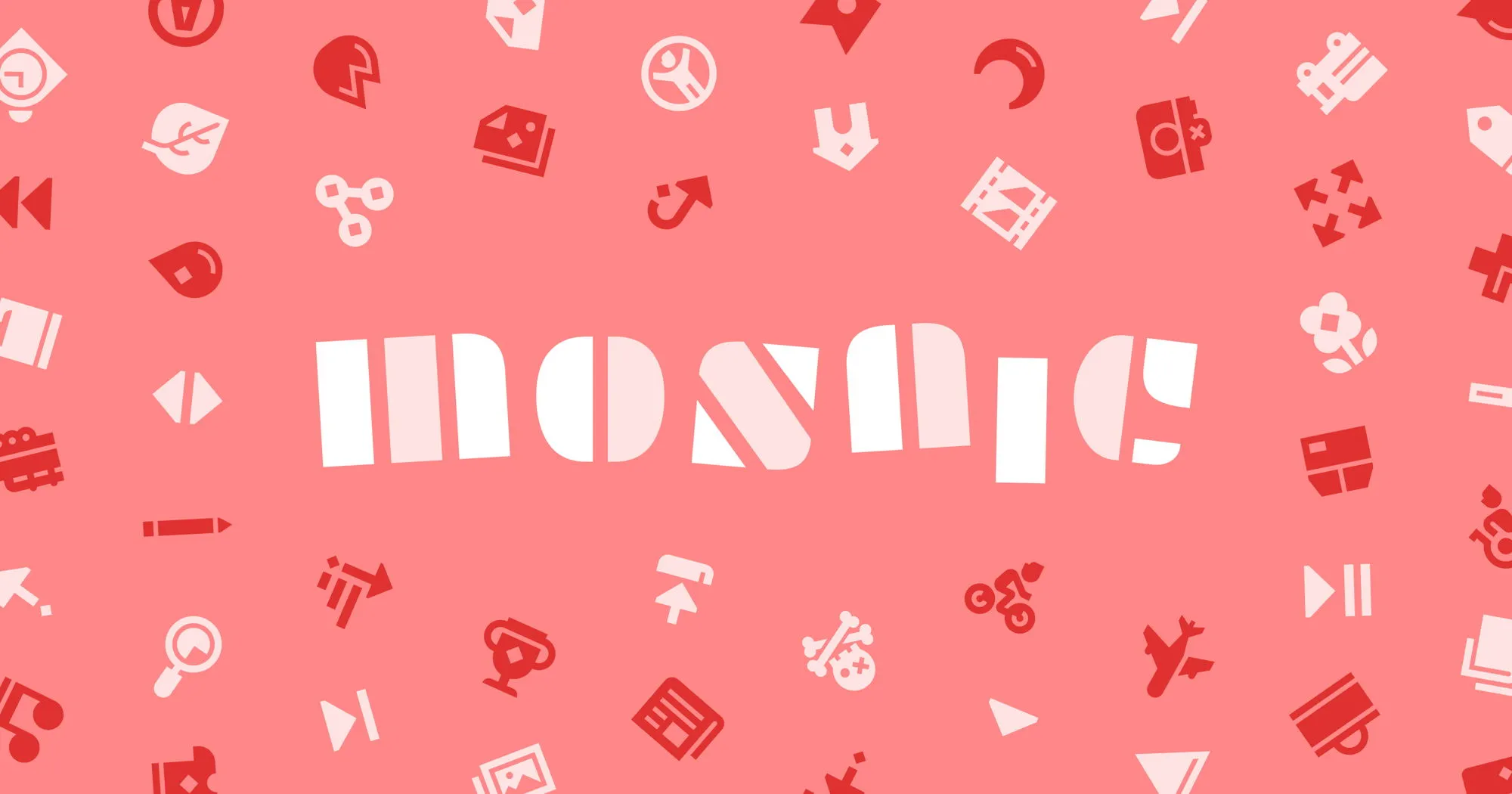
FA 7.3 just dropped four Pro+ icon packs. Mosaic is hand-crafted with "quirks." Pixel is pure retro. Vellum is layered and loveable. Slab is back with new styles. And if you've got a Pro+ subscription, you'll get all of them. fontawesome.com/icons
A big ol’ maintenance pre-release of Nunjucks reduces library dependencies to 0, audits to 0, install size by 566 kB (828 to 262):
https://github.com/11ty/nunjucks/releases/tag/v4.0.0-alpha.2
Coming soon to a canary release near you.
@11ty/nunjucks@4.0.0-alpha.2
A powerful templating engine with inheritance, asynchronous control, and more (jinja2 inspired)
Maintainence task: our docs on 11ty.dev have moved from clean-css to LightningCSS — excited to make use of CSS nesting!
Eleventy is a simpler static site generator
Eleventy is a simpler static site generator.
We noticed a sceptical vibe shift from the Web Awesome community. So, we took an honest look at why, and we didn't love what we found. Read the blog for the full story, and what we've already changed. blog.fontawesome.com/staying-...
@fortawesome/vue-fontawesome@3.3.0
Official Vue component for Font Awesome 7
@fortawesome/free-brands-svg-icons@7.3.0
The iconic font, CSS, and SVG framework
@fortawesome/free-regular-svg-icons@7.3.0
The iconic font, CSS, and SVG framework
@fortawesome/free-solid-svg-icons@7.3.0
The iconic font, CSS, and SVG framework
@fortawesome/fontawesome-common-types@7.3.0
The iconic font, CSS, and SVG framework
@fortawesome/fontawesome-free@7.3.0
The iconic font, CSS, and SVG framework
@fortawesome/fontawesome-svg-core@7.3.0
The iconic font, CSS, and SVG framework
7.3.0
Three new Pro+ packs (Pixel, Mosaic, and Vellum), Slab Duo styles, and six new animations.
Added
-
Three new Pro+ icon packs!
- Pixel: It's hip to be square. Before high density displays, the mighty pixel was king. FA Pixel takes you back to the halcyon days of yore, when quarters held your place at the arcade and computers only had 128kb of memory. If you're prepping your next plumbing adventure or space invasion, Pixel is ready to byte.
- Mosaic: All the pieces are coming together. Icons are little art pieces constructed from many elements, and FA Mosaic is no different. Master craftsman Josh Williams breaks the mold with this pack, blending solid forms, swoopy curves, and fun little sprinkles he lovingly calls "quirks."
- Vellum: Layers of depth. Here at Font Awesome, we like our icons like we like our jokes: layered. Guest designer Brian Brasher guides you amongst these overlapped slabs of significance for a pack with real dimension.
- Each pack is available with a Pro+ subscription.
-
New Slab styles!
- Our sturdy, blocky Slab pack gets two new family styles: Slab Duo and Slab Press Duo. Add some depth and a second layer of color to icons that feel bold and ready for action.
-
New animations!
- Inspired by Disney's 12 Principles of Animation, we added six new animation utilities so your icons don't just move, they have personality:
fa-buzz,fa-wag,fa-float,fa-swing,fa-spin-snap(withfa-spin-snap-4andfa-spin-snap-8variants), andfa-jello. - Each new animation follows our existing custom property naming convention and works out of the box without setting any properties.
- All animations continue to respect the
prefers-reduced-motionsetting. - See them all in action in the animation documentation.
- Inspired by Disney's 12 Principles of Animation, we added six new animation utilities so your icons don't just move, they have personality:
-
New canvas sizing classes!
- Two new opt-in utility classes let you drop any icon onto a predictable, square canvas, perfect for icon-only buttons and design-system layouts.
fa-canvas-squareadds vertical padding so an icon fills a square canvas (20×20 at 1em).fa-canvas-roomyadds a bit more padding for layouts that want extra breathing room (24×24 at 1em).- Both use
emunits, so the canvas scales right along with your icon size.
-
New Icons!
A few fresh additions to the family:
envelope-heart,file-md,file-txt, andmeerkat. -
New Brands!
Added a batch of the most-requested brand icons:
a11y-project,build-awesome,square-build-awesome-stroke,codeberg,copilot,devpost,dolibarr,internet-archive,lets-encrypt,matrix,mattermost,nextcloud,obs-studio,roblox-creator-studio,ror,storybook,substack,tesla,visual-studio,xrp,xrpl, andyoutube-shorts.
Changed
- Better motion for existing animations. We refined the keyframes for six of our existing animation utilities for motion that feels more alive:
fa-bounce,fa-beat,fa-beat-fade,fa-fade,fa-flip, andfa-shake. Same class names, same custom properties, just better motion. - Brand refreshes. Updated a few brand icons to match their latest logos:
githubfor GitHub's 2026 brand refresh,androidto match current brand standards, andthreadsfor Threads' updated logo.
Fixed
- The Etch
circle-questionicon wasn't quite right. It is now. - The solid and regular styles of
fingerprintwere identical. They're now their own unique selves. - Cleaned up some inconsistencies between the solid
boxicons. - Fixed a vertical misalignment on the solid
battery-emptyicon. - The Duotone Thin
game-board-simpleicon had a secondary tone spilling outside the lines. We tidied it up. - The Duotone Light
opossumicon wasn't actually duotone. Our 'possum now has two tones, as nature intended. - The Duotone
toolboxicon was showing just the line art for its fill. The fill is back where it belongs.
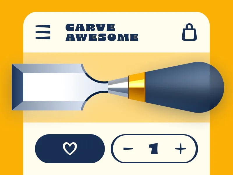
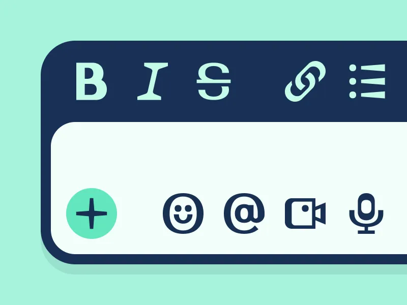
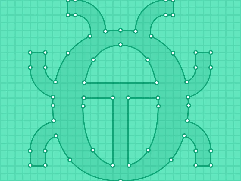
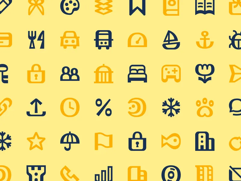
The whole concept came from a book cover. Specifically the stroke contrast in the typeface on it.
Laura had one question: can you bring thick-to-thin stroke contrast into an icon system?
Nobody had really done it. She wasn't sure it would work. She did it anyway.
Watch → youtu.be/ALlNUTYC83g?...
"Oh, you know, I just spent the last hour debating one pixel."
A perfectly normal thing to say if you're an icon designer.
In the latest ep, Laura talks about why icon design is really just solving tiny puzzles all day.
Watch → youtu.be/ALlNUTYC83g?...
Listen → www.buzzsprout.com/2092855/epis...
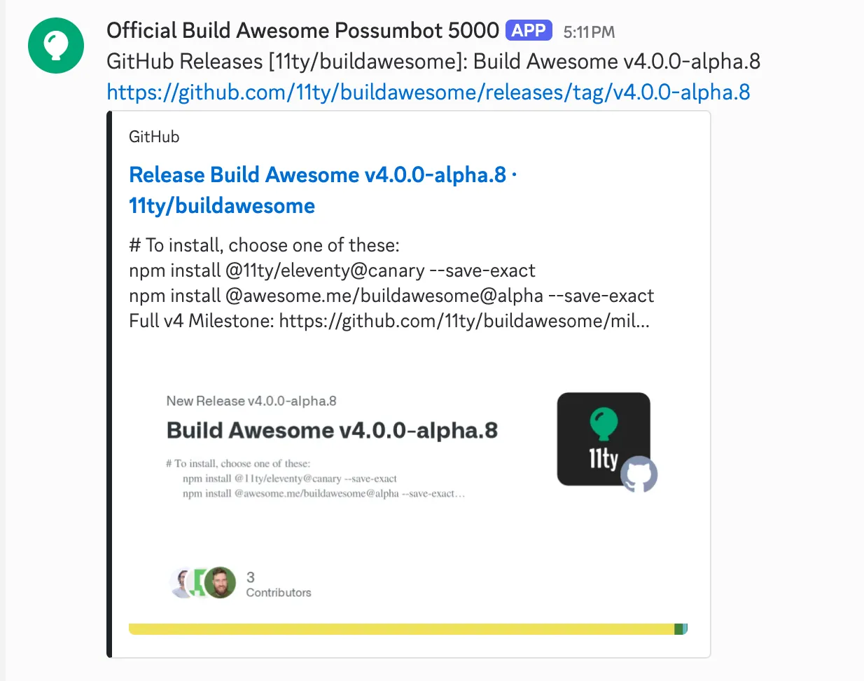
Possumbot now has the responsibility of letting Discord folks know about GitHub releases.
🤖 We've added a new webawesome-design skill to help AI agents build better UI with Web Awesome. 🤖
Get the new skill and all of the latest hotness like <wa-checkbox-group> in WA 3.9: https://webawesome.com/docs/resources/changelog#wa_390
@awesome.me/webawesome@3.9.0
A forward-thinking library of web components.

Build Awesome and Eleventy v4.0.0-alpha.8 are now available for testing!
https://github.com/11ty/buildawesome/releases/tag/v4.0.0-alpha.8
Using staged publish for extra security, the new Build Awesome package, and batched incremental builds! Try it out!
@awesome.me/astro-lit@5.0.4
Use Lit components within Astro
@awesome.me/buildawesome@4.0.0-alpha.8
A simpler way to build awesome web sites.
@11ty/client@4.0.0-alpha.8
Run Build Awesome (Eleventy) in your browser.
@11ty/eleventy@4.0.0-alpha.8
A simpler way to build awesome web sites.
@awesome.me/astro-lit@5.0.3
Use Lit components within Astro
@awesome.me/astro-lit@5.0.2
Use Lit components within Astro
@awesome.me/astro-lit@5.0.0
Use Lit components within Astro
Plan Changes
Switch plans, billing cycles, or seat counts from the plans page, with a price preview before you commit.
Changing plans no longer sends you off to a separate billing portal. Start from the plans page. Upgrades start right away, and downgrades wait for your renewal date.
@11ty/gray-matter@2.1.0
Parse front-matter from a string or file. Fast, reliable and easy to use. Parses YAML front matter by default, but also has support for YAML, JSON, TOML Front-Matter, with options to set custom delimiters. Used by metalsmith, assemble, verb and many other
@awesome.me/buildawesome@0.0.1
A simpler way to build awesome web sites.
Laura Bohill got a brief for Font Awesome 7: make something expressive, no rules, total freedom.
Reader, she had an existential crisis.
The result is Chisel — and it's unlike anything we've released. New Podcast Awesome episode is live. 🎙️
Watch → https://youtu.be/ALlNUTYC83g?si=Yi-xANnkrfqaiCed
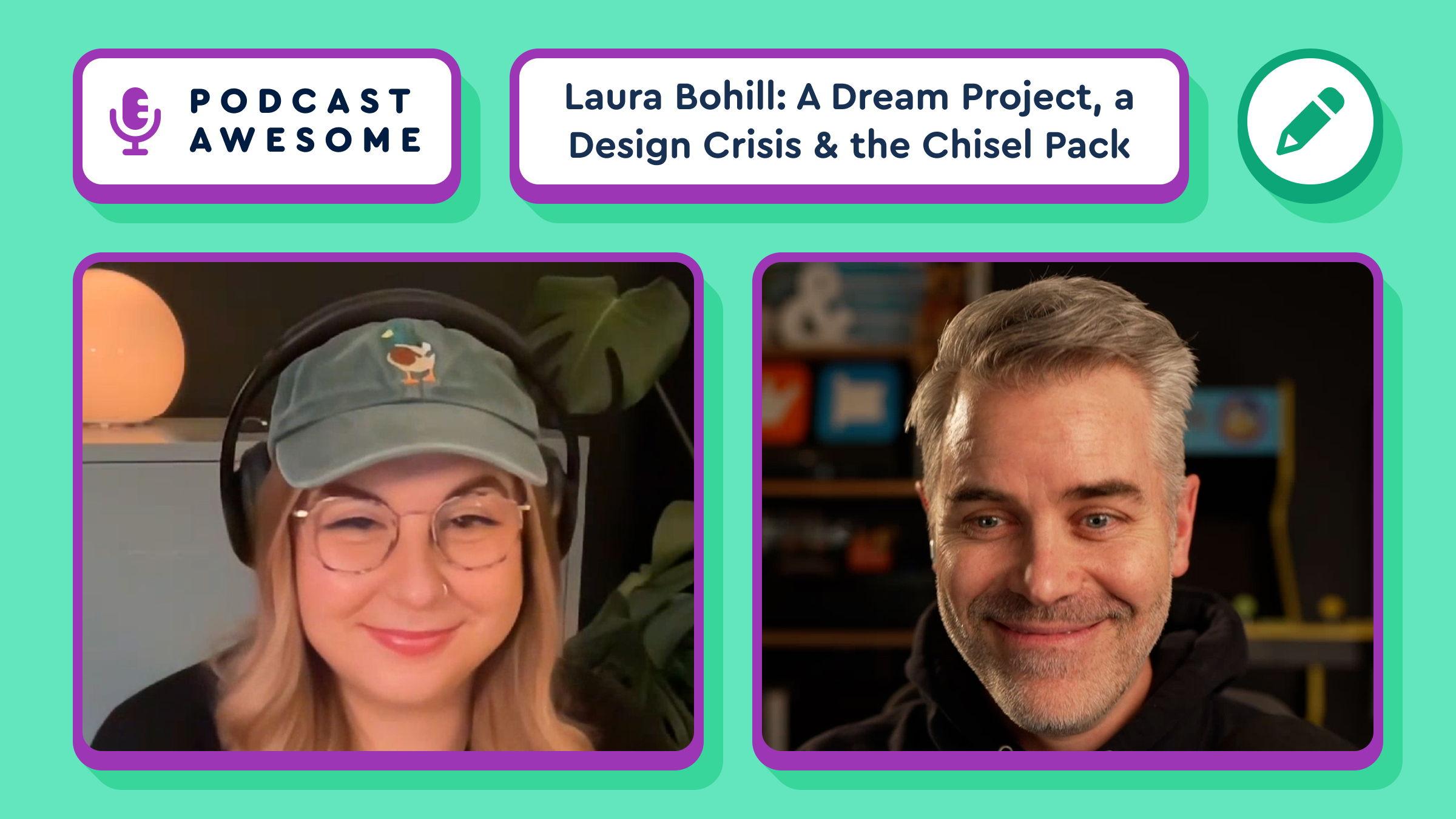
Laura Bohill: A Dream Project, a Design Crisis, and the Chisel Icon Pack
Episode Summary
What happens when you give a world-class icon designer a dream brief with almost no boundaries? A brief existential crisis, and eventually a beautiful type-inspired icon packs for Font Awesome 7. 😅
In this episode, Matt and Jory chat with icon designer Laura Bohill about the making of Chisel — the wonderfully chunky icon pack she designed for Font Awesome 7. They get into the weird magic of creative constraints, why icon design is really just tiny-illustration puzzle solving, and how type, branding, and metaphor all shape great icon systems.
They also talk about freelance life, protecting your creative brain, why not every design problem should follow you into your evenings, and how sometimes the best ideas show up only after you’ve stepped away from the screen. It’s thoughtful, funny, nerdy, and full of delightful icon design rabbit trails.
What We Cover in This Episode
- ✨ How Laura went from “dream project” to “I am spiritually untethered”
- ✏️ How a book cover typeface sparked the visual idea behind the Chisel icon pack
- 🧩 Why icon design is basically a never-ending series of tiny, beautiful puzzles
- 🧠 Why creative boundaries and time away from work matter more than hustle culture admits
- 🖼️ How Laura balances clarity vs. creativity in icon design systems
- 🏰 Why designing icons for Historic England meant trading “upload” icons for castles and country houses
- 🛠️ Laura’s journey from Illustrator to Figma, with a little help from Noah
- 🌍 Why icon designers might secretly be some of the most-seen artists on the internet
Timestamps
00:00 — Dream project meets existential crisis
00:04:00 — How an open-ended brief led to Chisel’s distinctive style
00:09:30 — Why Laura doesn’t usually do self-directed design projects
00:12:00 — How she found icon design through illustration and freelance work
00:16:00 — Freelance life, boundaries, and protecting creative energy
00:20:00 — How type design influences icon systems
00:30:00 — Why icon design is really a puzzle-solving practice
00:36:00 — Balancing clarity and creativity in icon systems
00:40:30 — Historic England, castles, and designing beyond typical UI icons
00:45:00 — Laura’s Figma origin story and Noah’s helpful onboarding
00:48:00 — Why icon designers are quietly famous
00:50:00 — Find Laura online and final thoughts
Links & Resources
- Laura Bohill / Laura Bee
Find Laura Laura Bee online 😄 - Font Awesome 7
Explore Font Awesome 7 and its small batch icon packs, including Chisel - Chisel icon pack
Laura’s custom icon pack for Font Awesome 7, inspired by stroke contrast in typography - YouTube version of this episode
Watch the visual demo version to see the Chisel icons on screen while the team talks through the design - Figma
Making the leap from Illustrator to Figma - Historic England
Laura’s recent icon system project featuring castles, parks, and places of worship
Credits
Hosted by Matt Johnson
Featuring: Laura Bohill, and Jory Raphael
Produced and edited by Matt Johnson
Theme song: Ronnie Martin
Music interstitials: Zach Malm
Additional video editing: Isaac Chase
Stay up to date on all the Font Awesomeness!
We ran Build Week at Font Awesome, which was an open week to just build with AI and see what actually happens.
We were surprised that the tools amplified expertise instead of flattening it. The people who knew what they wanted used AI to go further in that direction.
Dave's take: "AI helps you be more of who you are, not less."
Read the full post: https://blog.fontawesome.com/using-ai-tools-as-a-small-team/
"All capability and no character is just a supervillain."
Dave said that, and we beat this drum over and over: character has to come before the capability. Both for people and for how we adopt tools.
How to Use Kits in Your Project | Getting Started with Font Awesome [Part 2]
Ready to add awesome icons to your project in mere seconds? Look no further, because in this quick tutorial, we'll show you how to install and use a Font Awesome Kit — the easiest way to get icons into your project with just a single line of code. Whether you're building a personal site, client project, or your next side hustle, we’ll walk you through every step.
In just a few minutes, you'll learn how to:
✅ Embed a FA Kit into your HTML
🔎 Search & find the perfect icon
📋 Copy and paste icon code like a pro
🎉 Make your UI way more fun & functional, instantly!
No fuss. No config headaches. Just super-duper icon magic.
💡 Perfect for devs, designers, and digital tinkerers looking to speed up their workflow and make their projects stand out.
🔗 BONUS: We’re using [CodePen] (https://codepen.io) for the demo so you can play along in real time!
🧰 What You’ll Learn:
How Font Awesome Kits simplify icon installation
The fastest way to get icons into your project (no downloads required!)
The difference between icon styles (solid, regular, etc.)
Pro tips to keep your HTML clean and maintainable
⏱️ Timestamps
00:00 – Copy your kit into your project
00:40 – Search page & icon detail modal
01:10 – Using icons in your web projects
01:18 – Wrap-up & next steps
#FontAwesome #WebDesign #CodeTutorial #WebDevelopment #HTMLIcons #DevTips #FrontendDev #IconLibrary #WebAwesome
Subsetting Your Icons Using Kits | Getting Started with Font Awesome [Part 5]
Want to keep your projects loading up fast while still using the icons you love? In this screencast, we’ll show you how to subset your Font Awesome Kit, so you’re only loading the icons you actually need.
We’ll walk through the different ways to subset your icons—from automatic options to fully custom selections—so you can cut down file size, improve performance, and keep your setup streamlined.
🧰 What You’ll Learn:
⚡ What subsetting is and why it improves performance
🤖 The different subsetting options available in Kits
🔎 How to create a custom subset by selecting specific icons
💾 See how to enable 'Custom Subsetting' in your Kit settings
🚀 How to use your subsetted Kit in your project
⏱️ Timestamps
00:00:00 – Intro: Subsetting your icons using Kits
00:00:16 – FAQ: What is a subset?
00:00:41 – FAQ: What are my options when it comes to subsetting?
00:00:57 – Adding icons to your Kit: Subsetting 'By Icon'
00:01:35 – Managing your subset in Kit settings
00:01:42 – Using a subset in your project
00:02:05 – Outro: Go make something awesome!
Now that your icons are leaner and faster, go make something awesome!
🔗 Links & Resources
🎨 Font Awesome: https://fontawesome.com/
📘 Font Awesome Docs: https://docs.fontawesome.com/web/dig-...
💡 More Doing More with Font Awesome screencasts: • [v7-7.20] Managing Domains and Pageviews i...
Dave Gandy's color visualizer ended up looking like stained glass. He'd just visited the Sagrada Família and that's where his head was. The AI didn't replace his taste. It gave his taste somewhere to go, faster.
Upload Custom Icons and Make Font Awesome Yours | Doing More with Font Awesome [Part 7]
🎨 In this tutorial, we’ll walk you through uploading custom icons to your Font Awesome Kit. We’ll cover everything — from navigating the Custom Icons tab to troubleshooting any bumps along the way — so you can mix your unique custom icons with the official Font Awesome collection. And of course, we’ll show you how to easily add these icons to your projects using a quick code snippet. By the end, you'll have a personalized icon library that adds extra flair to your projects.✨
⏰ Timestamps:
🎉 00:00 Introduction to Custom Icons in Font Awesome
📤 00:20 Uploading Your Custom Icons
🛠️ 01:01 Handling Icon Issues and Publishing
📂 02:03 Using Custom Icons in Your Project
📥 03:17 Downloading Kits with Custom Icons
📝 04:00 Recap and Final Thoughts
#FontAwesome #CustomIcons #WebDesign #Tutorial #Icons #WebDevelopment
Try it on webawesome.com, then give it a try in your own project.
SSR docs: webawesome.com/docs/ssr